Pointillism Palette 14
Soft Apricot
Soft Low-contrast, gentle chroma - mid-key values and low saturation, approachable and calm.
Apricot Soft warm orange - peach-adjacent, the color of ripe stone fruit.

Palette Analysis
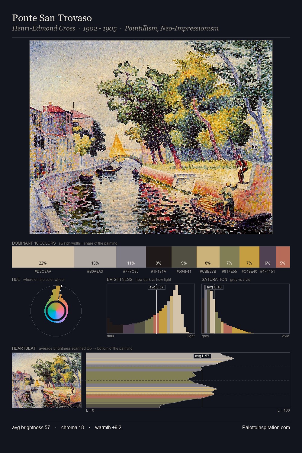
Pointillism distributes its values across the middle register, creating harmony without high contrast. The palette tilts toward cool - blues and silver-greys carry the structural weight. Colours are neither washed out nor blazing; they occupy the productive middle ground of the chroma scale. Only 8.7% is devoted to #91613D, yet that small allocation delivers the palette's entire chromatic tension. 57 units of value range underpin the palette's structural clarity: the eye always knows where light falls. High luminosity and cool temperature suggest the plein-air condition: unfiltered daylight and open sky.
Example use cases
- ceramics & pottery
- boutique hospitality
- menswear
- heritage food brands
- craft & artisan brands
I Love This!
Use This Palette
Copy, export, or download for your project
Copy, export, or download for your project
Copy:
Download:
Share: