Paul Nash Palette 4

Palette Analysis
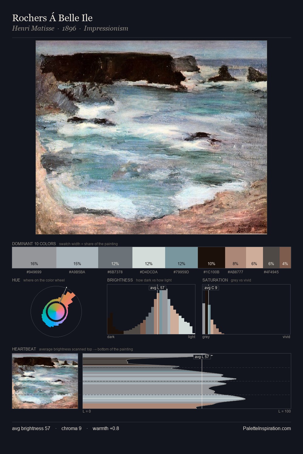
Values in Paul Nash tilt decisively toward white, giving the palette its luminous character. Cool tones set the register here - the blues and greens easily outweigh any warm accents. Saturation is deliberately withheld - the beauty here lies in the near-monochromatic gradations rather than colour difference. At 25.9%, #C6C9C6 functions less as a colour accent and more as a complete atmospheric environment. The saturated accent, #876041, registers at 2.6% - sparse enough to feel like a deliberate surprise. From deepest dark to palest light, the palette traverses 73 units of the value scale - a span that creates natural depth. The palette has the character of outdoor light: cool, mid-bright, with colour rendered faithfully rather than expressively. Palette 4 sits within the larger chromatic argument that Paul Nash's complete body of work advances.
Example use cases
- print magazines
- beauty brands
- real estate
- high-end packaging
- editorial design
I Love This!
Copy, export, or download for your project