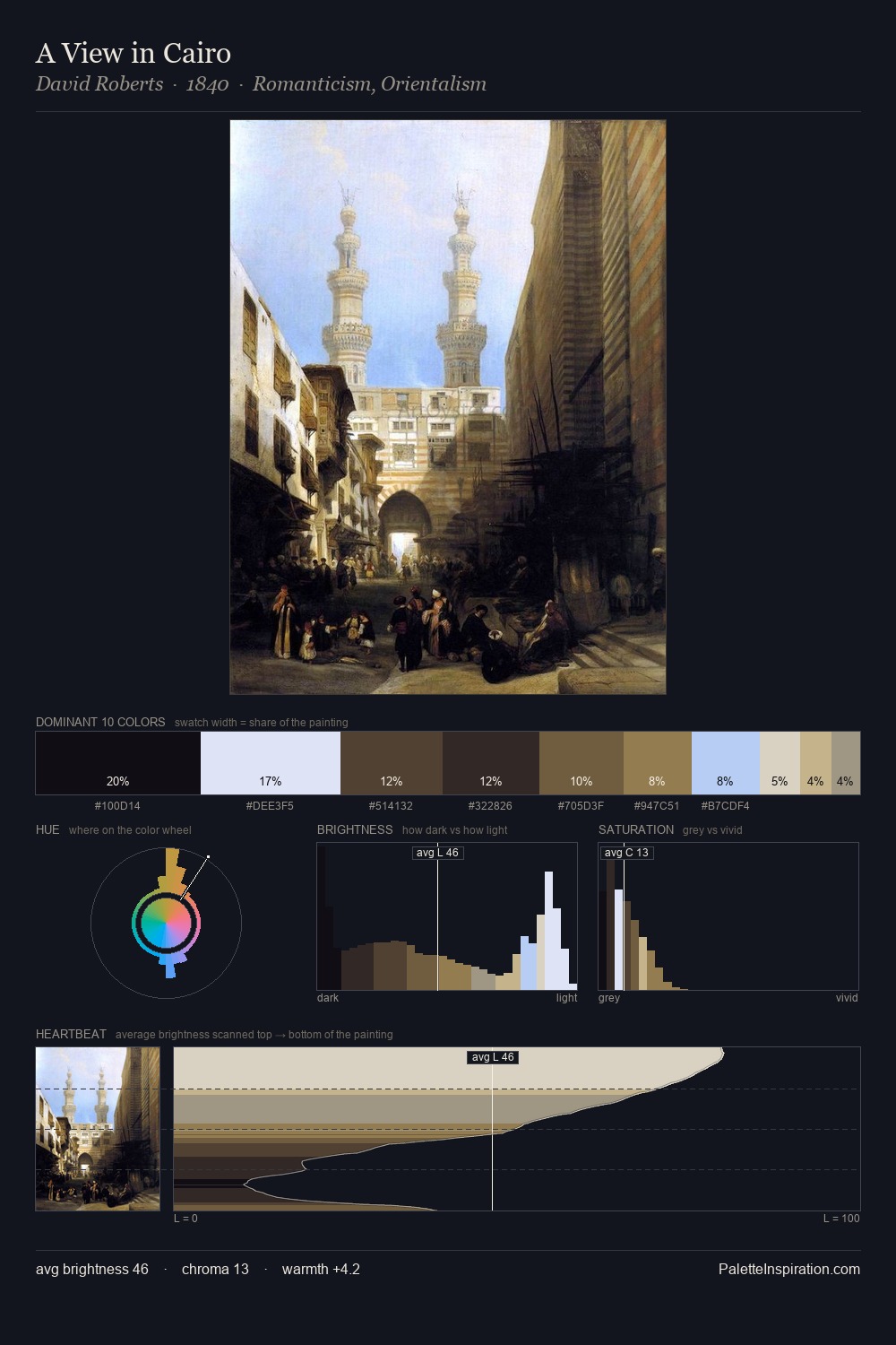
Michele Cammarano Palette 1

Palette Analysis
Michele Cammarano is high in key: pale, luminous, and filled with optical air. Michele Cammarano builds on cool foundations: the palette favours the blue-cyan-green arc. Saturation is deliberately withheld - the beauty here lies in the near-monochromatic gradations rather than colour difference. The saturated accent, #665A3B, registers at 8.2% - sparse enough to feel like a deliberate surprise. 69 units of value range underpin the palette's structural clarity: the eye always knows where light falls. The mid-to-high key, cool bias, and moderate chroma point to outdoor observation - sky and diffused daylight as the dominant light source. Palette 1 sits within the larger chromatic argument that Michele Cammarano's complete body of work advances.
Example use cases
- editorial design
- skincare branding
- architecture portfolios
- wellness apps
- print magazines
I Love This!
Copy, export, or download for your project