Willard Metcalf Palette 2
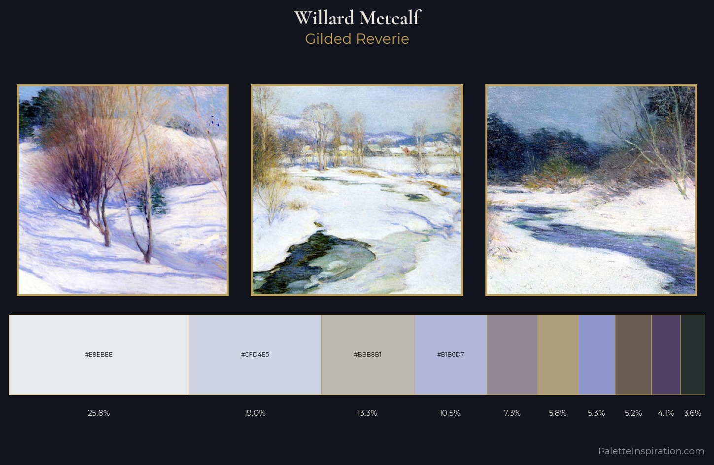
Palette Analysis
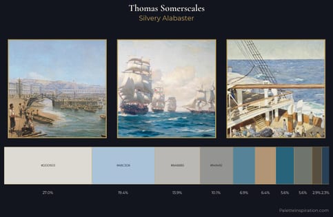
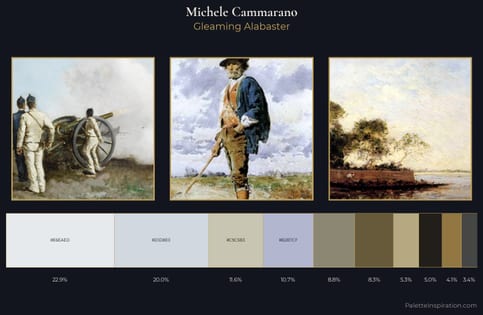
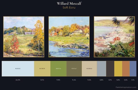
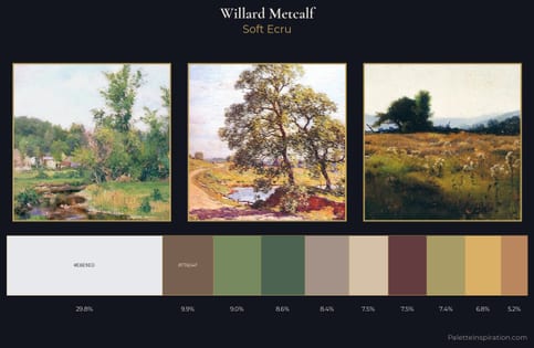
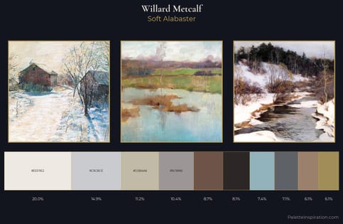
Willard Metcalf is strongly light-biased - shadow is suggested rather than declared. Blues and teal-greys govern the palette, lending it an aquatic or atmospheric quality. The absence of saturated colour is itself an expressive choice: this is a palette of restraint and atmosphere. Willard Metcalf gives 25.8% of the composition to a single #E8EBEE - a decisive chromatic anchor. The saturated accent, #AD9B7B, registers at 5.8% - sparse enough to feel like a deliberate surprise. A value spread of 64 units gives the palette both depth and air - shadows are genuinely dark, lights genuinely light. The mid-to-high key, cool bias, and moderate chroma point to outdoor observation - sky and diffused daylight as the dominant light source. Willard Metcalf's palette 2 carries its own internal logic while remaining in conversation with the artist's broader colour intelligence.
Example use cases
- print magazines
- beauty brands
- real estate
- high-end packaging
- editorial design
I Love This!
Copy, export, or download for your project