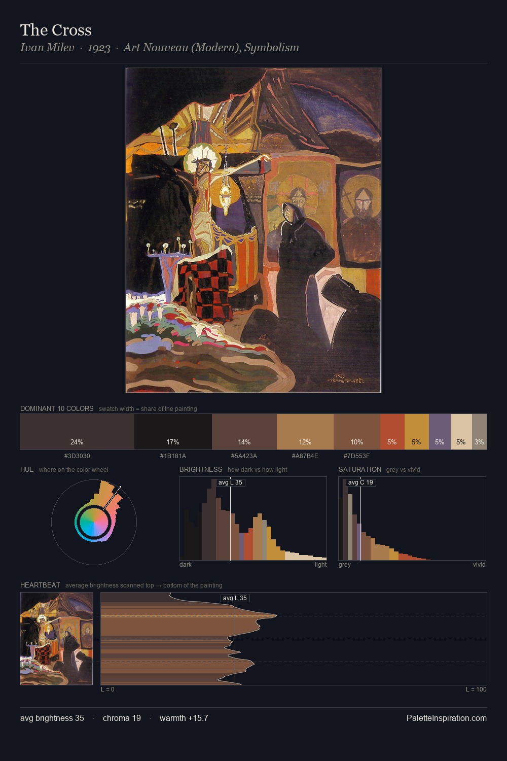
Paul Nash Palette 9
Shadowed Gamboge
Shadowed Low-key - values weighted toward shadow, the palette of dim interiors and overcast skies.
Gamboge Deep golden yellow - a traditional warm pigment, rich amber-gold.

Palette Analysis
Paul Nash distributes its values across the middle register, creating harmony without high contrast. Heat pervades this palette; warm chromatic identities outweigh cool ones at almost every weight. All colours lean toward grey, building depth through value rather than colour punch. Only 4.3% is devoted to #BD933D, yet that small allocation delivers the palette's entire chromatic tension. At 63 units of value range, the palette has the tonal breadth to sustain complex spatial readings. Palette 9 sits within the larger chromatic argument that Paul Nash's complete body of work advances.
Example use cases
- theater design
- jewelry brands
- tobacco-adjacent retail
- event branding
- film & entertainment
I Love This!
Use This Palette
Copy, export, or download for your project
Copy, export, or download for your project
Copy:
Download:
Share: