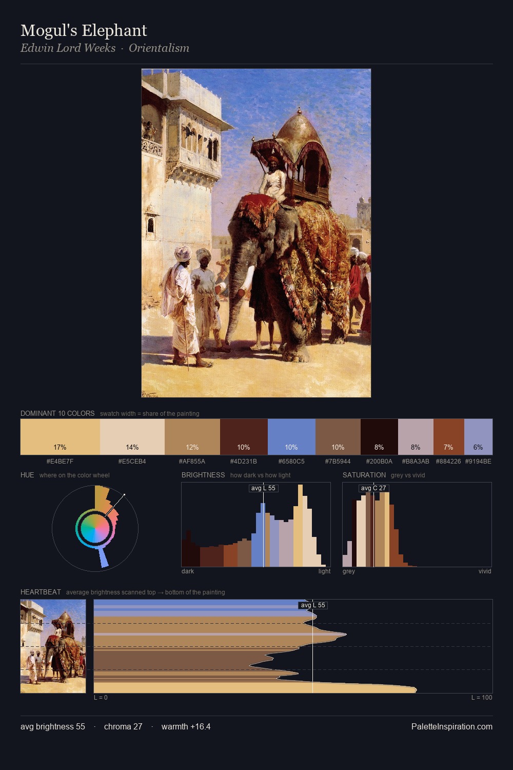
Paul Nash Palette 1
Luminous Champagne
Luminous Self-illuminated feeling - high-key values with an inner glow quality.
Champagne Pale gold - the color of sparkling wine, high-key and lightly warm.

Palette Analysis
Paul Nash is strongly light-biased - shadow is suggested rather than declared. The dominant temperature is warm, with earth tones and fire-hues setting the emotional key. Chroma is held at a comfortable level - distinct colours, but no single hue is allowed to overwhelm. A single dominant - #F0BA76 at 33.4% - sets the character of the whole composition. The most saturated colour, #88331C, is reserved to 2.0% of the surface, where it acts as a focal punctuation. 59 units of value range underpin the palette's structural clarity: the eye always knows where light falls. This is palette 1 of Paul Nash's sequence - a single chapter in a chromatic story told across many works.
Example use cases
- publishing
- corporate identity
- consumer apps
- hospitality
- design agencies
I Love This!
Use This Palette
Copy, export, or download for your project
Copy, export, or download for your project
Copy:
Download:
Share: