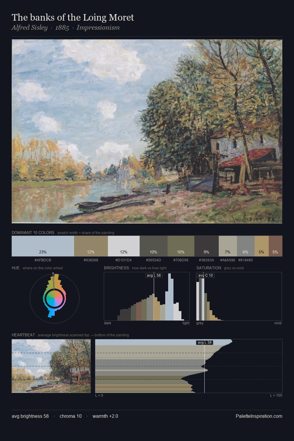
Pierre-Jacques Pelletier Palette 5

Palette Analysis
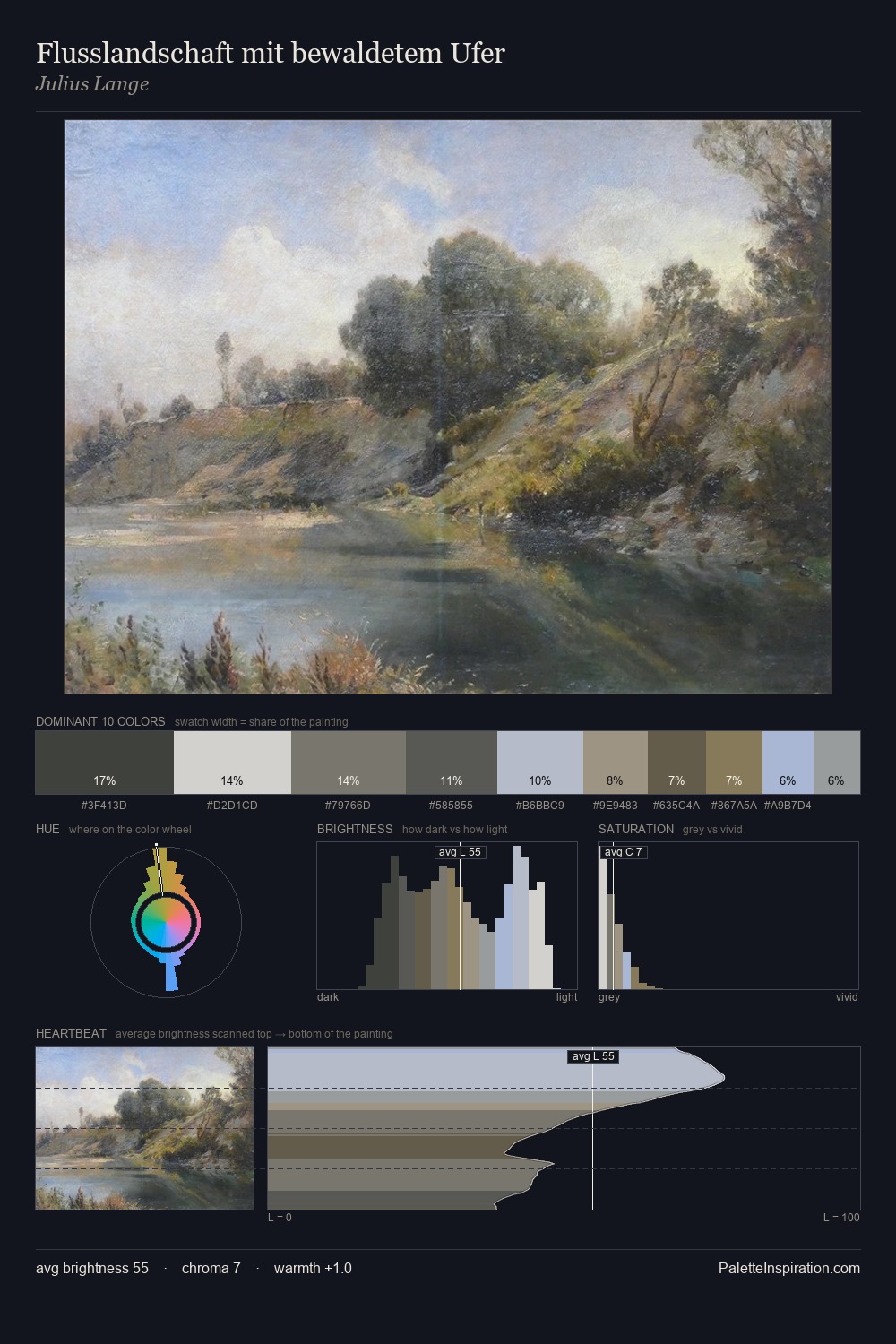
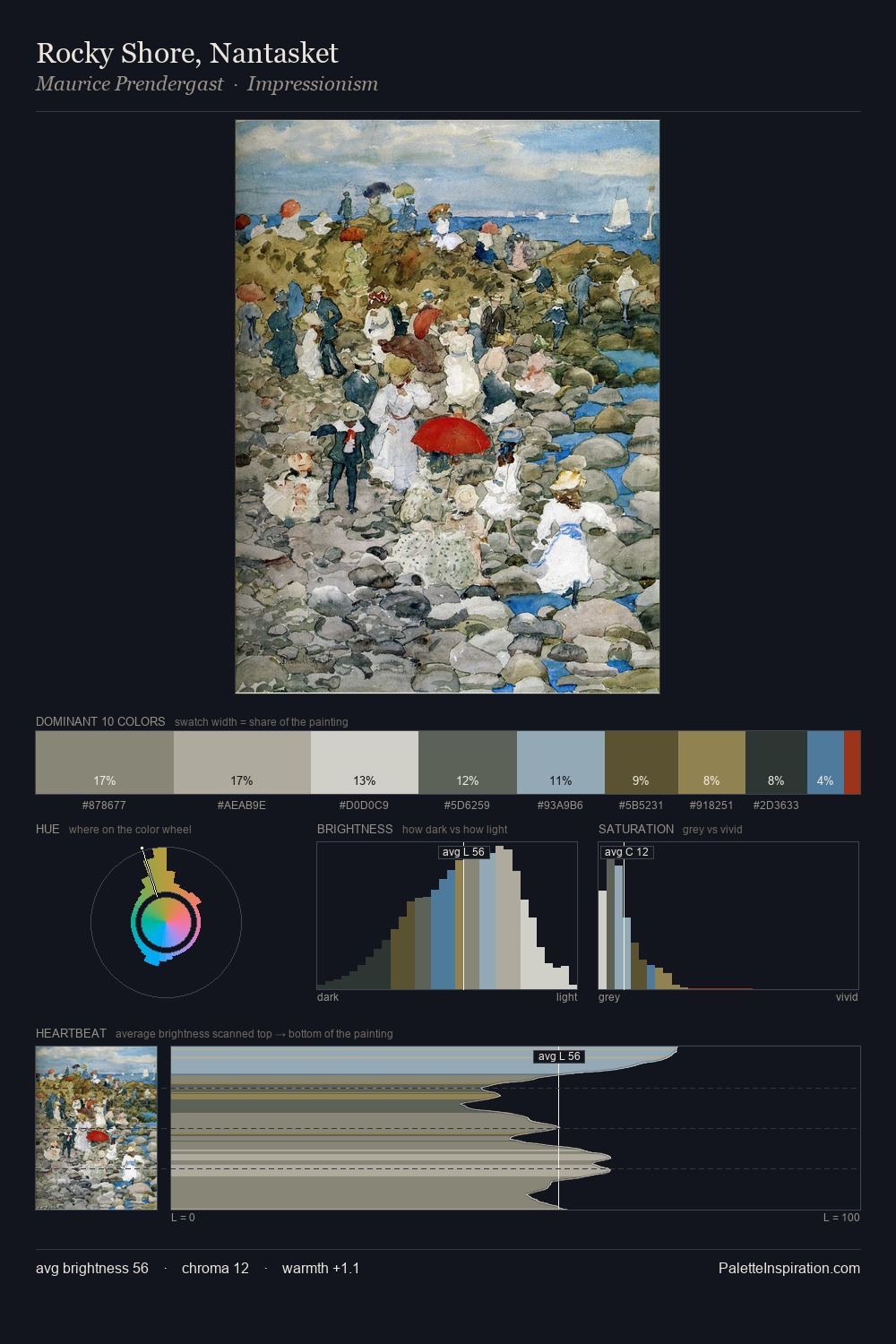
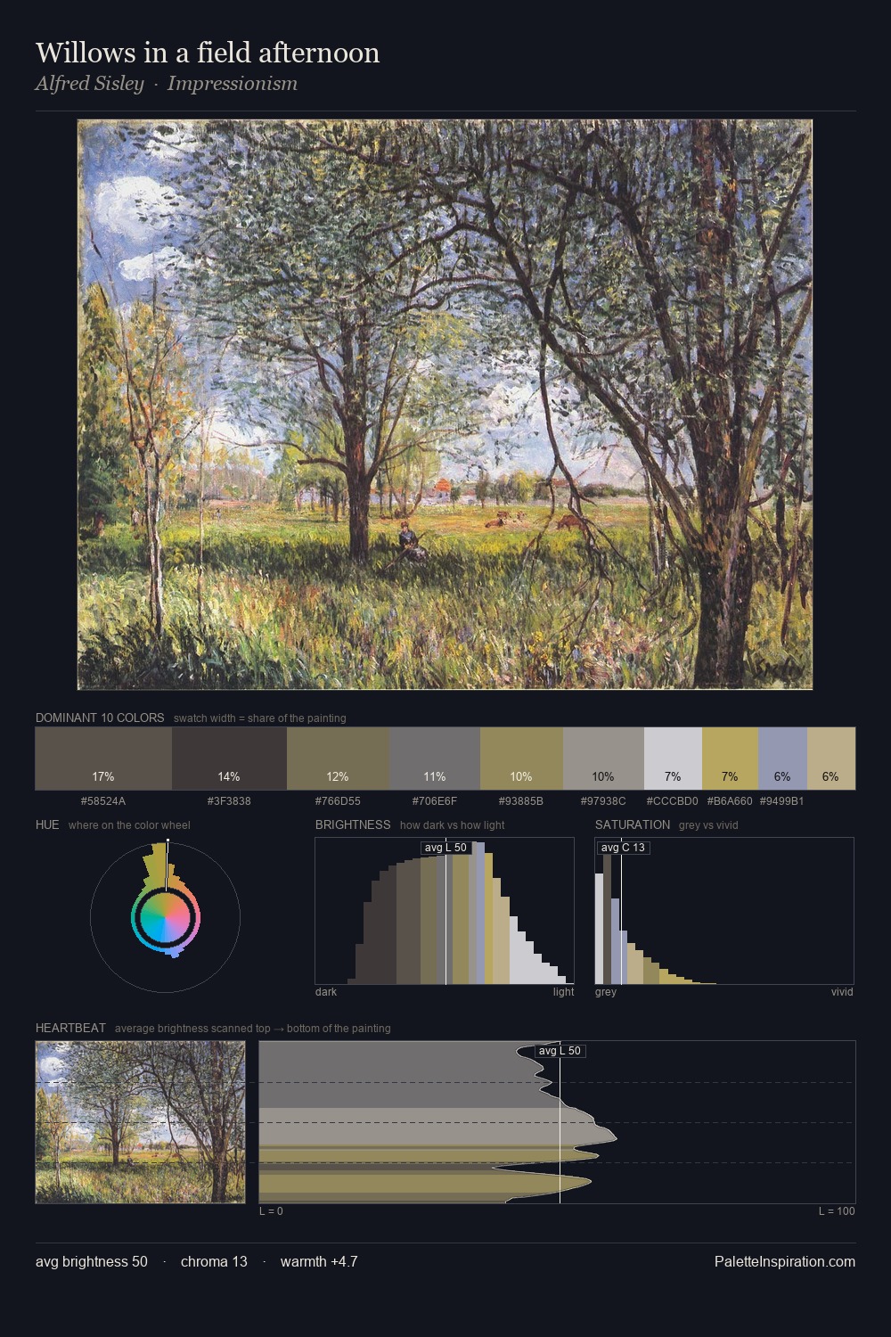
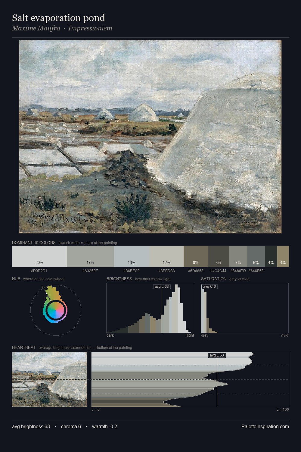
Light floods Pierre-Jacques Pelletier; the palette keeps values pale and airy across its range. Cool tones set the register here - the blues and greens easily outweigh any warm accents. Chroma hovers near zero; colour declares itself through subtle shifts in hue rather than outright saturation. #8D7E55 functions as the palette's exclamation mark: highest chroma, lowest percentage (1.9%). A value spread of 55 units gives the palette both depth and air - shadows are genuinely dark, lights genuinely light. The palette has the character of outdoor light: cool, mid-bright, with colour rendered faithfully rather than expressively. In the context of Pierre-Jacques Pelletier's full range of palettes, group 5 represents one movement in an ongoing chromatic dialogue.
Example use cases
- florist branding
- event design
- real estate
- jewelry retail
- hospitality branding
I Love This!
Copy, export, or download for your project