Pierre-Jacques Pelletier Palette 3
Palette Analysis
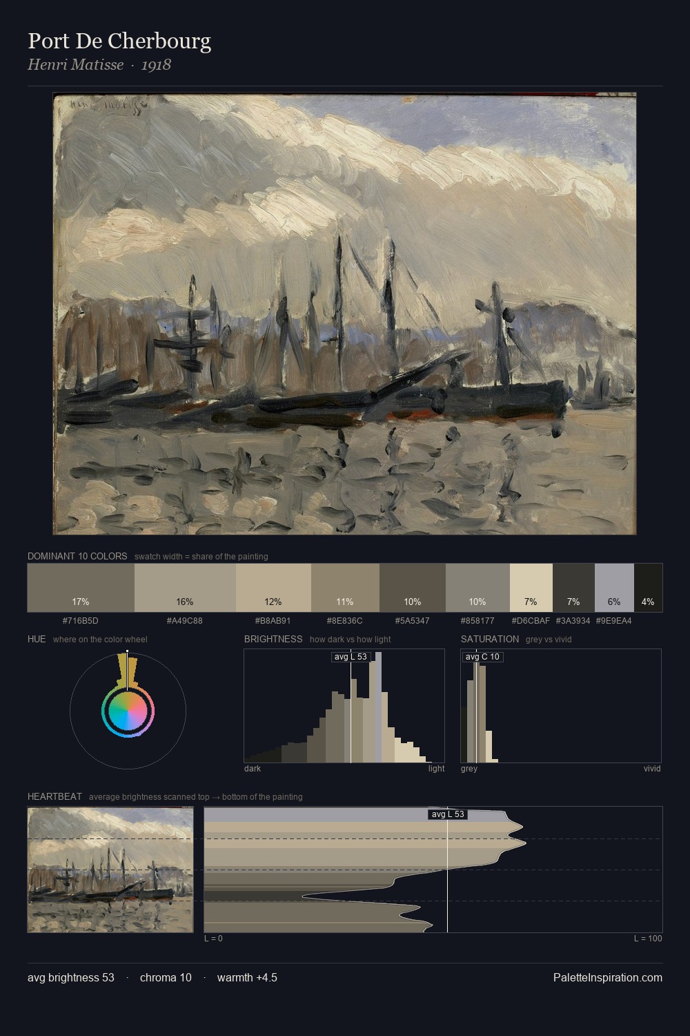
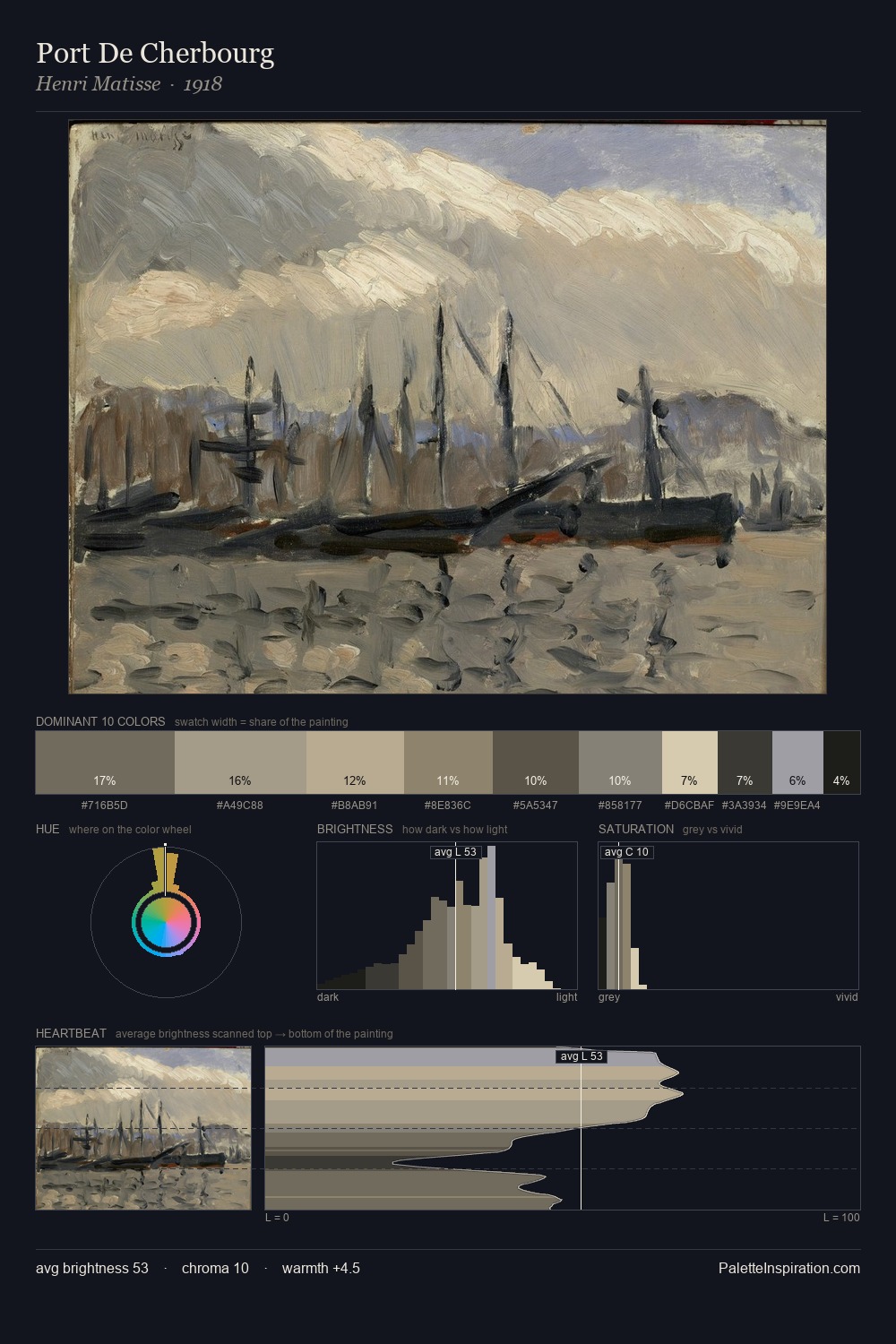
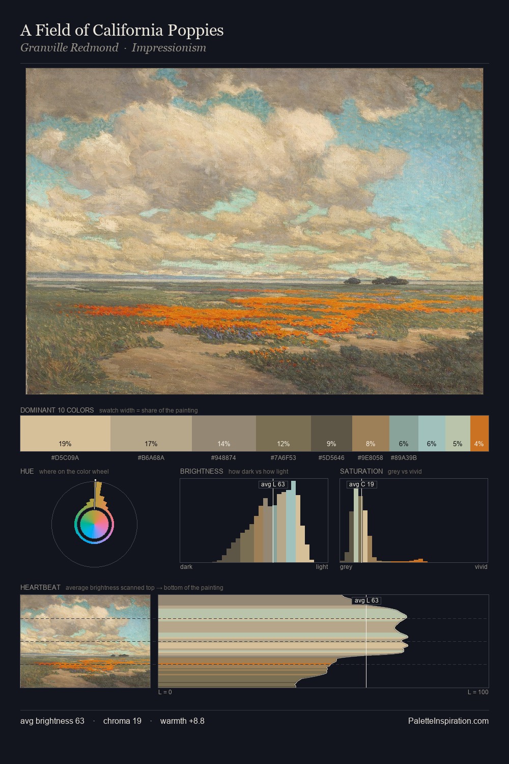
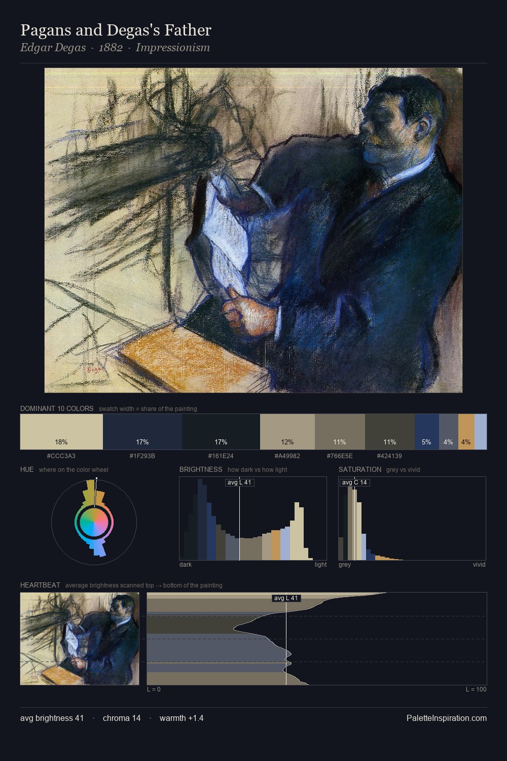
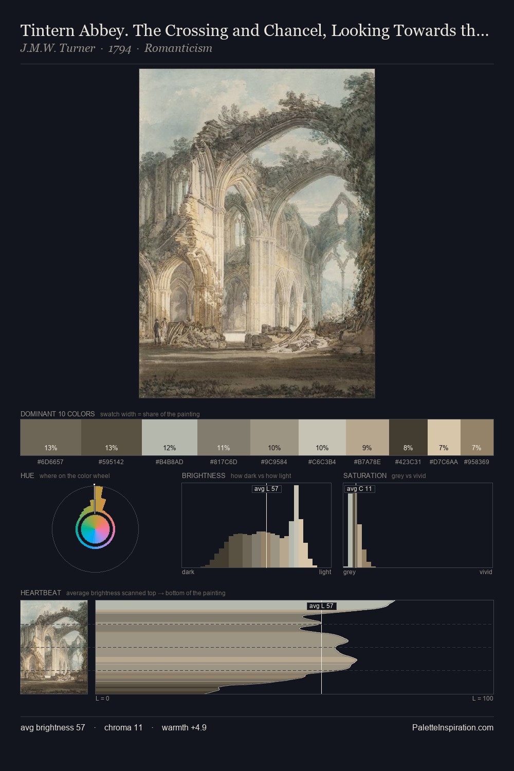
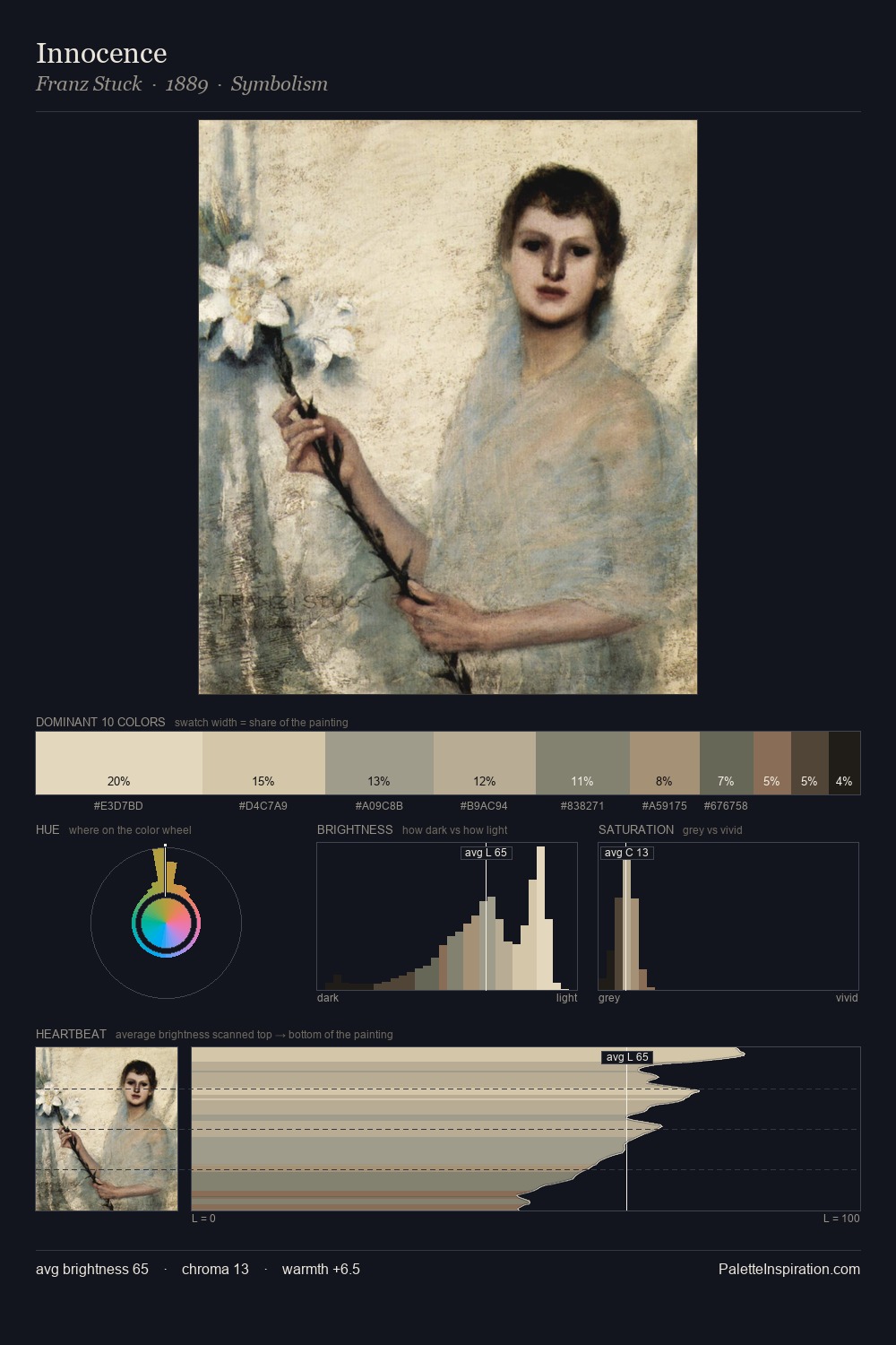
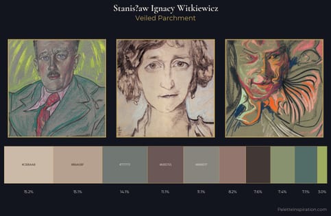
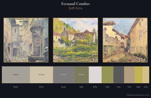
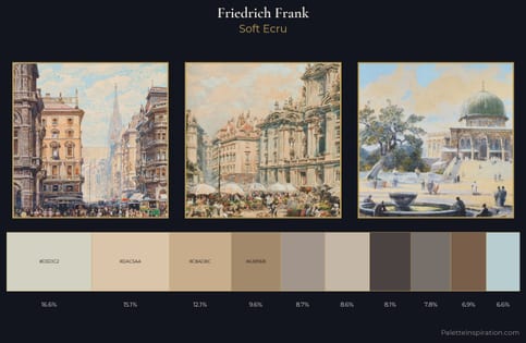
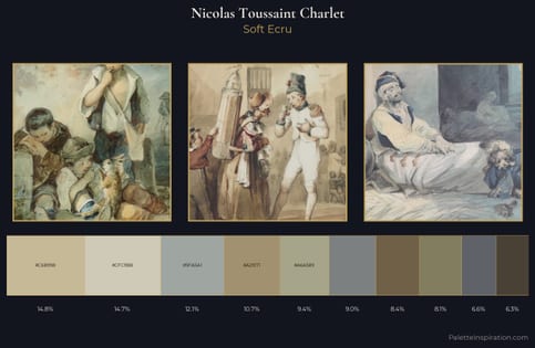
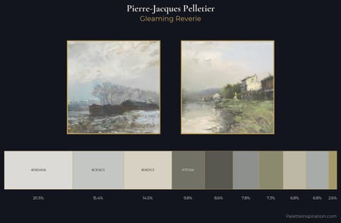
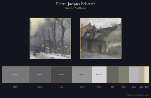
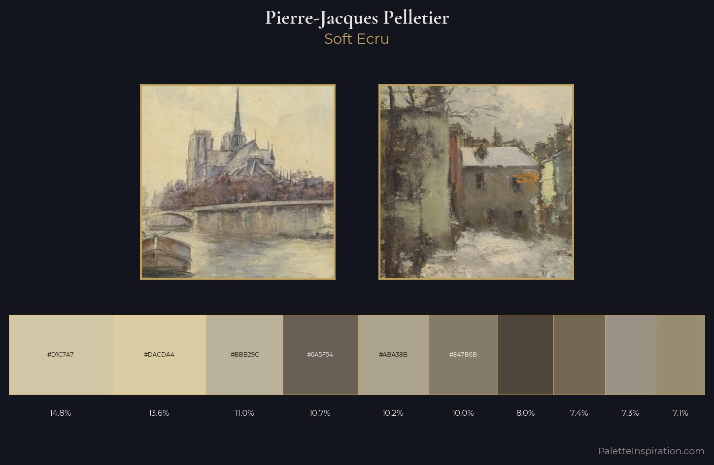
The high-key values of Pierre-Jacques Pelletier give it an effulgent, almost bleached quality. Pierre-Jacques Pelletier tilts toward cool - blues and silver-greys carry the structural weight. Chroma is kept low across all colours, producing the soft, enveloping quality that characterises tonal painting. #746751 delivers the chromatic peak at only 7.4% - a small shot of colour with outsized visual impact. 45 units of value spread create a palette that is varied but unified - contrast in the service of harmony. The palette has the character of outdoor light: cool, mid-bright, with colour rendered faithfully rather than expressively. Pierre-Jacques Pelletier's palette 3 carries its own internal logic while remaining in conversation with the artist's broader colour intelligence.
Example use cases
- exhibition design
- foundation branding
- estate management
- art education
- museums & galleries
I Love This!
Copy, export, or download for your project