Pierre-Jacques Pelletier Master Palette

Palette Analysis
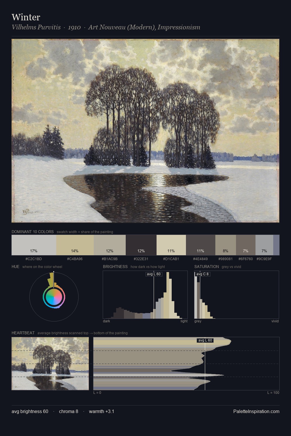
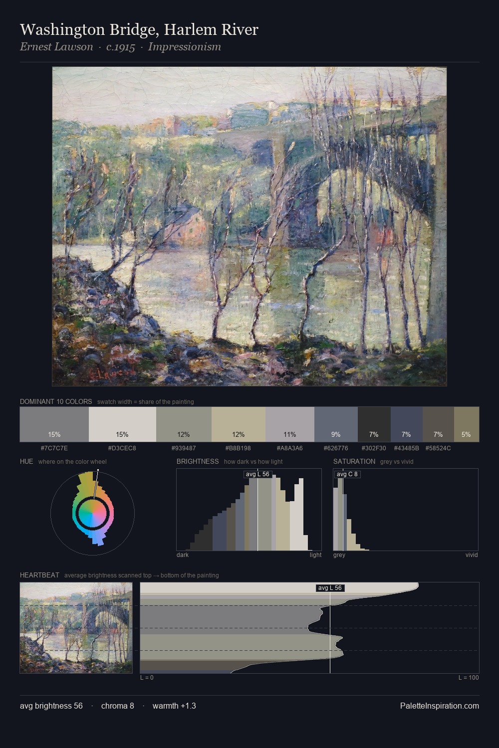
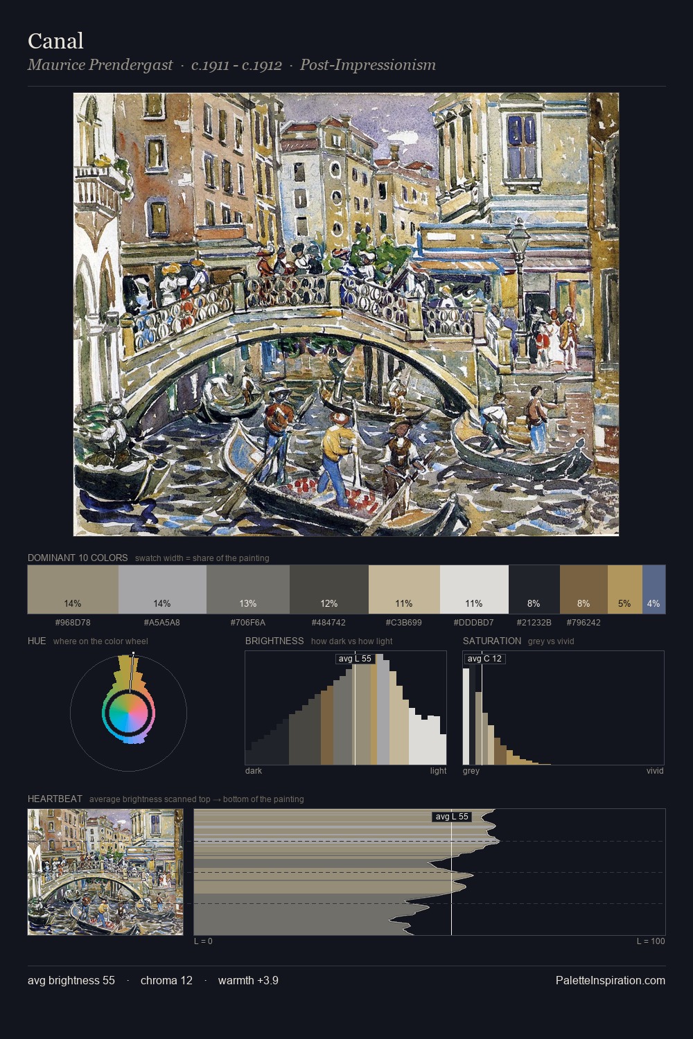
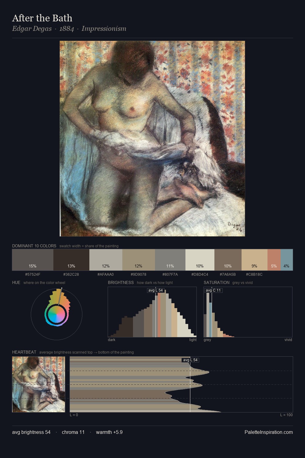
Pierre-Jacques Pelletier occupies the comfortable middle of the value scale, avoiding both extremes to hold the eye in a sustained middle grey. Pierre-Jacques Pelletier tilts toward cool - blues and silver-greys carry the structural weight. Chroma hovers near zero; colour declares itself through subtle shifts in hue rather than outright saturation. The highest-chroma note - #C9C3AA - appears at just 6.7%, deployed as a precision accent against the quieter ground. At 53 units across the value scale, the palette keeps contrast readable without letting it dominate. The mid-to-high key, cool bias, and moderate chroma point to outdoor observation - sky and diffused daylight as the dominant light source. Taken together, these qualities constitute Pierre-Jacques Pelletier's chromatic voice - distinctive enough to be read across an entire body of work.
Example use cases
- exhibition design
- foundation branding
- estate management
- art education
- museums & galleries
I Love This!
Copy, export, or download for your project