Nicolaes van Verendael Master Palette

Palette Analysis
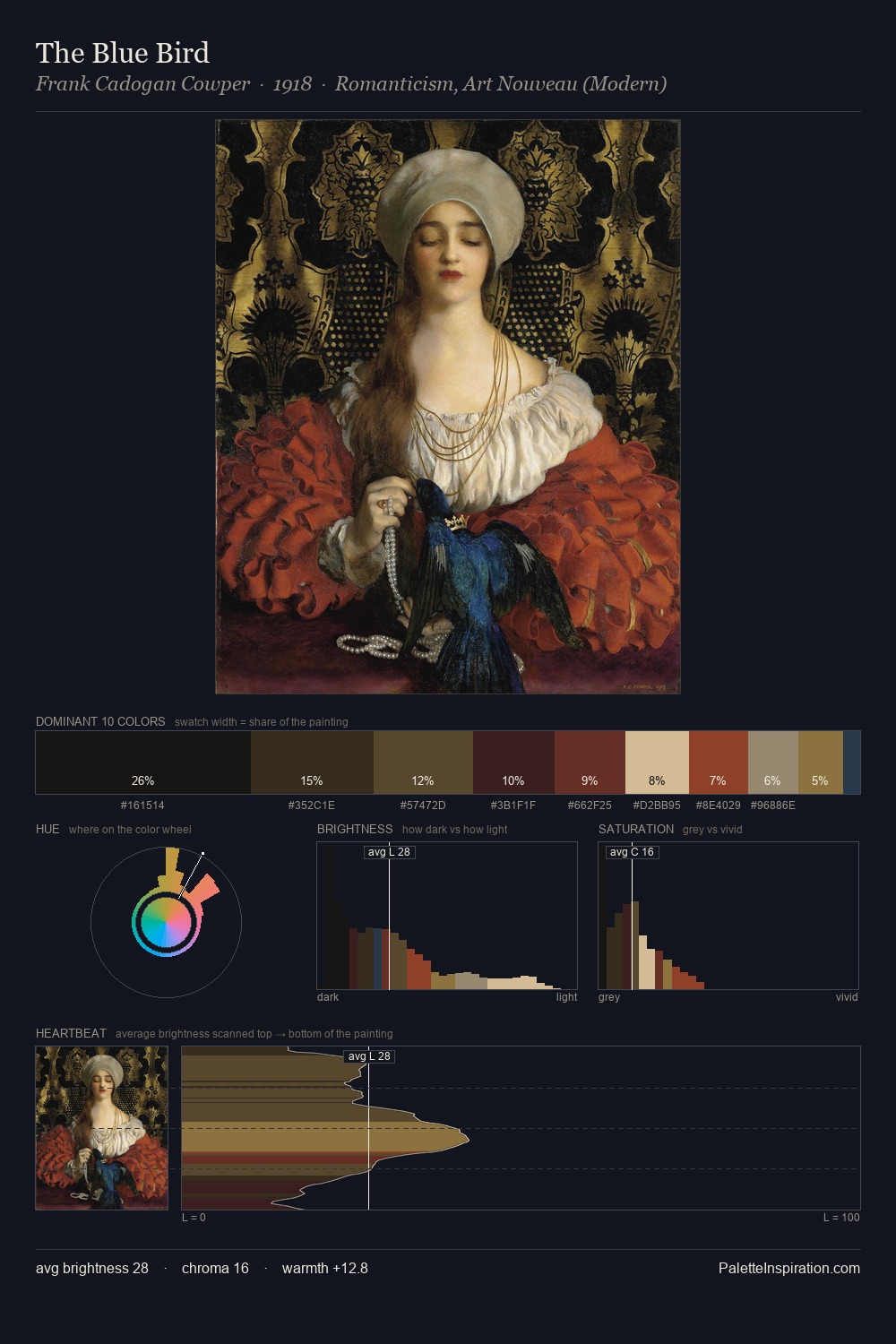
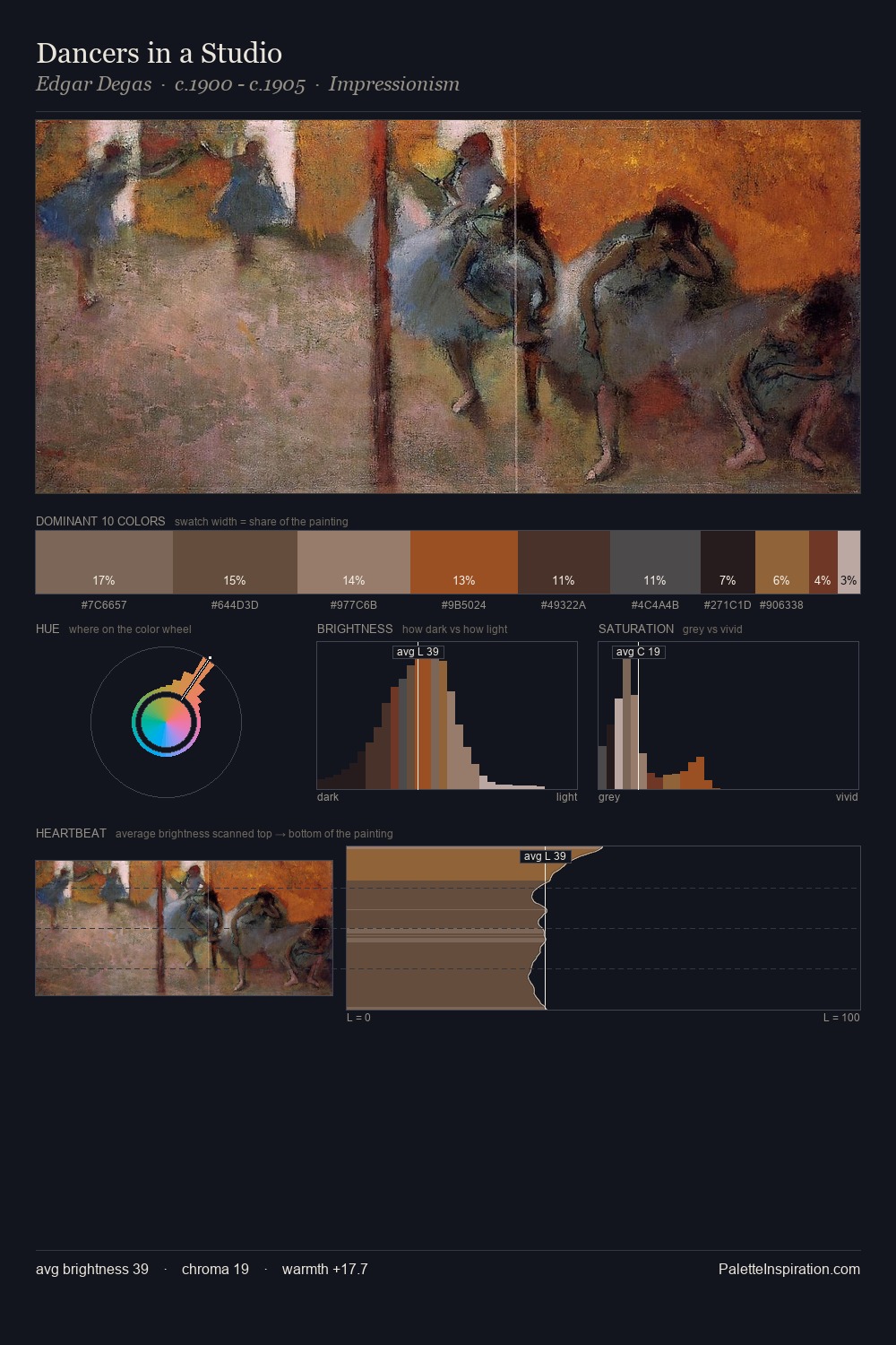
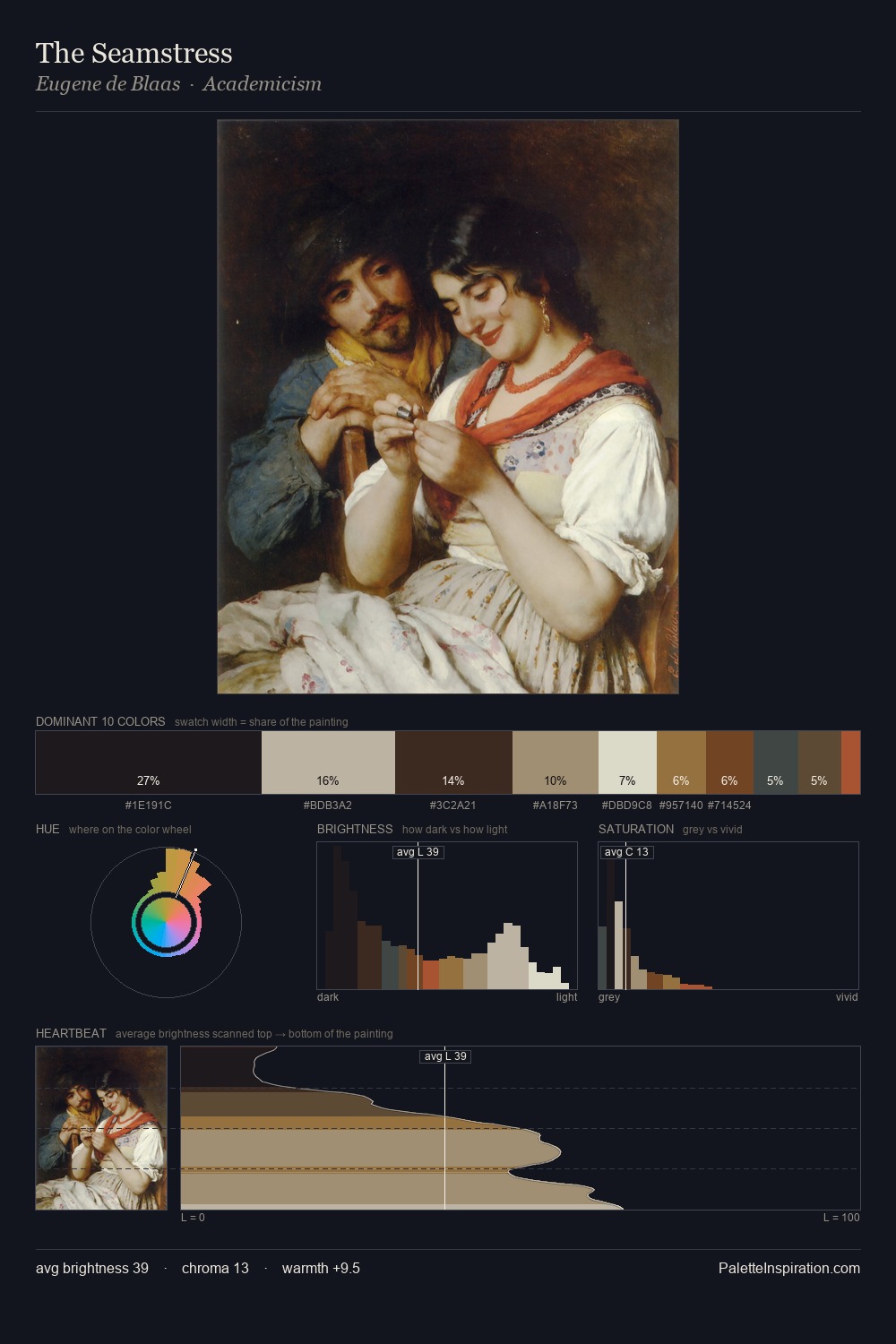
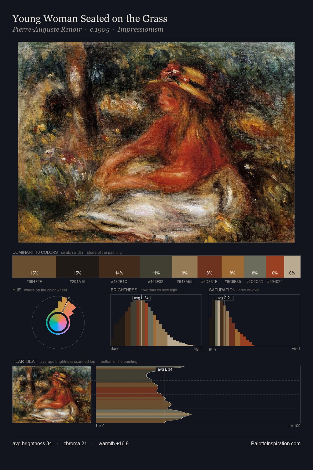
Values in Nicolaes van Verendael rest in the mid-range - neither dramatically lit nor steeped in shadow. Blues and teal-greys govern the palette, lending it an aquatic or atmospheric quality. Saturation is deliberately withheld - the beauty here lies in the near-monochromatic gradations rather than colour difference. #906B37 functions as the palette's exclamation mark: highest chroma, lowest percentage (6.0%). The full value range is 56 units: broad enough to build convincing three-dimensional form. The mid-to-high key, cool bias, and moderate chroma point to outdoor observation - sky and diffused daylight as the dominant light source. These proportions encode Nicolaes van Verendael's instinctive sense of how much of each quality the eye can hold.
Example use cases
- theater design
- jewelry brands
- tobacco-adjacent retail
- event branding
- film & entertainment
I Love This!
Copy, export, or download for your project