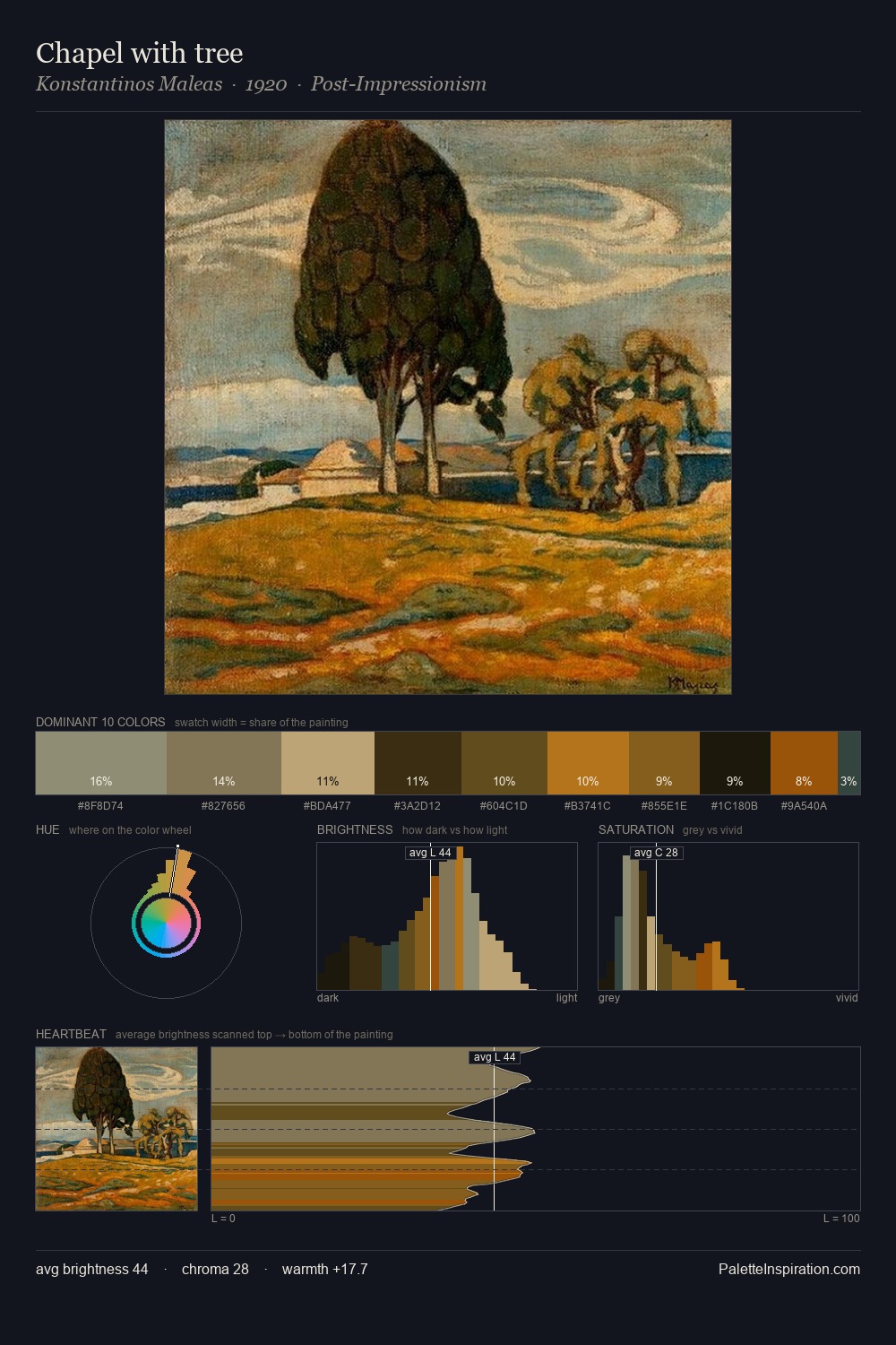
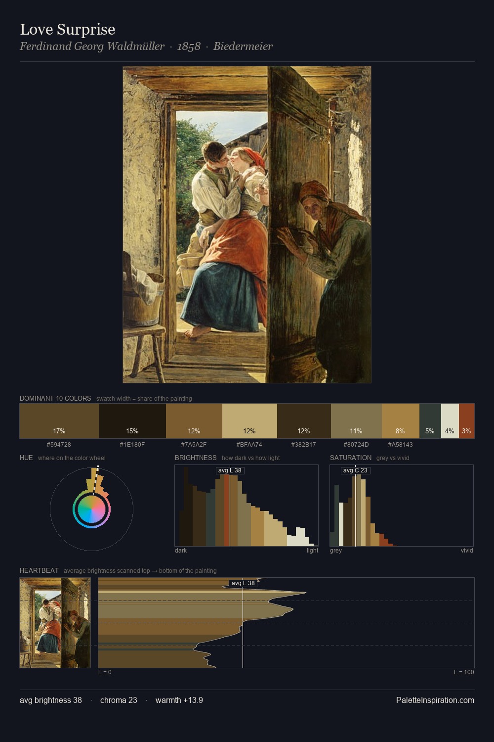
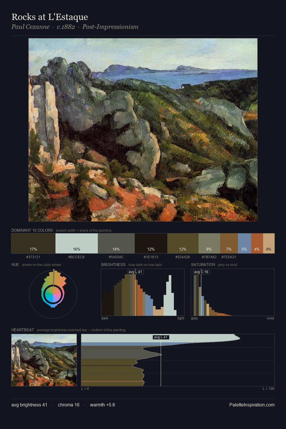
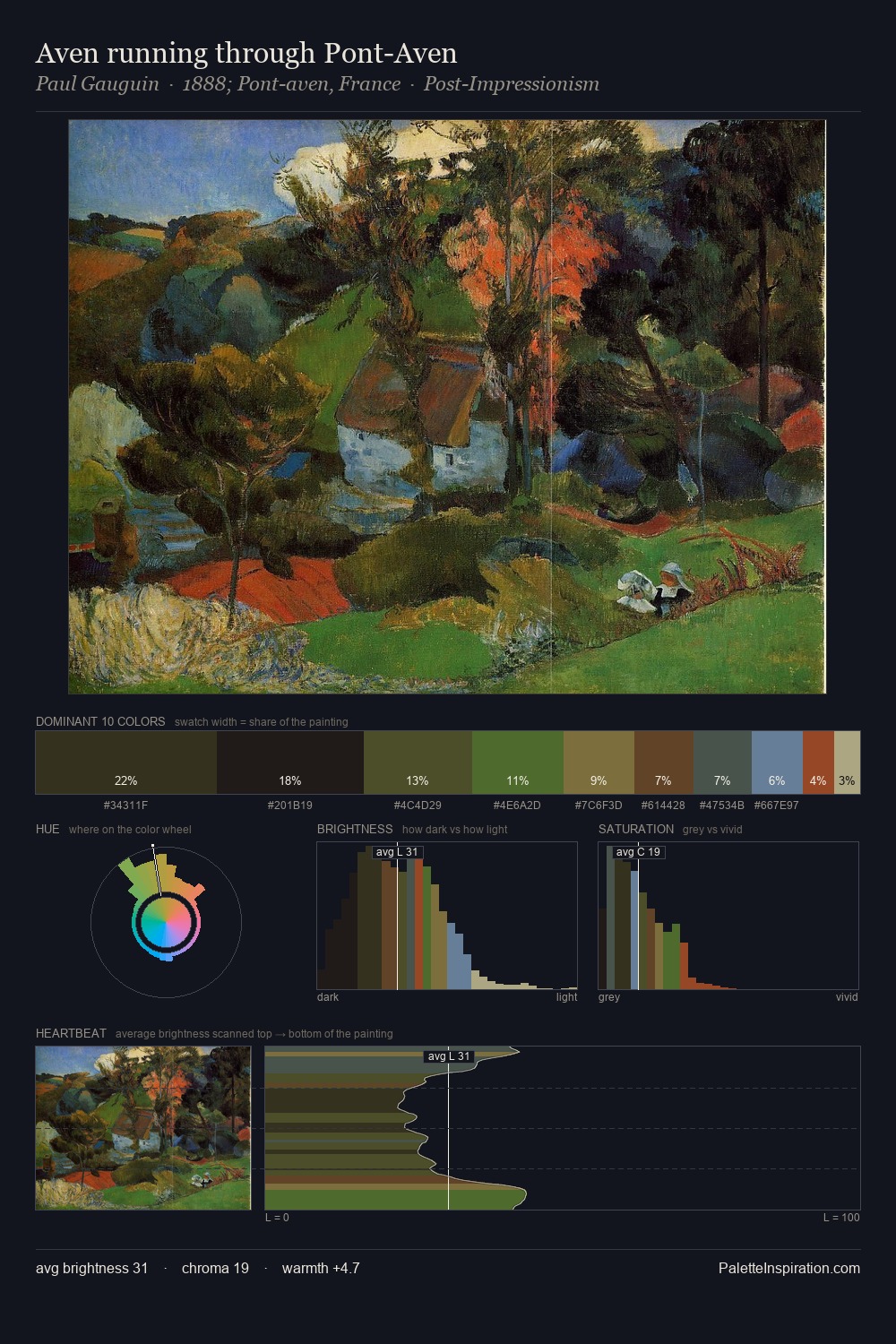
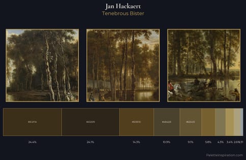
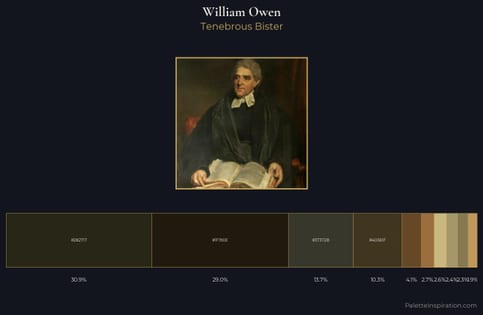
Nicolaes van Verendael Palette 4
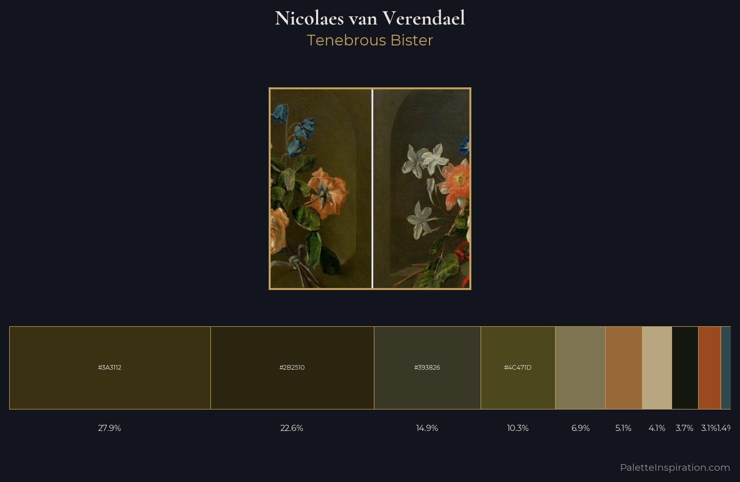
Palette Analysis
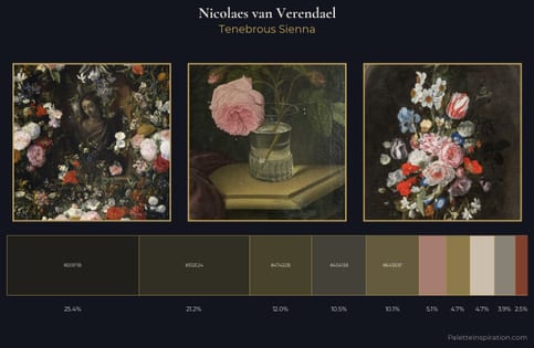
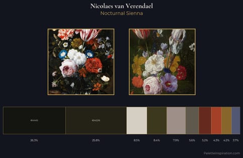
Mid-key values give Nicolaes van Verendael its characteristic quietness - nothing blazes, nothing disappears. Nicolaes van Verendael builds on cool foundations: the palette favours the blue-cyan-green arc. Chroma hovers near zero; colour declares itself through subtle shifts in hue rather than outright saturation. Nicolaes van Verendael gives 27.9% of the composition to a single #3A3112 - a decisive chromatic anchor. The highest-chroma note - #9B491E - appears at just 3.1%, deployed as a precision accent against the quieter ground. 53 units of value spread create a palette that is varied but unified - contrast in the service of harmony. The mid-to-high key, cool bias, and moderate chroma point to outdoor observation - sky and diffused daylight as the dominant light source. In the context of Nicolaes van Verendael's full range of palettes, group 4 represents one movement in an ongoing chromatic dialogue.
Example use cases
- theater design
- jewelry brands
- tobacco-adjacent retail
- event branding
- film & entertainment
I Love This!
Copy, export, or download for your project