Nicolaes van Verendael Palette 5

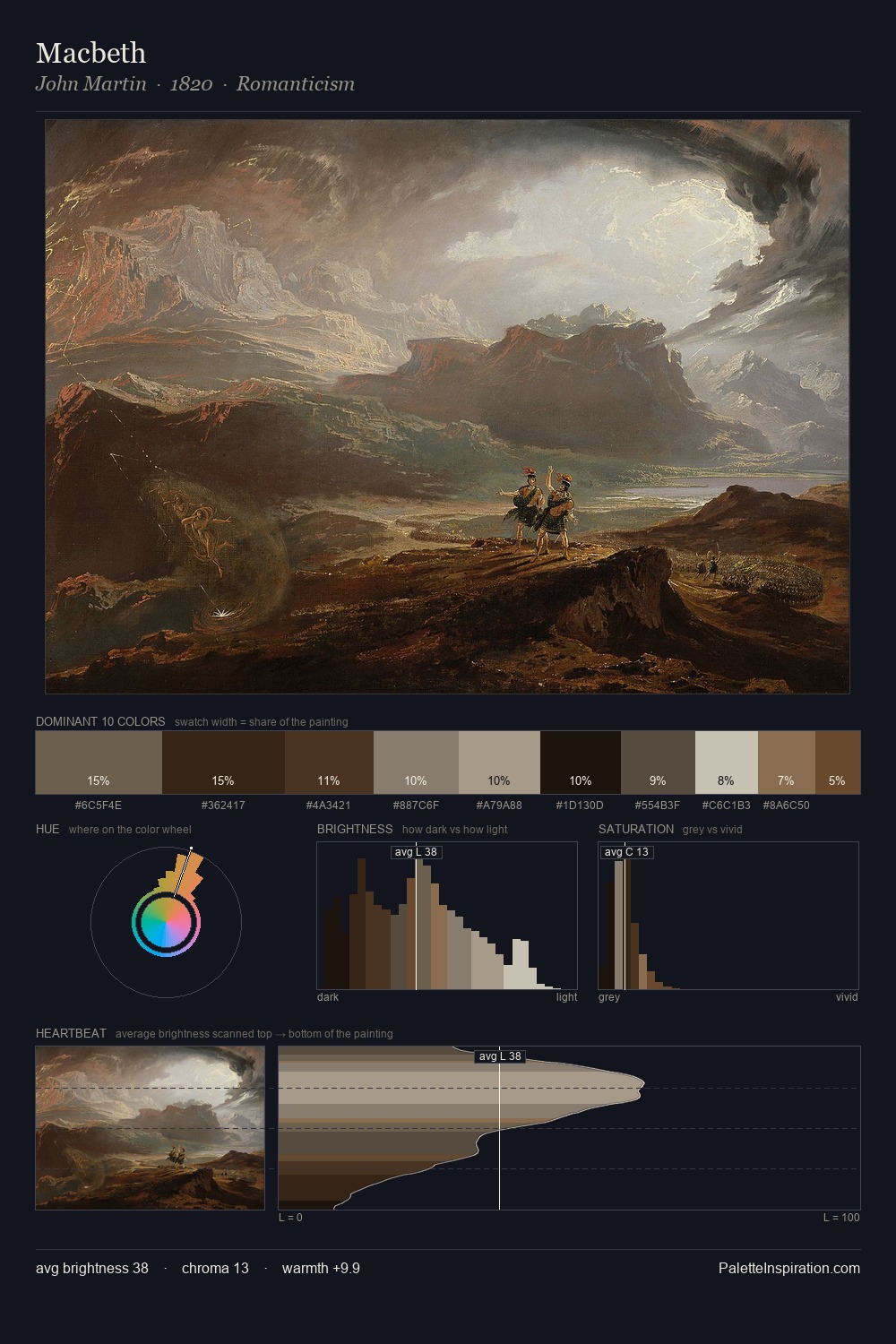
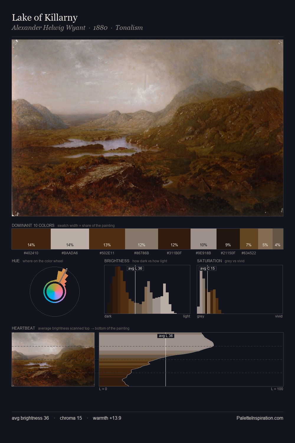
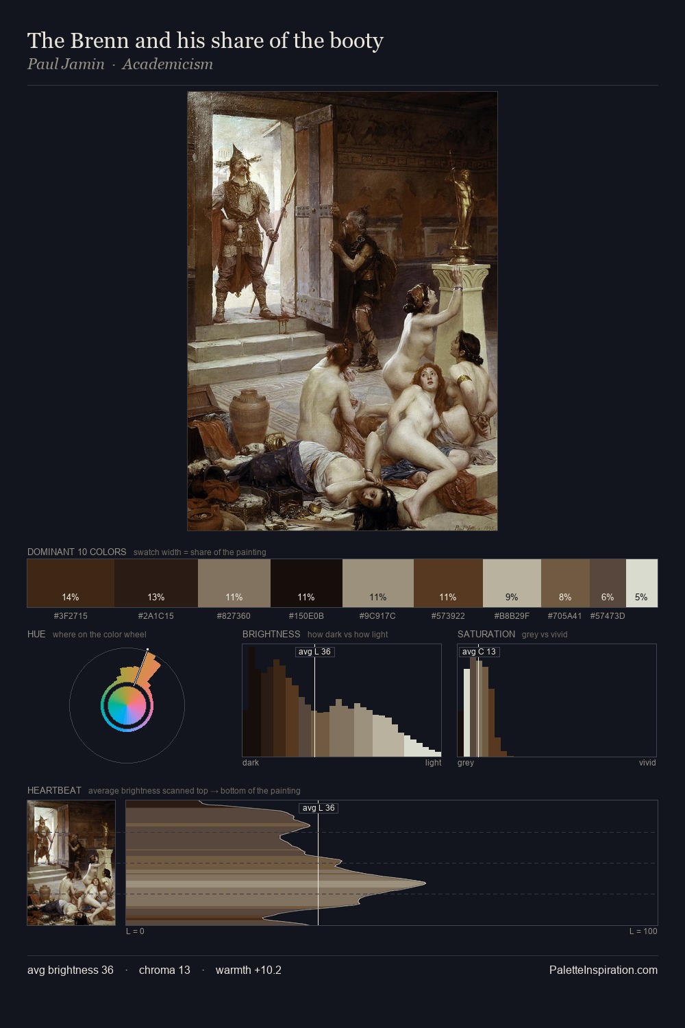
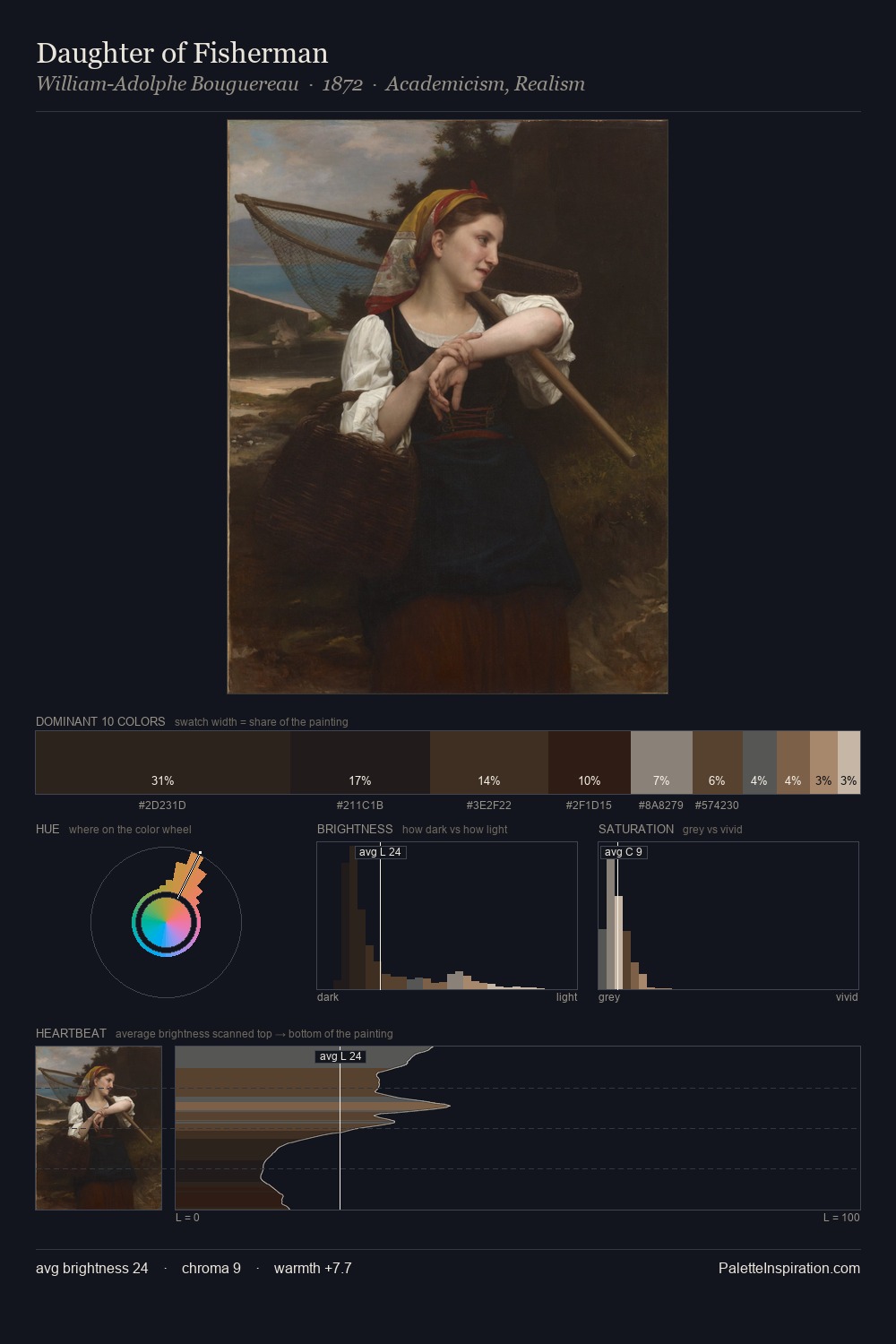
Palette Analysis
Nicolaes van Verendael is built on dark foundations, with values clustered toward shadow. Nicolaes van Verendael orchestrates warmth above all else - reds, ambers, and siennas take the lead. All colours lean toward grey, building depth through value rather than colour punch. The dominant colour, #1F1B16, takes 33.1% of the total area, establishing the overall mood before any other hue is introduced. The most saturated colour, #352A1E, is reserved to 9.1% of the surface, where it acts as a focal punctuation. At 61 units of value range, the palette has the tonal breadth to sustain complex spatial readings. The combination of low values, muted chroma, and compressed range is the signature of the Tonalist mode - painting as atmosphere. In the context of Nicolaes van Verendael's full range of palettes, group 5 represents one movement in an ongoing chromatic dialogue.
Example use cases
- theater design
- jewelry brands
- tobacco-adjacent retail
- event branding
- film & entertainment
I Love This!
Copy, export, or download for your project