Nicolaes van Verendael Palette 2
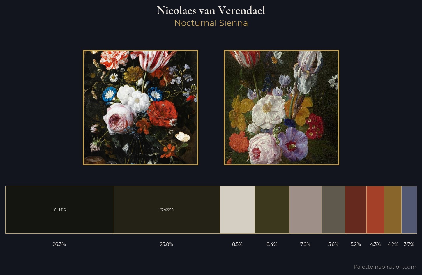
Palette Analysis
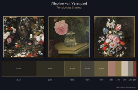
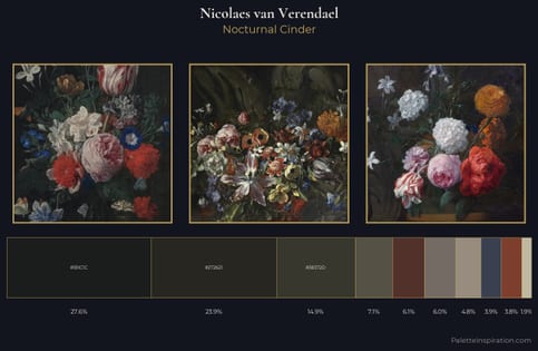
Nicolaes van Verendael sits in the centre of the value range, lending the palette a sense of even, sustained light. Temperature is cool-dominant, with blue and green families claiming the largest areas. All colours lean toward grey, building depth through value rather than colour punch. #141410 claims 26.3% of the surface, functioning as the work's tonal foundation. The saturated accent, #65291E, registers at 5.2% - sparse enough to feel like a deliberate surprise. 66 units of value range underpin the palette's structural clarity: the eye always knows where light falls. The mid-to-high key, cool bias, and moderate chroma point to outdoor observation - sky and diffused daylight as the dominant light source. This is palette 2 of Nicolaes van Verendael's sequence - a single chapter in a chromatic story told across many works.
Example use cases
- theater design
- jewelry brands
- tobacco-adjacent retail
- event branding
- film & entertainment
I Love This!
Copy, export, or download for your project