Kitsch Master Palette
Muted Tawny
Muted Deliberately desaturated - chroma pulled toward gray, the restraint of tonal painting.
Tawny Warm orange-brown - a traditional term for the color of tanned leather or lion fur.

Palette Analysis
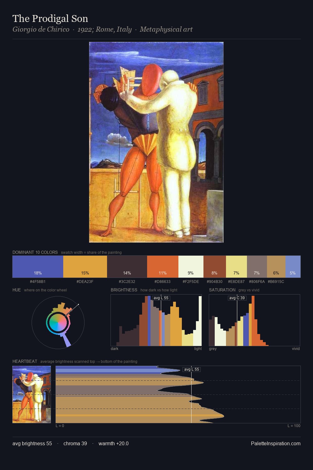
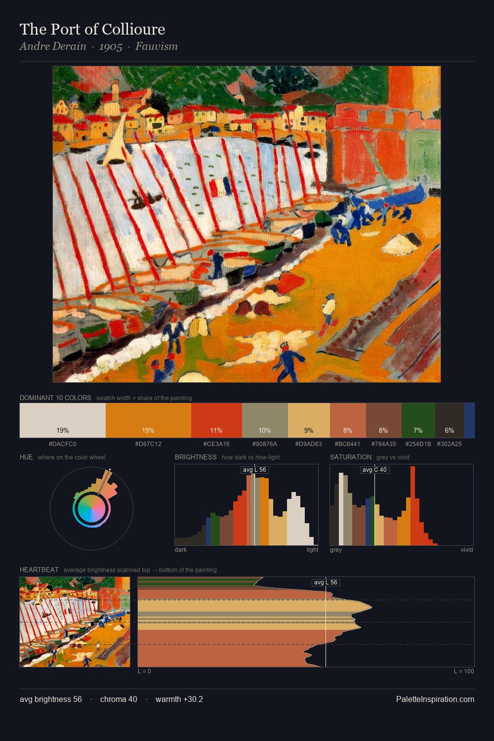
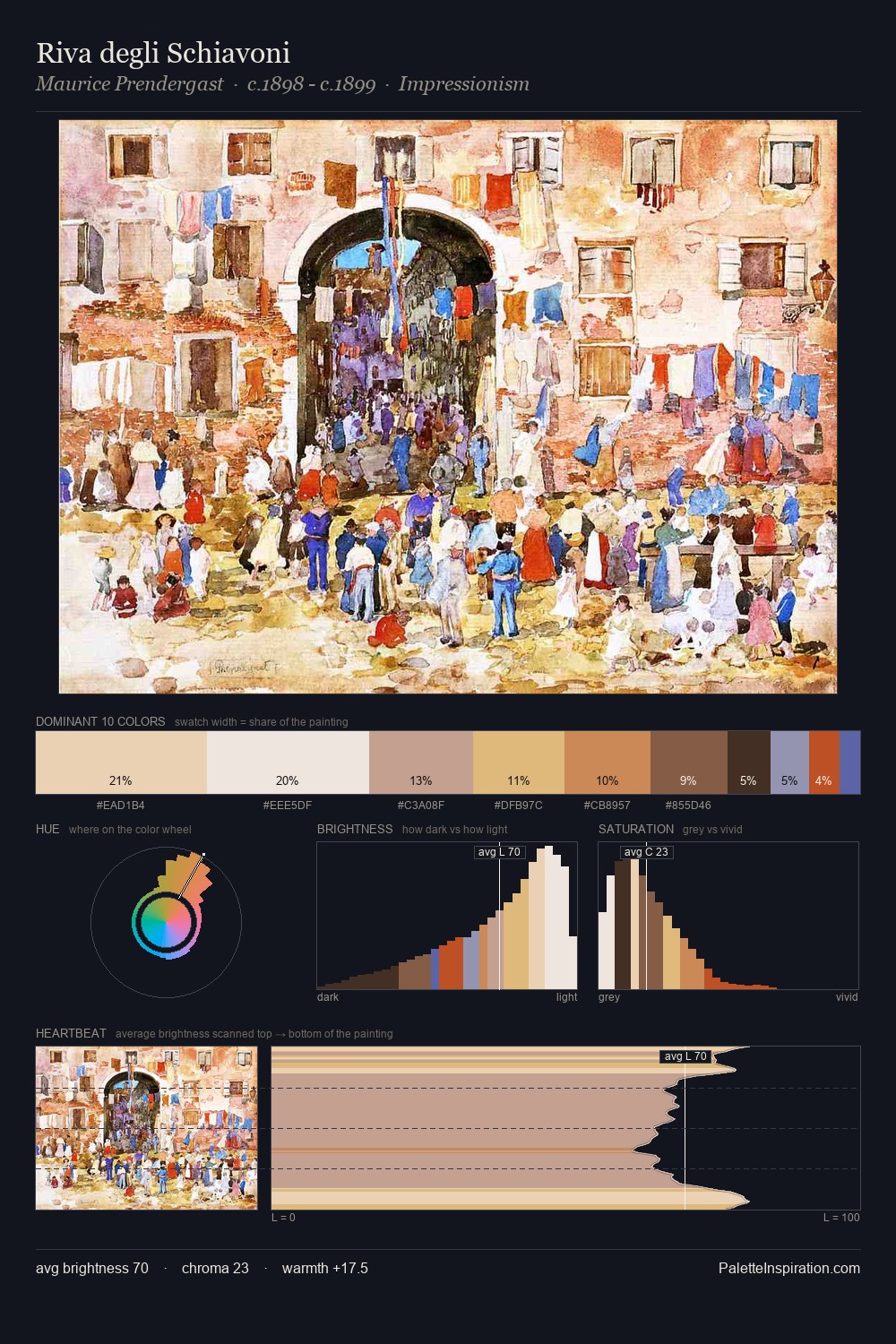
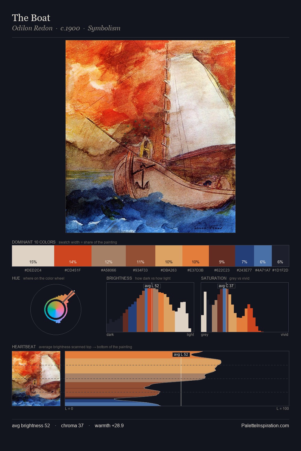
Kitsch painters returned to these tonal relationships repeatedly; this palette is their shared chromatic grammar. The value structure of Kitsch is mid-key: quiet, controlled, and cohesive. Warmth dominates - the palette leans heavily on the yellow-orange-red arc of the colour wheel. Muted throughout, the palette achieves its effects through value and temperature rather than chromatic force. The highest-chroma note - #DD5322 - appears at just 2.2%, deployed as a precision accent against the quieter ground. From deepest dark to palest light, the palette traverses 73 units of the value scale - a span that creates natural depth. This is the light that Kitsch painters chose to live inside.
Example use cases
- ceramics & pottery
- boutique hospitality
- menswear
- heritage food brands
- craft & artisan brands
I Love This!
Use This Palette
Copy, export, or download for your project
Copy, export, or download for your project
Copy:
Download:
Share: