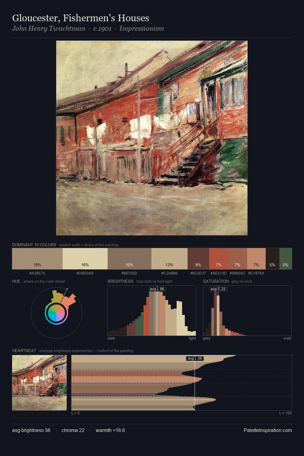
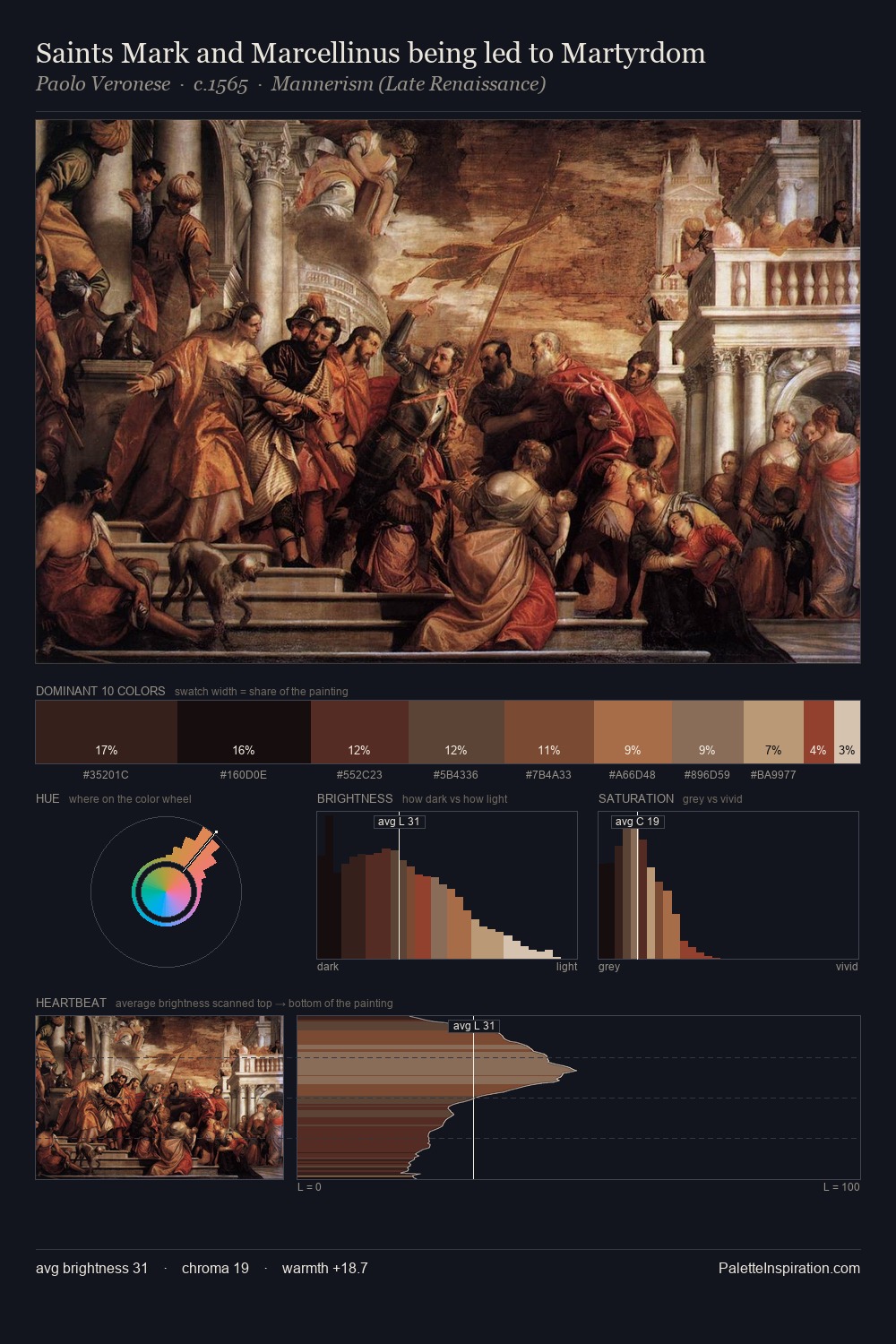
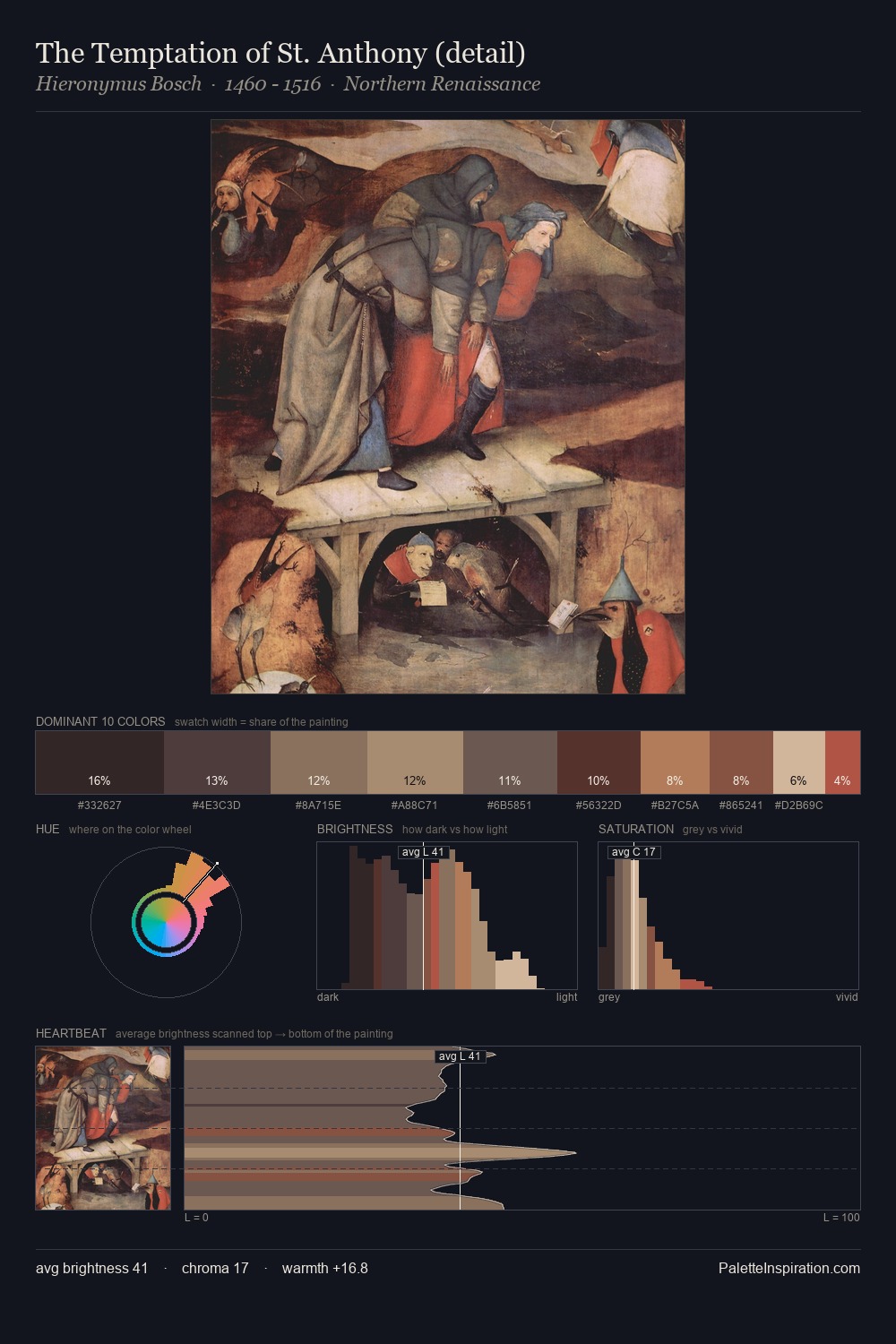
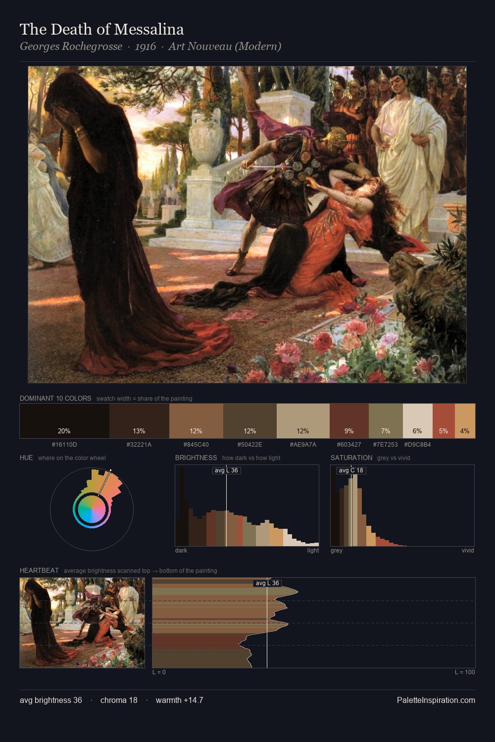
Kitsch Palette 10
Pale Apricot
Pale High-key and low-chroma - delicate, bleached, washed with light.
Apricot Soft warm orange - peach-adjacent, the color of ripe stone fruit.

Palette Analysis
Kitsch works in the upper reaches of the value scale, creating an atmosphere of brightness and expansiveness. Temperature reads distinctly warm: the reds and earth tones carry the compositional weight. Mid-range chroma keeps the palette grounded - colourful but not strident. A single dominant - #DBC1A4 at 36.9% - sets the character of the whole composition. The highest-chroma note - #B96C4E - appears at just 4.2%, deployed as a precision accent against the quieter ground. The value range of 53 units sits in the comfortable middle: enough depth, enough light, neither extreme.
Example use cases
- craft & artisan brands
- specialty coffee
- home goods
- lifestyle retail
- ceramics & pottery
I Love This!
Use This Palette
Copy, export, or download for your project
Copy, export, or download for your project
Copy:
Download:
Share: