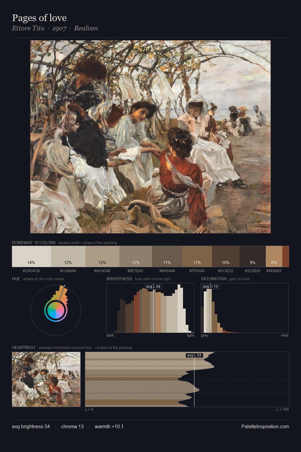
Kitsch Palette 11
Muted Tawny
Muted Deliberately desaturated - chroma pulled toward gray, the restraint of tonal painting.
Tawny Warm orange-brown - a traditional term for the color of tanned leather or lion fur.

Palette Analysis
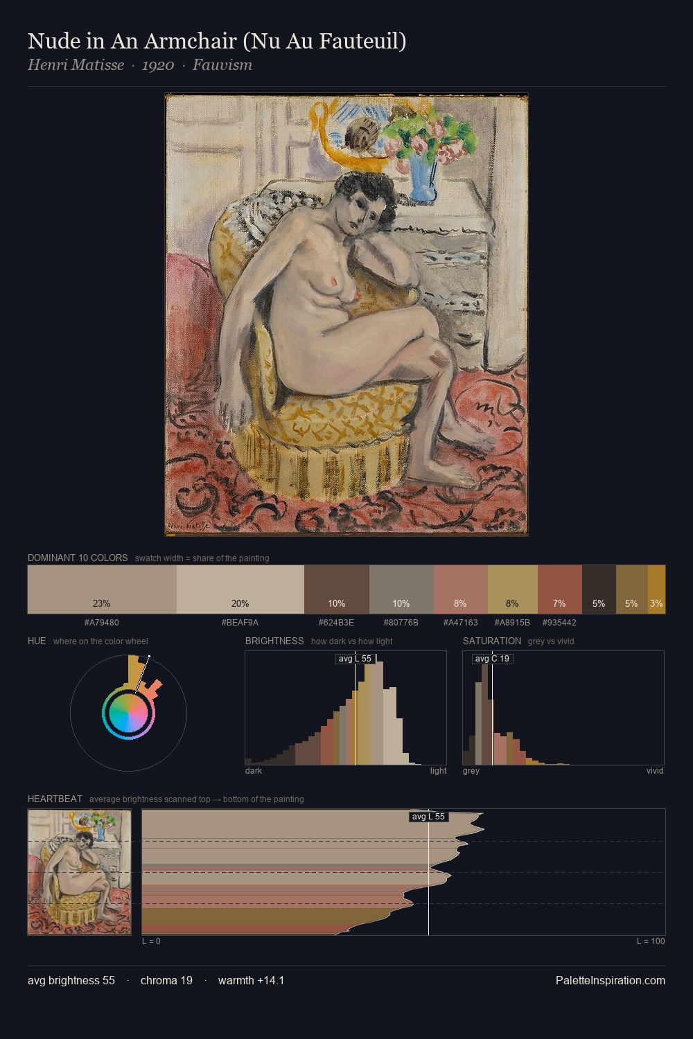
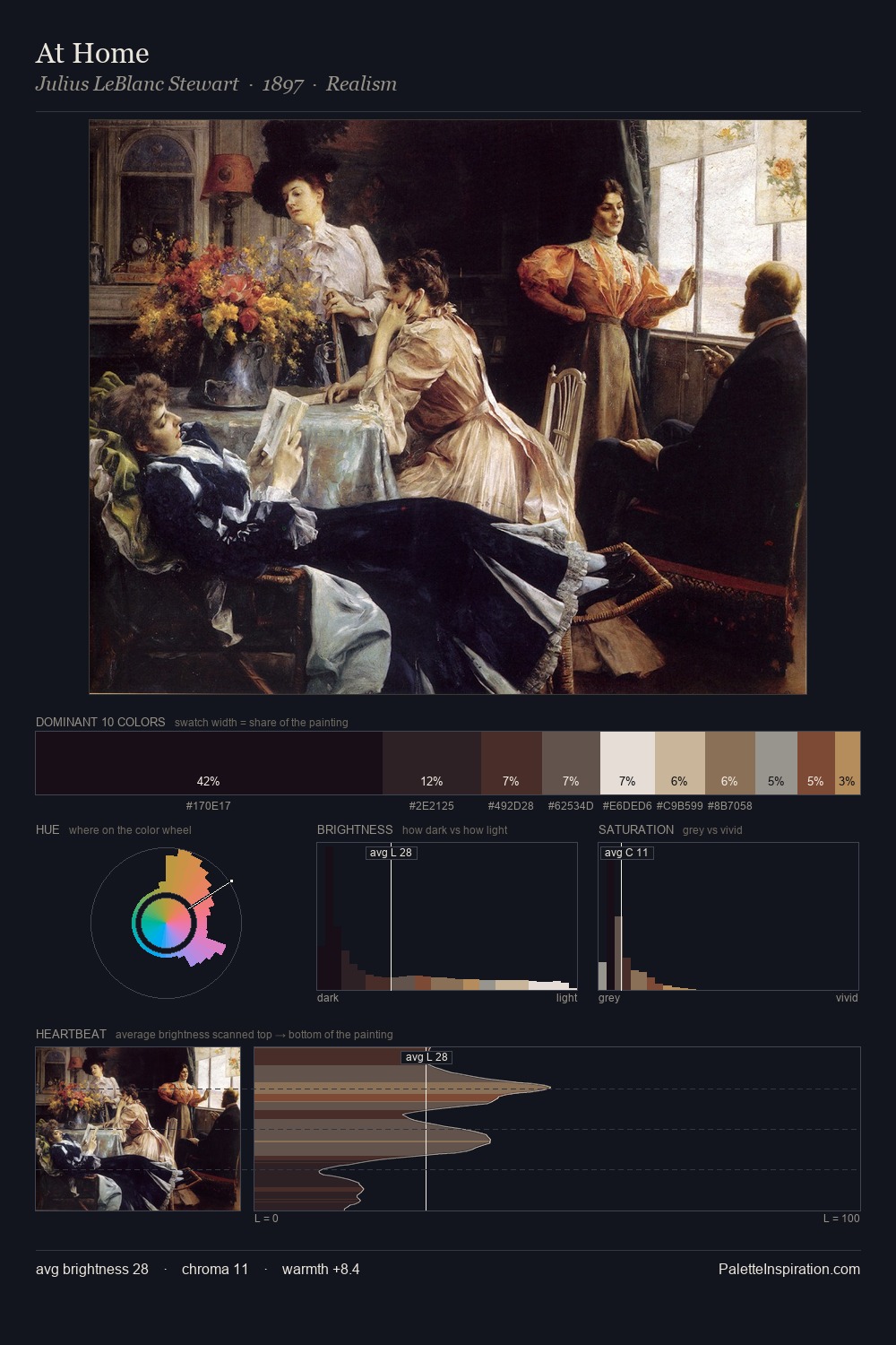
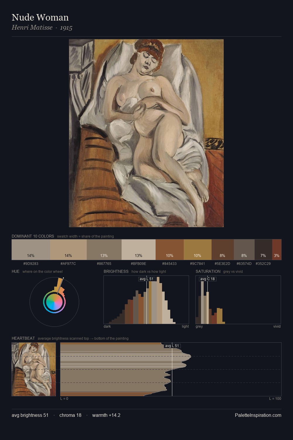
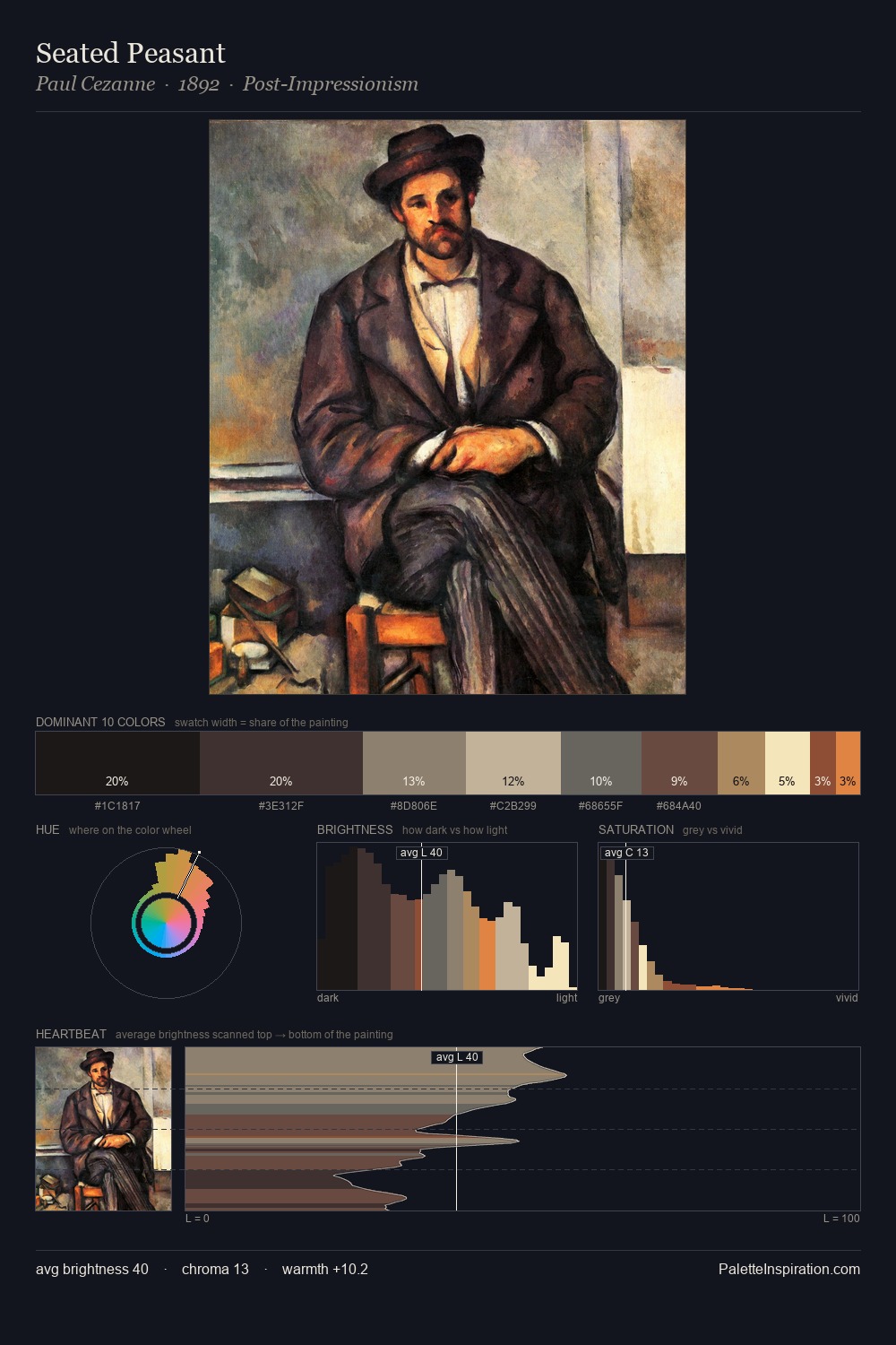
Kitsch occupies the comfortable middle of the value scale, avoiding both extremes to hold the eye in a sustained middle grey. Warm hues command this palette; it favours the reds, oranges, and yellows of firelight and earth. Muted throughout, the palette achieves its effects through value and temperature rather than chromatic force. The saturated accent, #B08F57, registers at 2.9% - sparse enough to feel like a deliberate surprise. At 54 units across the value scale, the palette keeps contrast readable without letting it dominate.
Example use cases
- exhibition design
- foundation branding
- estate management
- art education
- museums & galleries
I Love This!
Use This Palette
Copy, export, or download for your project
Copy, export, or download for your project
Copy:
Download:
Share: