Kitsch Palette 7
Pale Ecru
Pale High-key and low-chroma - delicate, bleached, washed with light.
Ecru Unbleached linen - warm mid-neutral, slightly grayed, raw and natural.

Palette Analysis
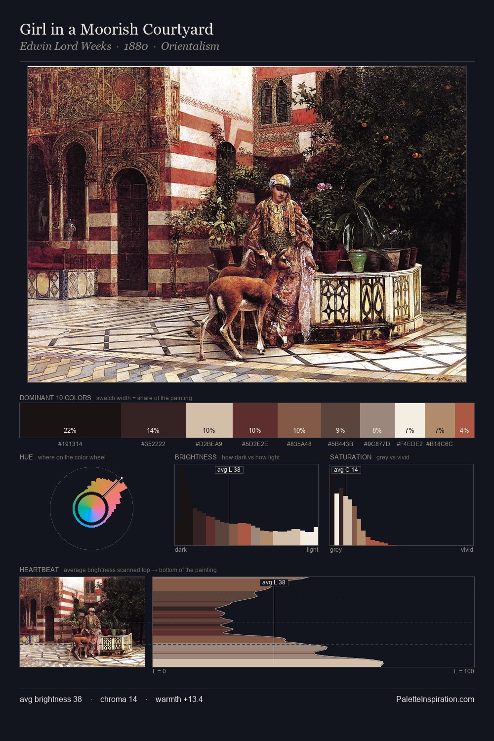
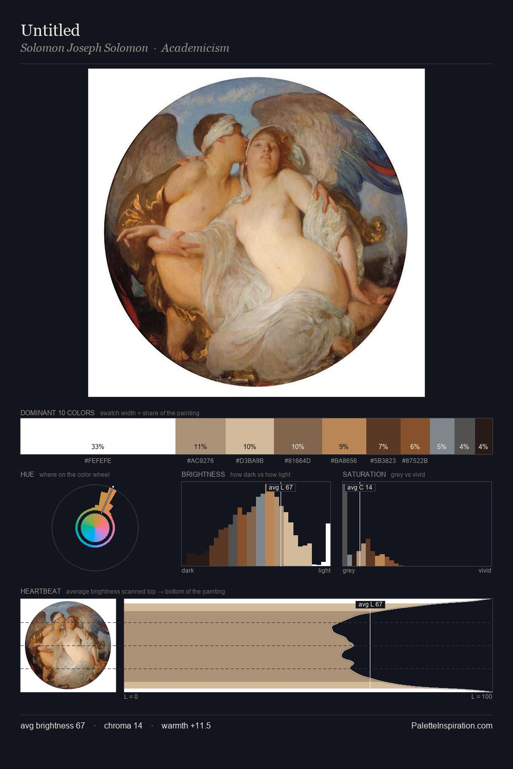
Kitsch works in the upper reaches of the value scale, creating an atmosphere of brightness and expansiveness. The palette achieves thermal balance - reds and blues, ochres and greens, each holding the other in check. Chroma is kept low across all colours, producing the soft, enveloping quality that characterises tonal painting. At 29.1%, #F5E6CA functions less as a colour accent and more as a complete atmospheric environment. The most saturated colour, #522314, is reserved to 7.5% of the surface, where it acts as a focal punctuation. A value spread of 85 units gives the palette both depth and air - shadows are genuinely dark, lights genuinely light.
Example use cases
- publishing
- corporate identity
- consumer apps
- hospitality
- design agencies
I Love This!
Use This Palette
Copy, export, or download for your project
Copy, export, or download for your project
Copy:
Download:
Share: