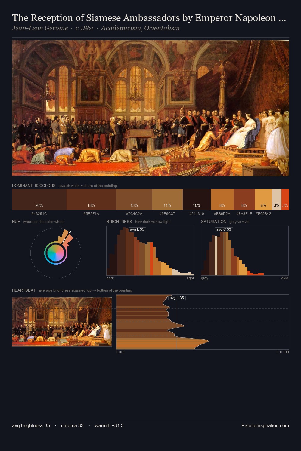
Kitsch Palette 12
Shadowed Tawny
Shadowed Low-key - values weighted toward shadow, the palette of dim interiors and overcast skies.
Tawny Warm orange-brown - a traditional term for the color of tanned leather or lion fur.

Palette Analysis
Kitsch sits in the centre of the value range, lending the palette a sense of even, sustained light. Warmth dominates - the palette leans heavily on the yellow-orange-red arc of the colour wheel. Chroma is moderate: colours carry enough saturation to be read as colour, but the palette stops well short of garish intensity. At 26.7%, #120C0C functions less as a colour accent and more as a complete atmospheric environment. The highest-chroma note - #D53709 - appears at just 3.1%, deployed as a precision accent against the quieter ground. A value spread of 65 units gives the palette both depth and air - shadows are genuinely dark, lights genuinely light.
Example use cases
- theater design
- jewelry brands
- tobacco-adjacent retail
- event branding
- film & entertainment
I Love This!
Use This Palette
Copy, export, or download for your project
Copy, export, or download for your project
Copy:
Download:
Share: