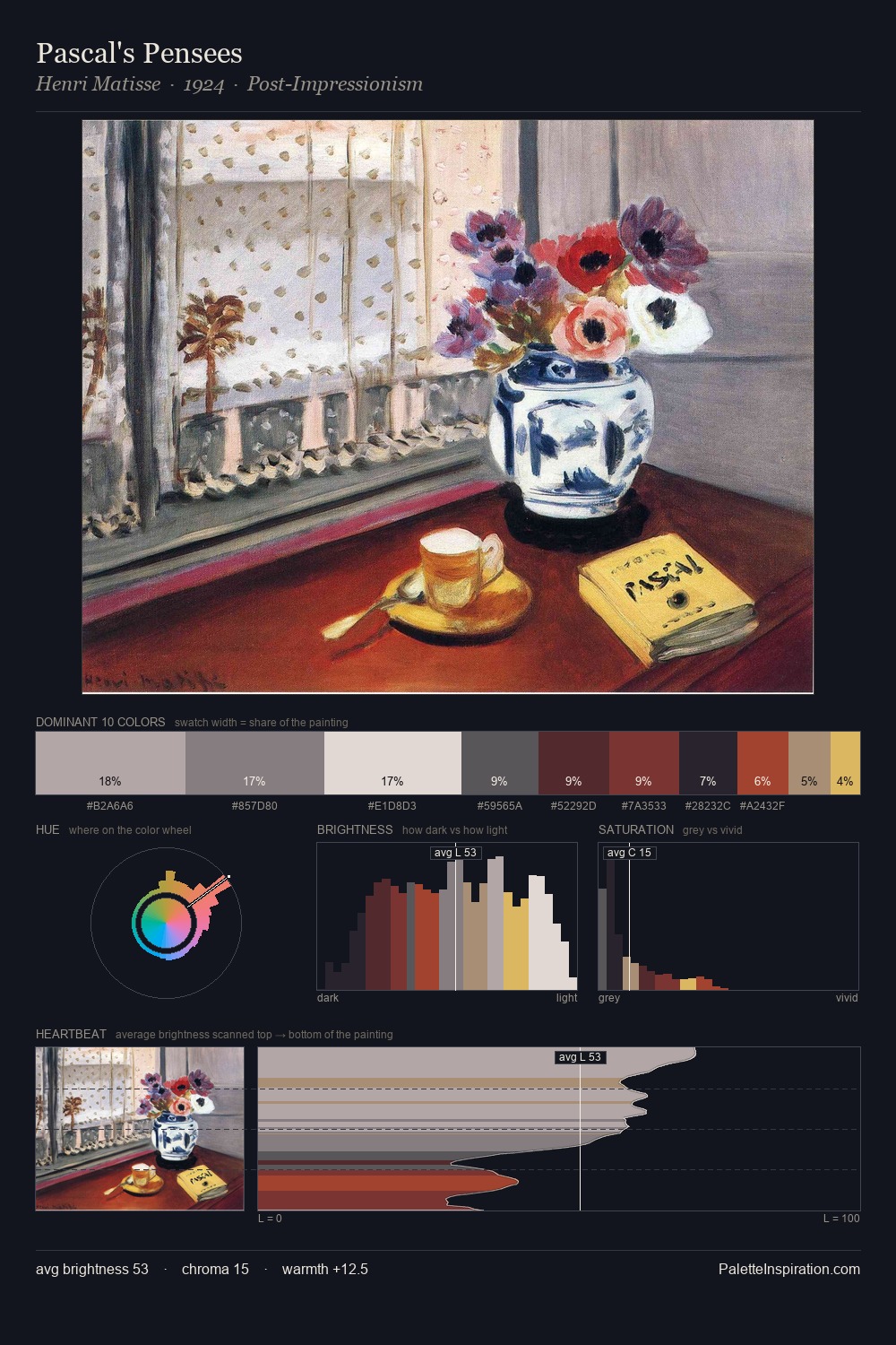
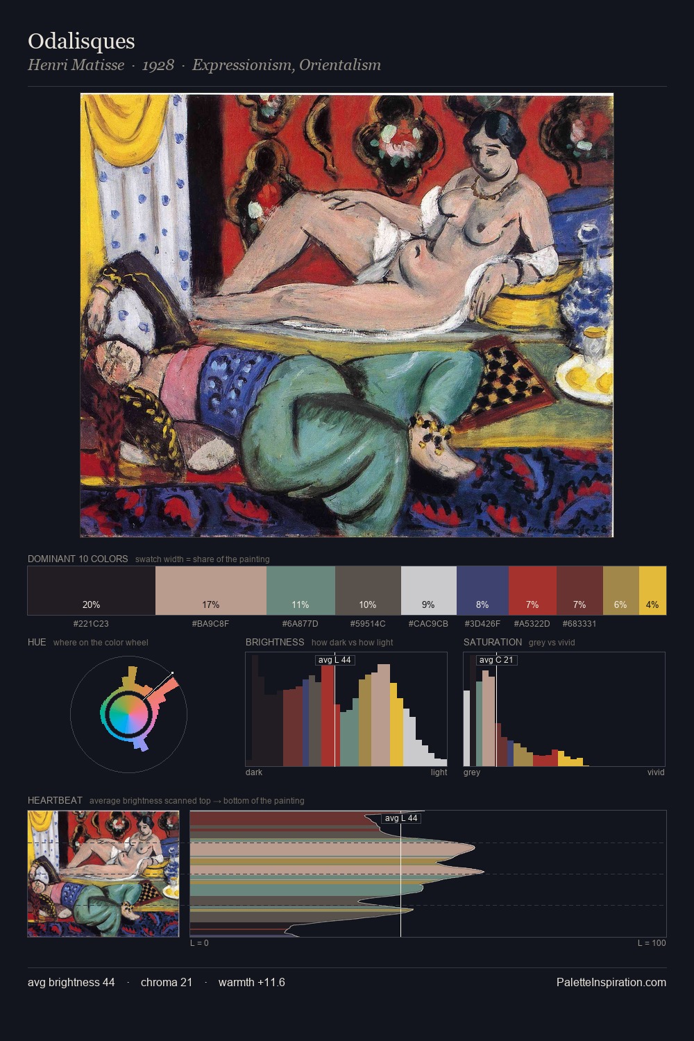
Josef Kriehuber Palette 7

Palette Analysis
Josef Kriehuber is high in key: pale, luminous, and filled with optical air. Temperature is cool-dominant, with blue and green families claiming the largest areas. All colours lean toward grey, building depth through value rather than colour punch. Josef Kriehuber gives 25.9% of the composition to a single #EEEBE3 - a decisive chromatic anchor. At 1.8%, #AF3539 carries the palette's sharpest chromatic charge: an accent that earns its place precisely because it is withheld. A value spread of 68 units gives the palette both depth and air - shadows are genuinely dark, lights genuinely light. The mid-to-high key, cool bias, and moderate chroma point to outdoor observation - sky and diffused daylight as the dominant light source. This is palette 7 of Josef Kriehuber's sequence - a single chapter in a chromatic story told across many works.
Example use cases
- hospitality branding
- boutique hotels
- restaurant identity
- home goods
- florist branding
I Love This!
Copy, export, or download for your project