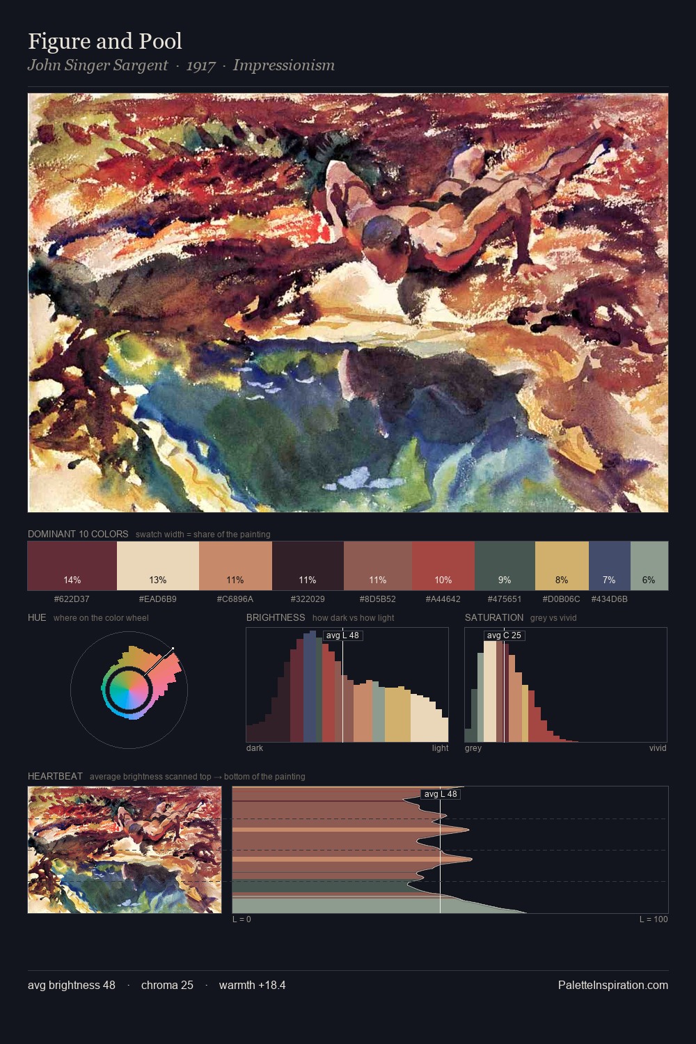
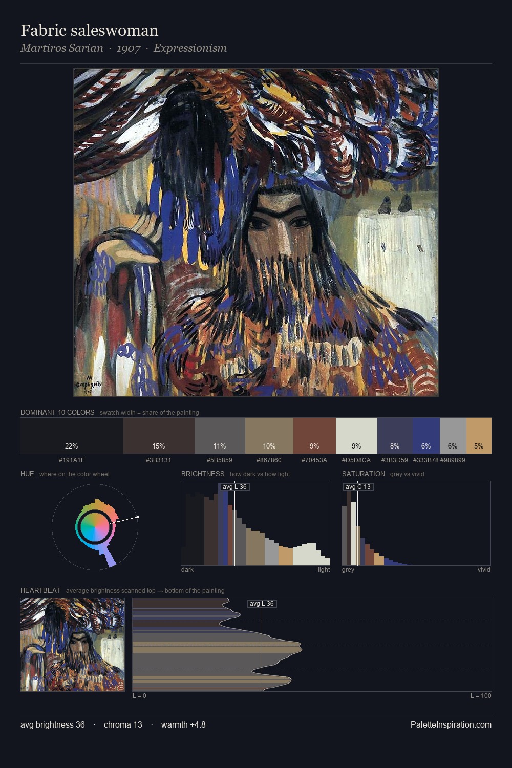
Josef Kriehuber Palette 10

Palette Analysis
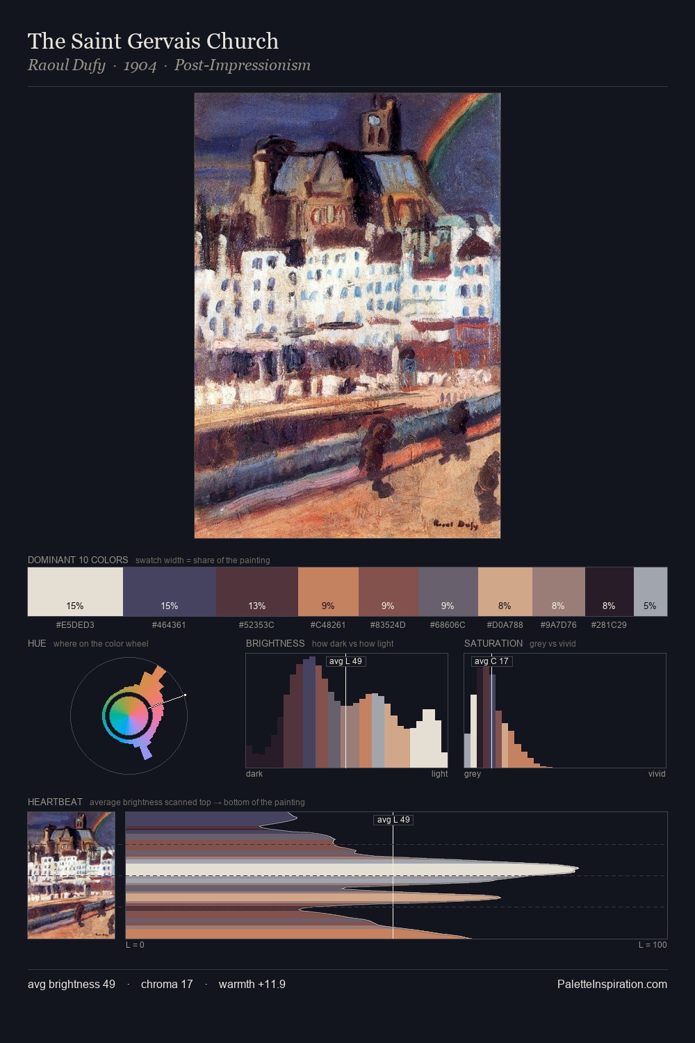
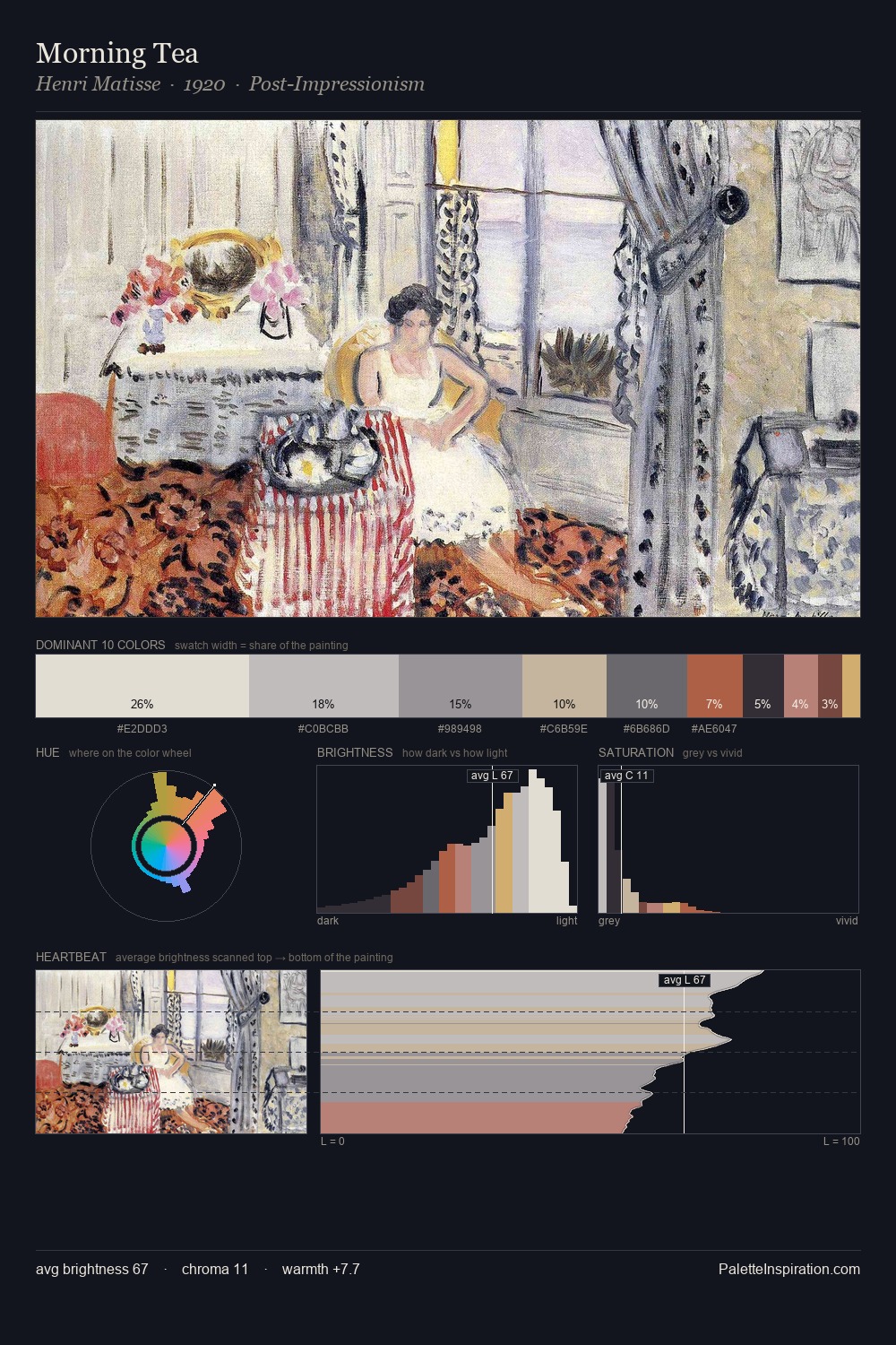
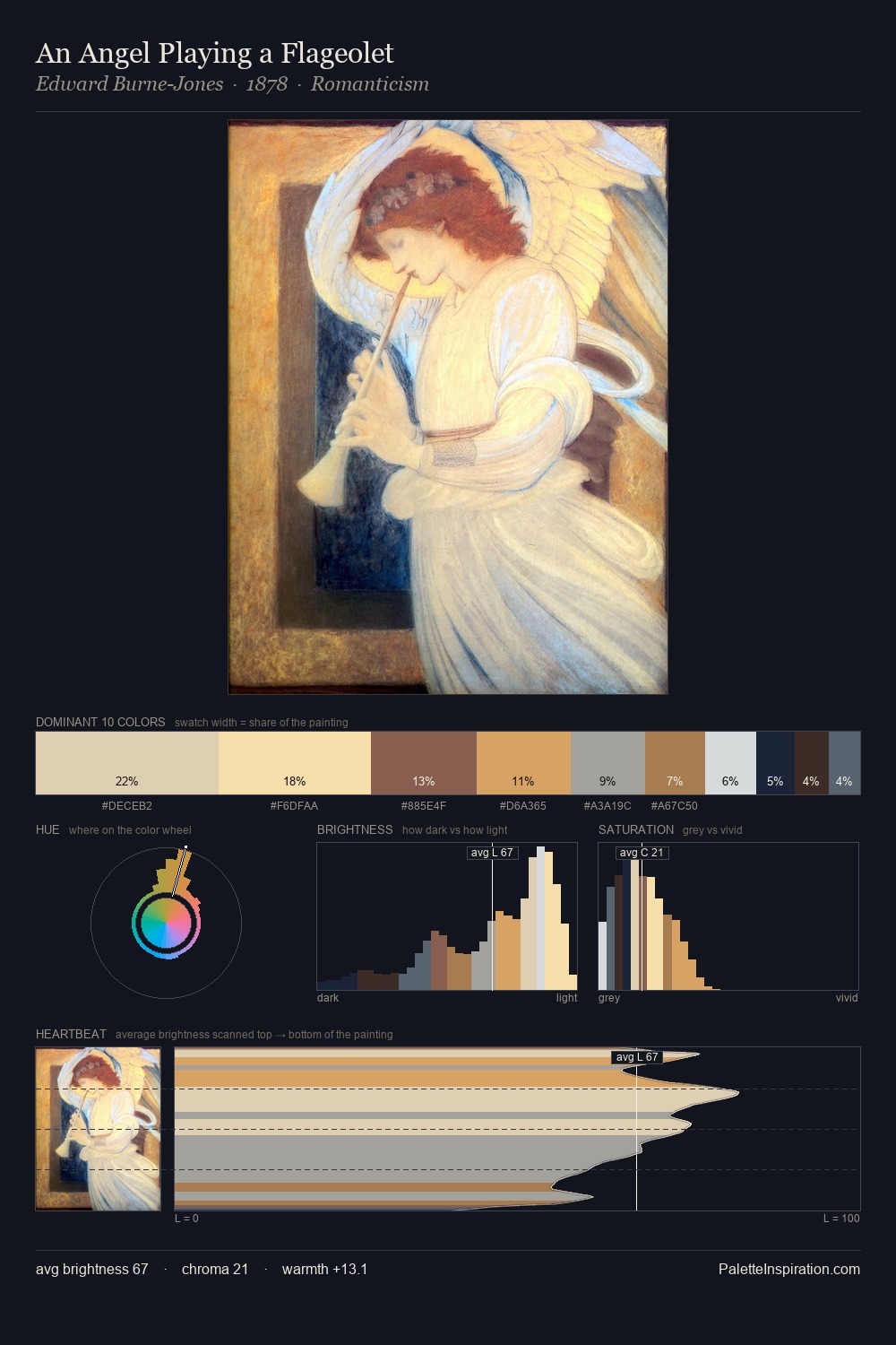
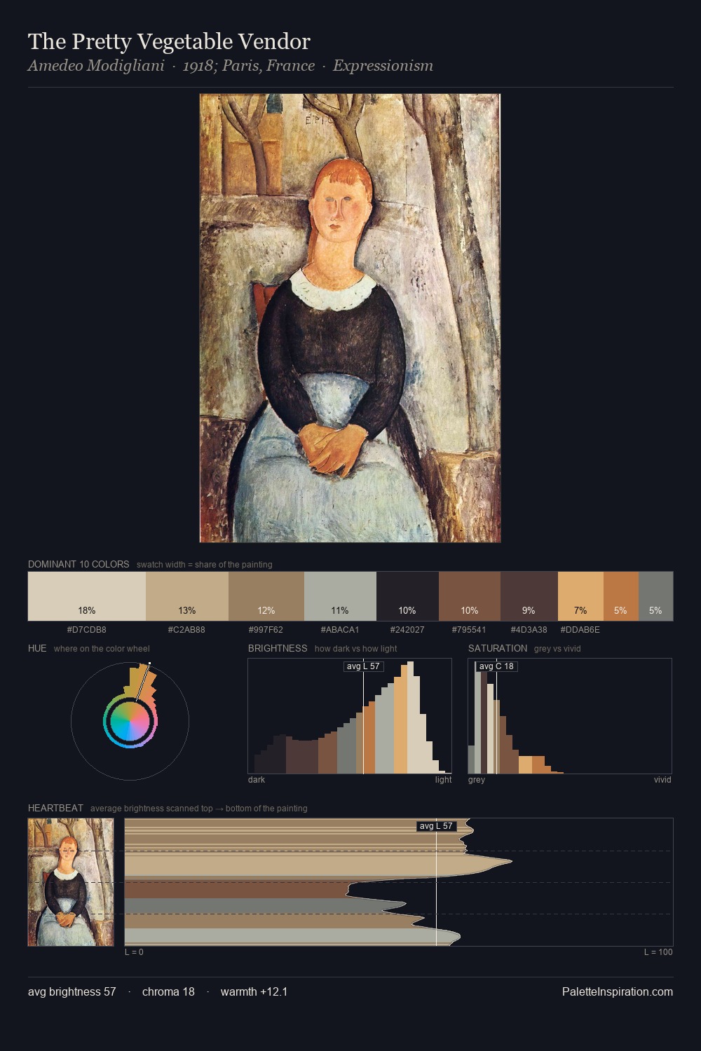
Values in Josef Kriehuber tilt decisively toward white, giving the palette its luminous character. Josef Kriehuber builds on cool foundations: the palette favours the blue-cyan-green arc. Saturation is deliberately withheld - the beauty here lies in the near-monochromatic gradations rather than colour difference. #F2EFE0 at 35.7% of the palette: an overwhelming presence that pulls all other colours into its gravitational field. The most saturated colour, #885548, is reserved to 5.7% of the surface, where it acts as a focal punctuation. The full value range is 73 units: broad enough to build convincing three-dimensional form. The palette has the character of outdoor light: cool, mid-bright, with colour rendered faithfully rather than expressively. This is palette 10 of Josef Kriehuber's sequence - a single chapter in a chromatic story told across many works.
Example use cases
- publishing
- corporate identity
- consumer apps
- hospitality
- design agencies
I Love This!
Copy, export, or download for your project