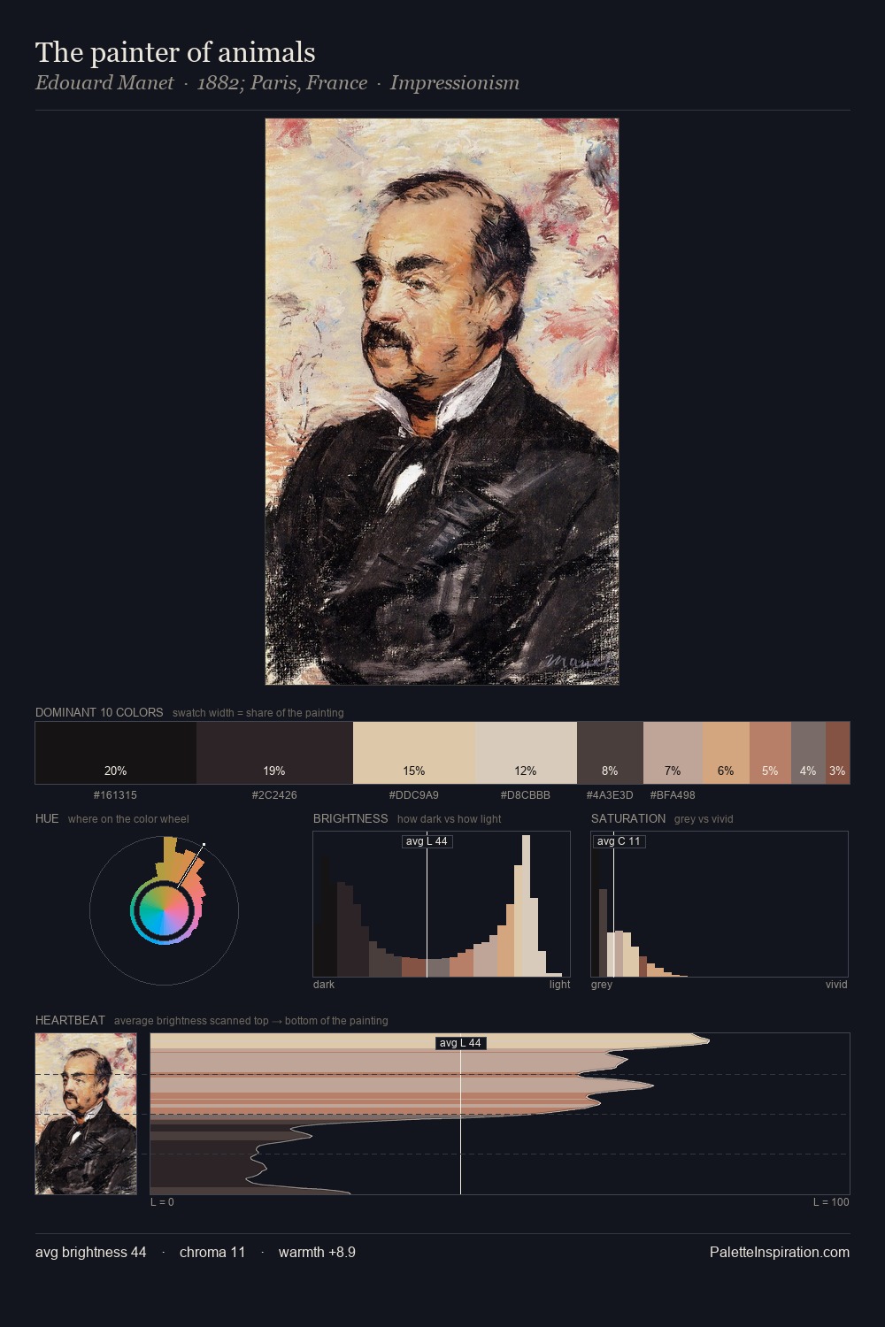
Josef Kriehuber Palette 9

Palette Analysis
Josef Kriehuber is high-key - luminous, open, and weighted toward light. Josef Kriehuber orchestrates warmth above all else - reds, ambers, and siennas take the lead. Saturation is deliberately withheld - the beauty here lies in the near-monochromatic gradations rather than colour difference. The dominant colour, #E3D8CC, takes 32.6% of the total area, establishing the overall mood before any other hue is introduced. At 1.1%, #A46F63 carries the palette's sharpest chromatic charge: an accent that earns its place precisely because it is withheld. From deepest dark to palest light, the palette traverses 67 units of the value scale - a span that creates natural depth. Josef Kriehuber's palette 9 carries its own internal logic while remaining in conversation with the artist's broader colour intelligence.
Example use cases
- ceramics & pottery
- boutique hospitality
- menswear
- heritage food brands
- craft & artisan brands
I Love This!
Copy, export, or download for your project