Josef Kriehuber Palette 8

Palette Analysis
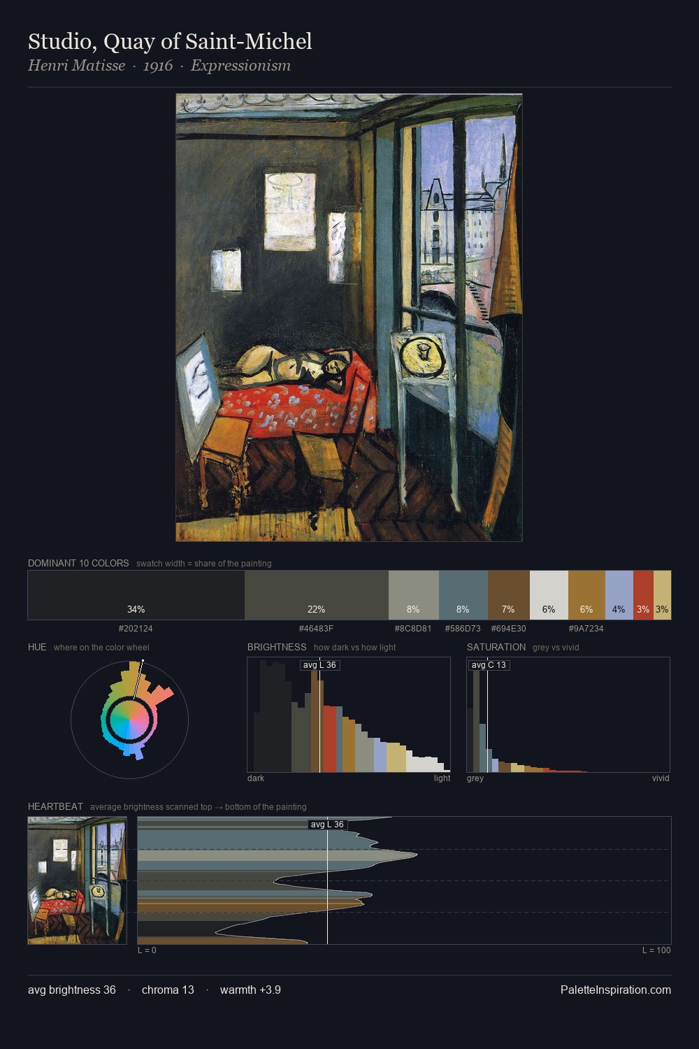
Light floods Josef Kriehuber; the palette keeps values pale and airy across its range. Josef Kriehuber tilts toward cool - blues and silver-greys carry the structural weight. Chroma is kept low across all colours, producing the soft, enveloping quality that characterises tonal painting. #CECED1 claims 30.8% of the surface, functioning as the work's tonal foundation. At 6.1%, #937938 carries the palette's sharpest chromatic charge: an accent that earns its place precisely because it is withheld. From deepest dark to palest light, the palette traverses 55 units of the value scale - a span that creates natural depth. The mid-to-high key, cool bias, and moderate chroma point to outdoor observation - sky and diffused daylight as the dominant light source. Palette 8 sits within the larger chromatic argument that Josef Kriehuber's complete body of work advances.
Example use cases
- florist branding
- event design
- real estate
- jewelry retail
- hospitality branding
I Love This!
Copy, export, or download for your project