José Garnelo Palette 2
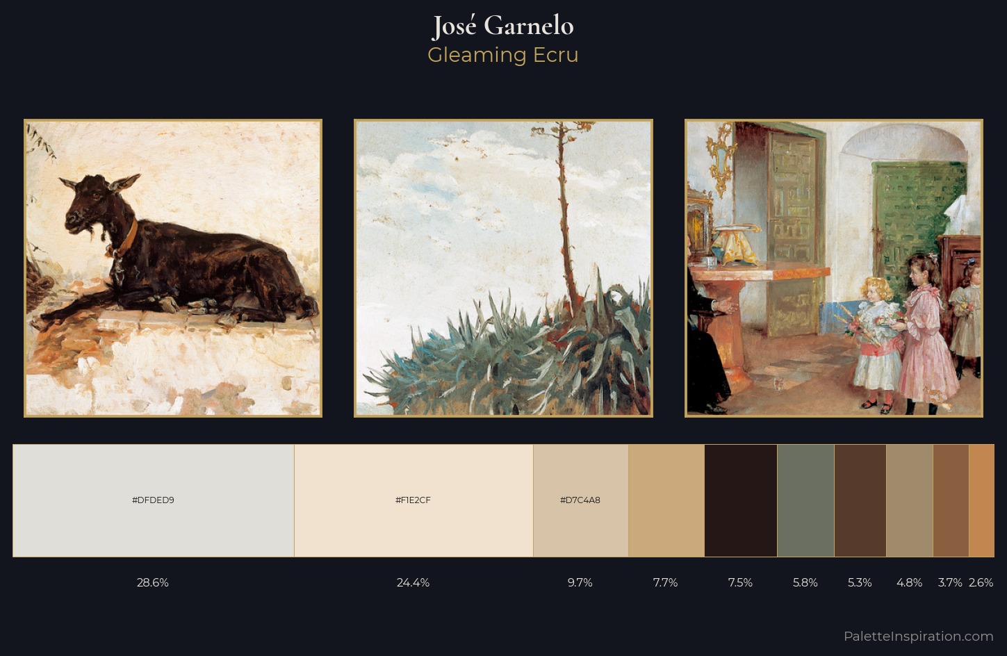
Palette Analysis
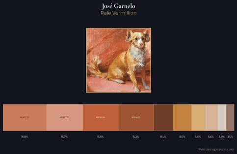
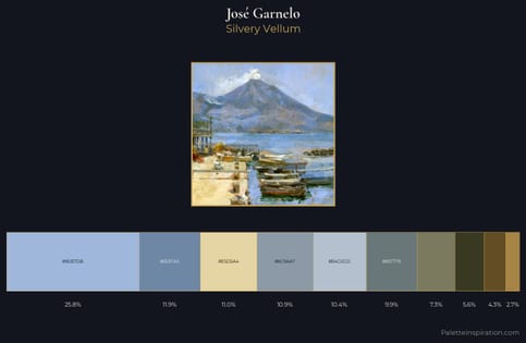
Values in José Garnelo tilt decisively toward white, giving the palette its luminous character. Warm and cool are kept in productive tension, creating the kind of chromatic harmony that sustains the eye. Saturation is deliberately withheld - the beauty here lies in the near-monochromatic gradations rather than colour difference. The dominant colour, #DFDED9, takes 28.6% of the total area, establishing the overall mood before any other hue is introduced. The most saturated colour, #C28750, is reserved to 2.6% of the surface, where it acts as a focal punctuation. A value spread of 70 units gives the palette both depth and air - shadows are genuinely dark, lights genuinely light. In the context of José Garnelo's full range of palettes, group 2 represents one movement in an ongoing chromatic dialogue.
Example use cases
- ceramics & pottery
- boutique hospitality
- menswear
- heritage food brands
- craft & artisan brands
I Love This!
Copy, export, or download for your project