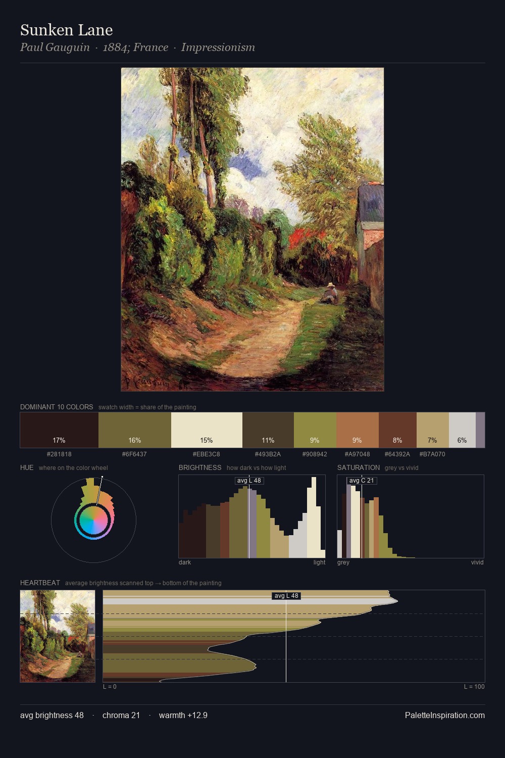
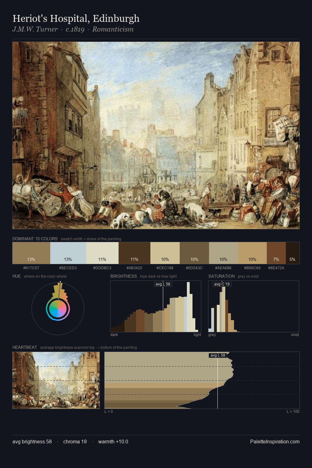
Conrad Wise Chapman Palette 2

Palette Analysis
Conrad Wise Chapman is high-key - luminous, open, and weighted toward light. Temperature is cool-dominant, with blue and green families claiming the largest areas. Saturation is deliberately withheld - the beauty here lies in the near-monochromatic gradations rather than colour difference. A single dominant - #C9CCC7 at 31.7% - sets the character of the whole composition. #C7B488 delivers the chromatic peak at only 7.9% - a small shot of colour with outsized visual impact. Value range is moderate at 49 units - enough contrast for legibility, not so much as to fragment the tonal unity. The mid-to-high key, cool bias, and moderate chroma point to outdoor observation - sky and diffused daylight as the dominant light source. In the context of Conrad Wise Chapman's full range of palettes, group 2 represents one movement in an ongoing chromatic dialogue.
Example use cases
- publishing
- corporate identity
- consumer apps
- hospitality
- design agencies
I Love This!
Copy, export, or download for your project