Conrad Wise Chapman Palette 7
Nocturnal Bister
Nocturnal Night-register palette - very low values, the world after dark.
Bister Dark warm brown - a traditional ink and wash pigment made from wood soot.

Palette Analysis
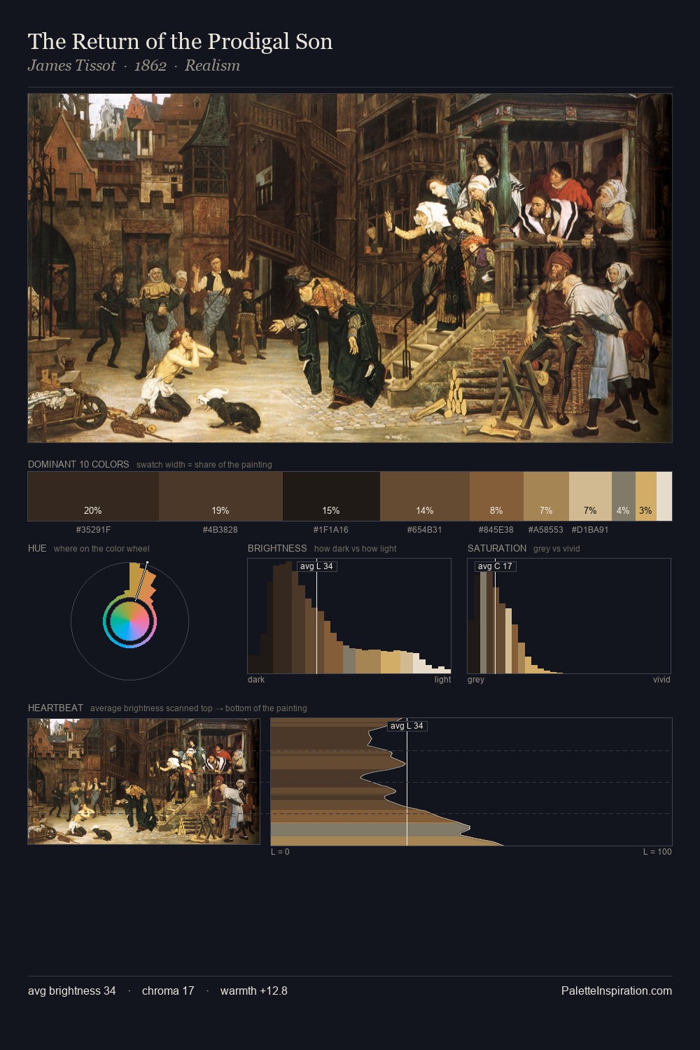
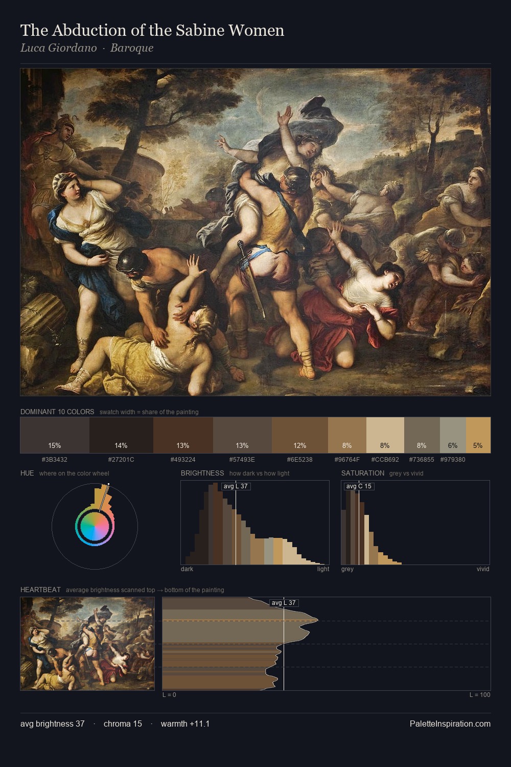
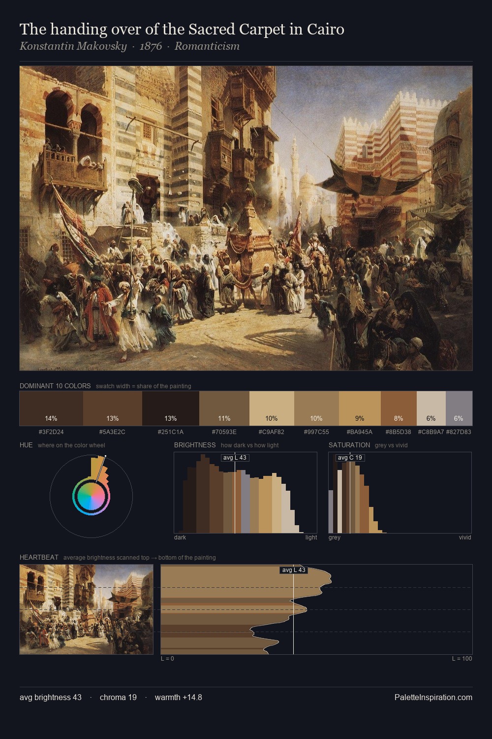
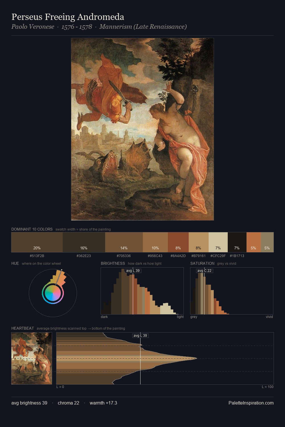
Conrad Wise Chapman sits in the centre of the value range, lending the palette a sense of even, sustained light. Yellow, ochre, sienna: warm hues that Conrad Wise Chapman deploys as the palette's primary energy. Saturation is deliberately withheld - the beauty here lies in the near-monochromatic gradations rather than colour difference. Only 3.0% is devoted to #B2854F, yet that small allocation delivers the palette's entire chromatic tension. At 59 units of value range, the palette has the tonal breadth to sustain complex spatial readings. Palette 7 sits within the larger chromatic argument that Conrad Wise Chapman's complete body of work advances.
Example use cases
- music labels
- luxury hospitality
- editorial photography
- leather goods
- premium streaming
I Love This!
Use This Palette
Copy, export, or download for your project
Copy, export, or download for your project
Copy:
Download:
Share: