John Frederick Kensett Palette 5

Palette Analysis
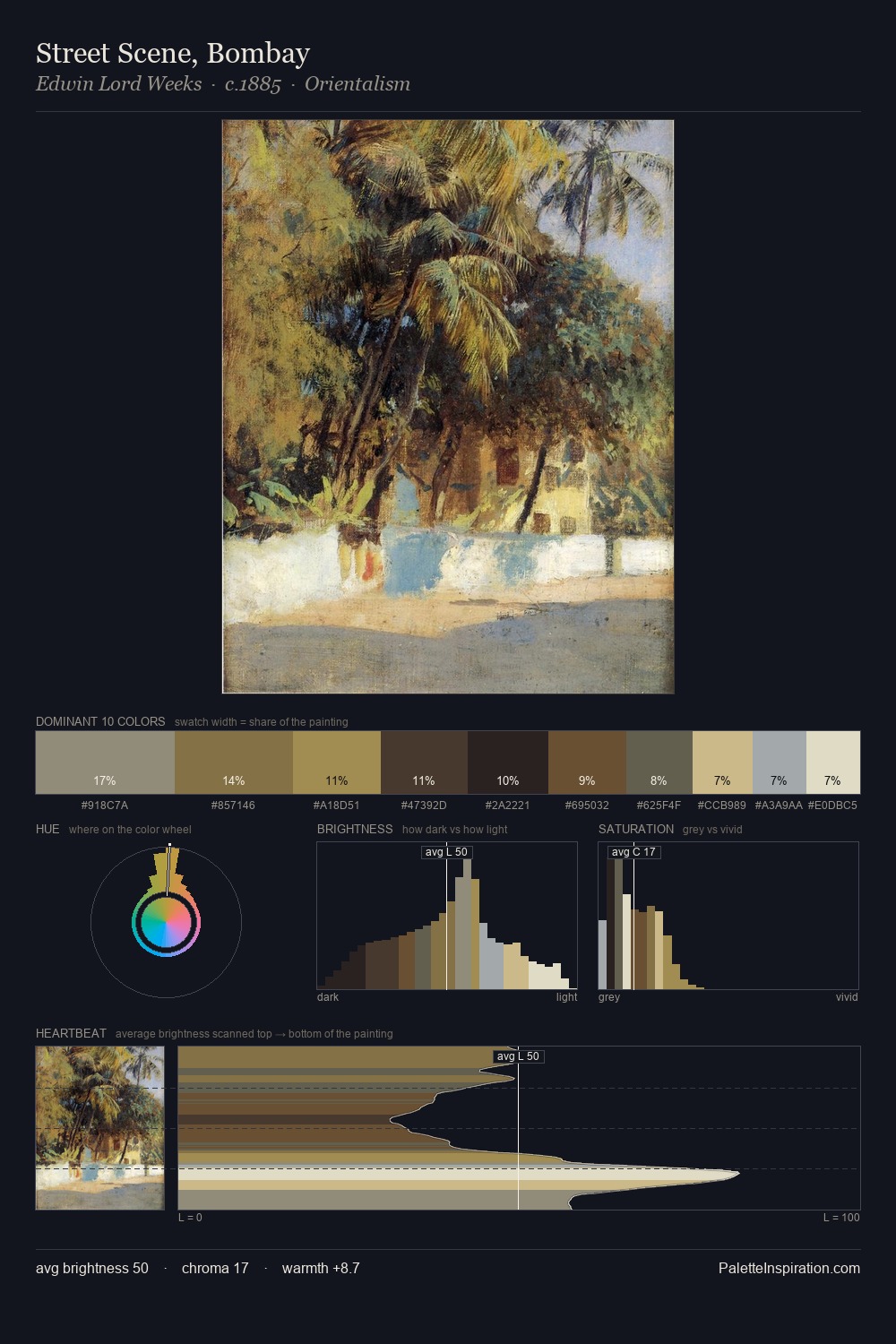
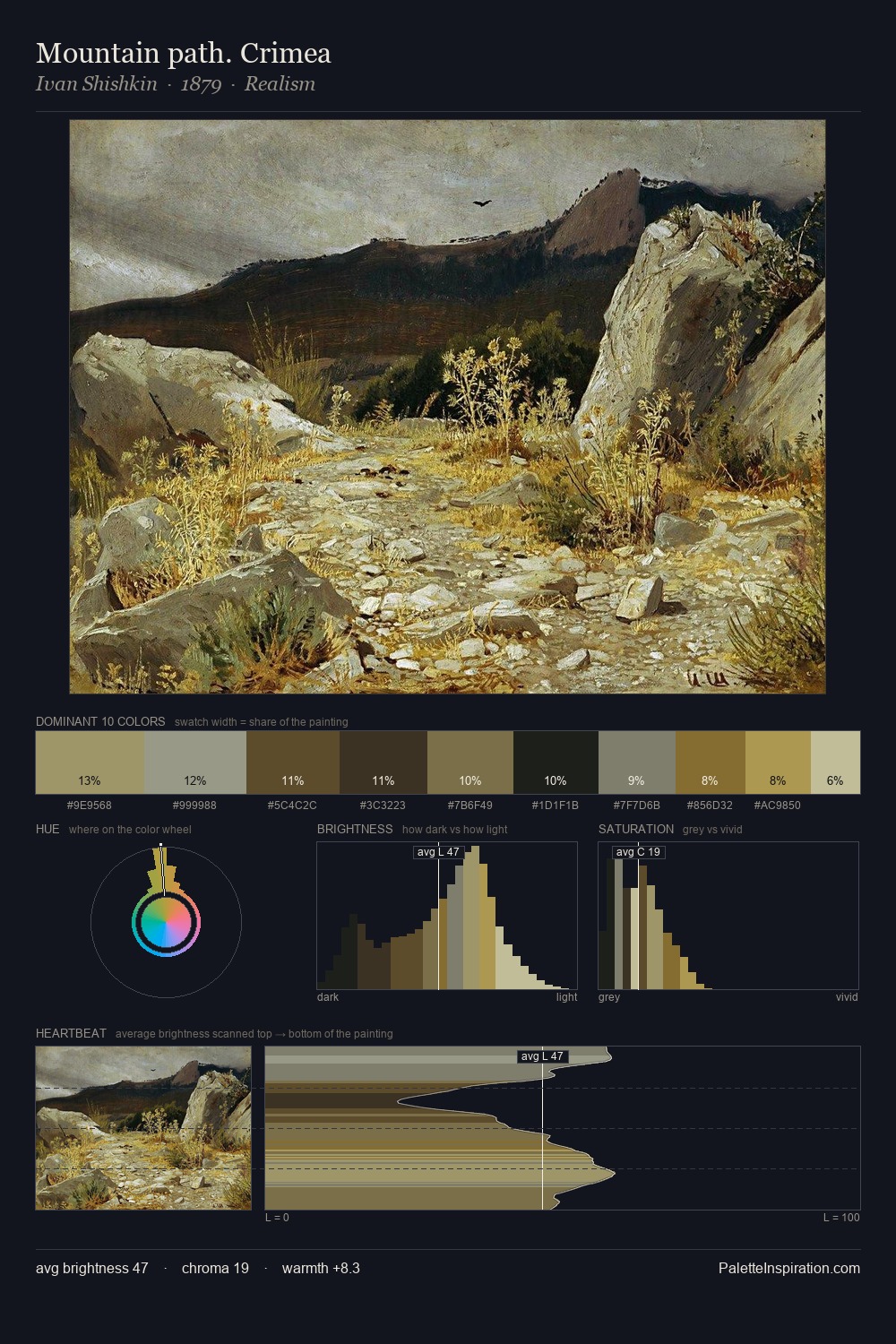
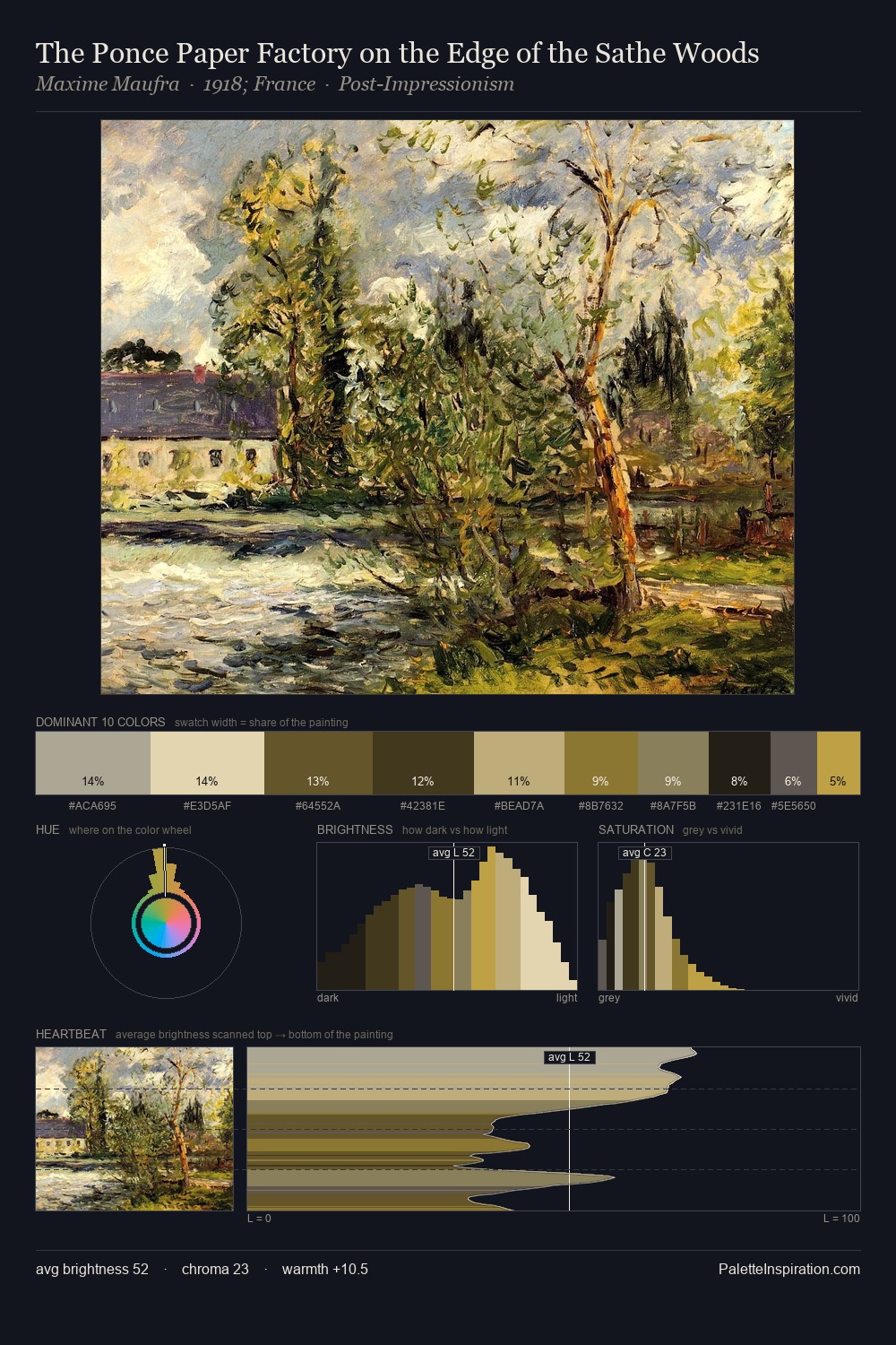
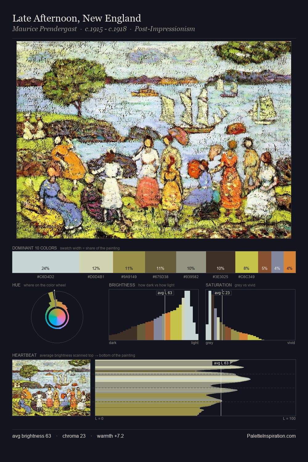
John Frederick Kensett distributes its values across the middle register, creating harmony without high contrast. John Frederick Kensett builds on cool foundations: the palette favours the blue-cyan-green arc. Chroma is kept low across all colours, producing the soft, enveloping quality that characterises tonal painting. #95823E delivers the chromatic peak at only 8.0% - a small shot of colour with outsized visual impact. 55 units of value range underpin the palette's structural clarity: the eye always knows where light falls. The palette has the character of outdoor light: cool, mid-bright, with colour rendered faithfully rather than expressively. This is palette 5 of John Frederick Kensett's sequence - a single chapter in a chromatic story told across many works.
Example use cases
- publishing
- corporate identity
- consumer apps
- hospitality
- design agencies
I Love This!
Copy, export, or download for your project