Johan Hendrik Weissenbruch Palette 1

Palette Analysis
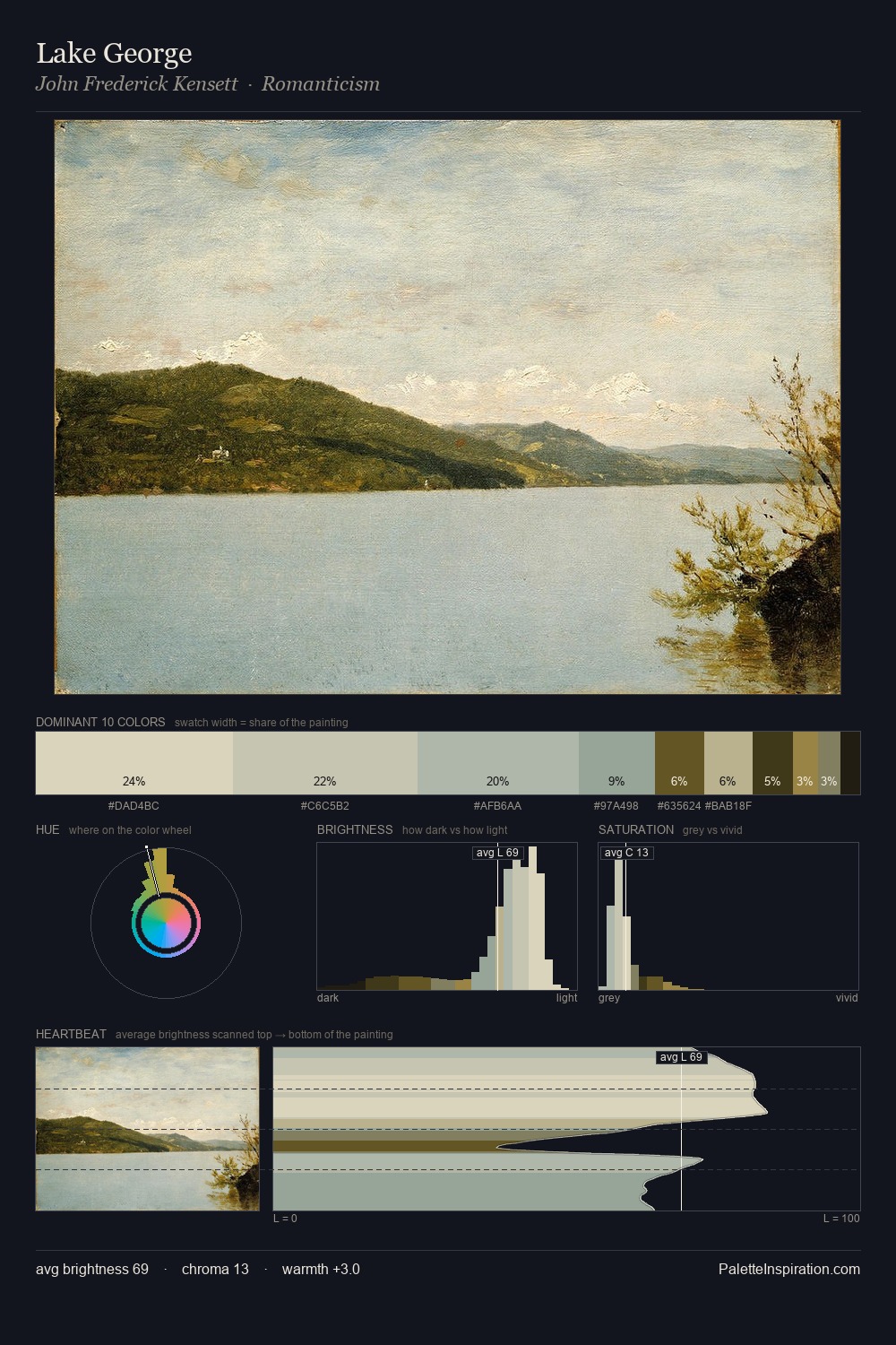
Johan Hendrik Weissenbruch is high in key: pale, luminous, and filled with optical air. Johan Hendrik Weissenbruch tilts toward cool - blues and silver-greys carry the structural weight. All colours lean toward grey, building depth through value rather than colour punch. The saturated accent, #BFB583, registers at 5.1% - sparse enough to feel like a deliberate surprise. A value spread of 66 units gives the palette both depth and air - shadows are genuinely dark, lights genuinely light. The mid-to-high key, cool bias, and moderate chroma point to outdoor observation - sky and diffused daylight as the dominant light source. This is palette 1 of Johan Hendrik Weissenbruch's sequence - a single chapter in a chromatic story told across many works.
Example use cases
- florist branding
- event design
- real estate
- jewelry retail
- hospitality branding
I Love This!
Copy, export, or download for your project