Johan Hendrik Weissenbruch Palette 3
Soft Alabaster
Soft Low-contrast, gentle chroma - mid-key values and low saturation, approachable and calm.
Alabaster Warm off-white - creamy stone white, luminous and slightly translucent.

Palette Analysis
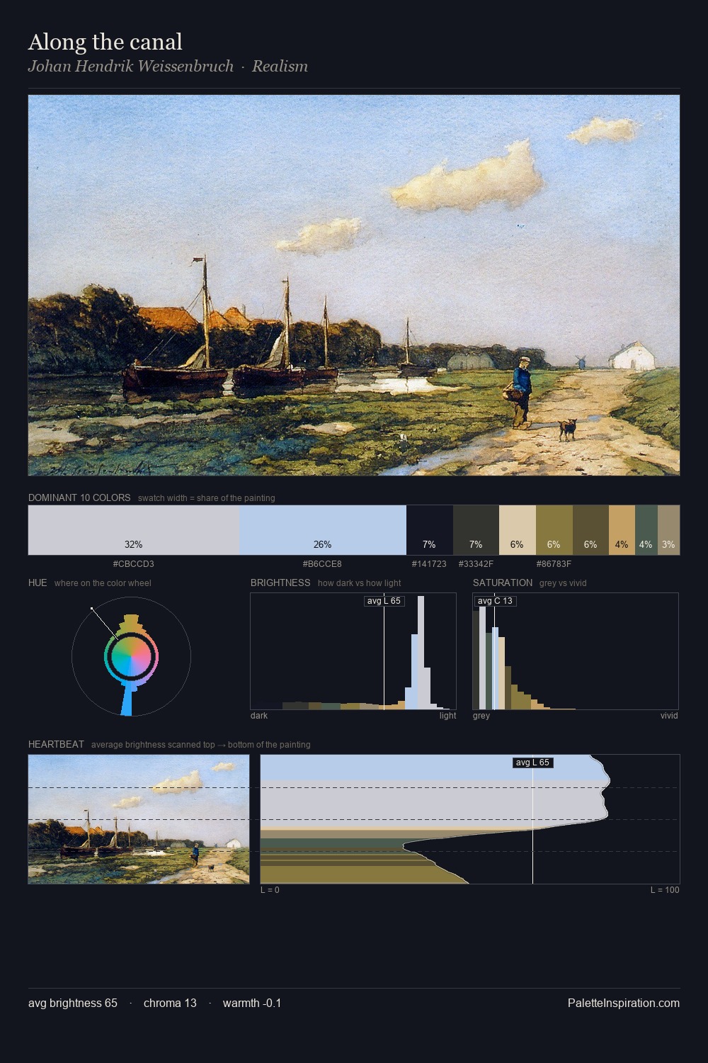
Johan Hendrik Weissenbruch is strongly light-biased - shadow is suggested rather than declared. Cool hues prevail: blues, greens, and greys anchor the palette's emotional temperature. Saturation is deliberately withheld - the beauty here lies in the near-monochromatic gradations rather than colour difference. Only 1.3% is devoted to #9F682A, yet that small allocation delivers the palette's entire chromatic tension. The full value range is 63 units: broad enough to build convincing three-dimensional form. High luminosity and cool temperature suggest the plein-air condition: unfiltered daylight and open sky. This is palette 3 of Johan Hendrik Weissenbruch's sequence - a single chapter in a chromatic story told across many works.
Example use cases
- print magazines
- beauty brands
- real estate
- high-end packaging
- editorial design
I Love This!
Use This Palette
Copy, export, or download for your project
Copy, export, or download for your project
Copy:
Download:
Share: