Johan Hendrik Weissenbruch Palette 5

Palette Analysis
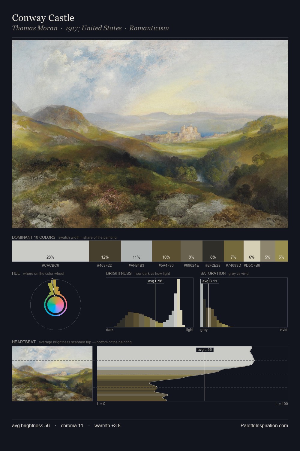
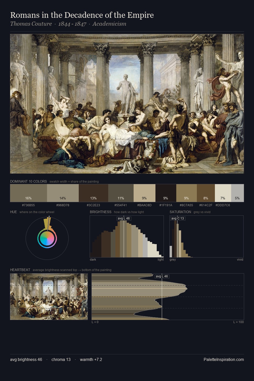
Values in Johan Hendrik Weissenbruch tilt decisively toward white, giving the palette its luminous character. A distinctly cool atmosphere runs through this palette: sky, water, and mist given colour form. The absence of saturated colour is itself an expressive choice: this is a palette of restraint and atmosphere. The saturated accent, #424A31, registers at 10.0% - sparse enough to feel like a deliberate surprise. 66 units of value range underpin the palette's structural clarity: the eye always knows where light falls. The palette has the character of outdoor light: cool, mid-bright, with colour rendered faithfully rather than expressively. Palette 5 sits within the larger chromatic argument that Johan Hendrik Weissenbruch's complete body of work advances.
Example use cases
- exhibition design
- foundation branding
- estate management
- art education
- museums & galleries
I Love This!
Copy, export, or download for your project