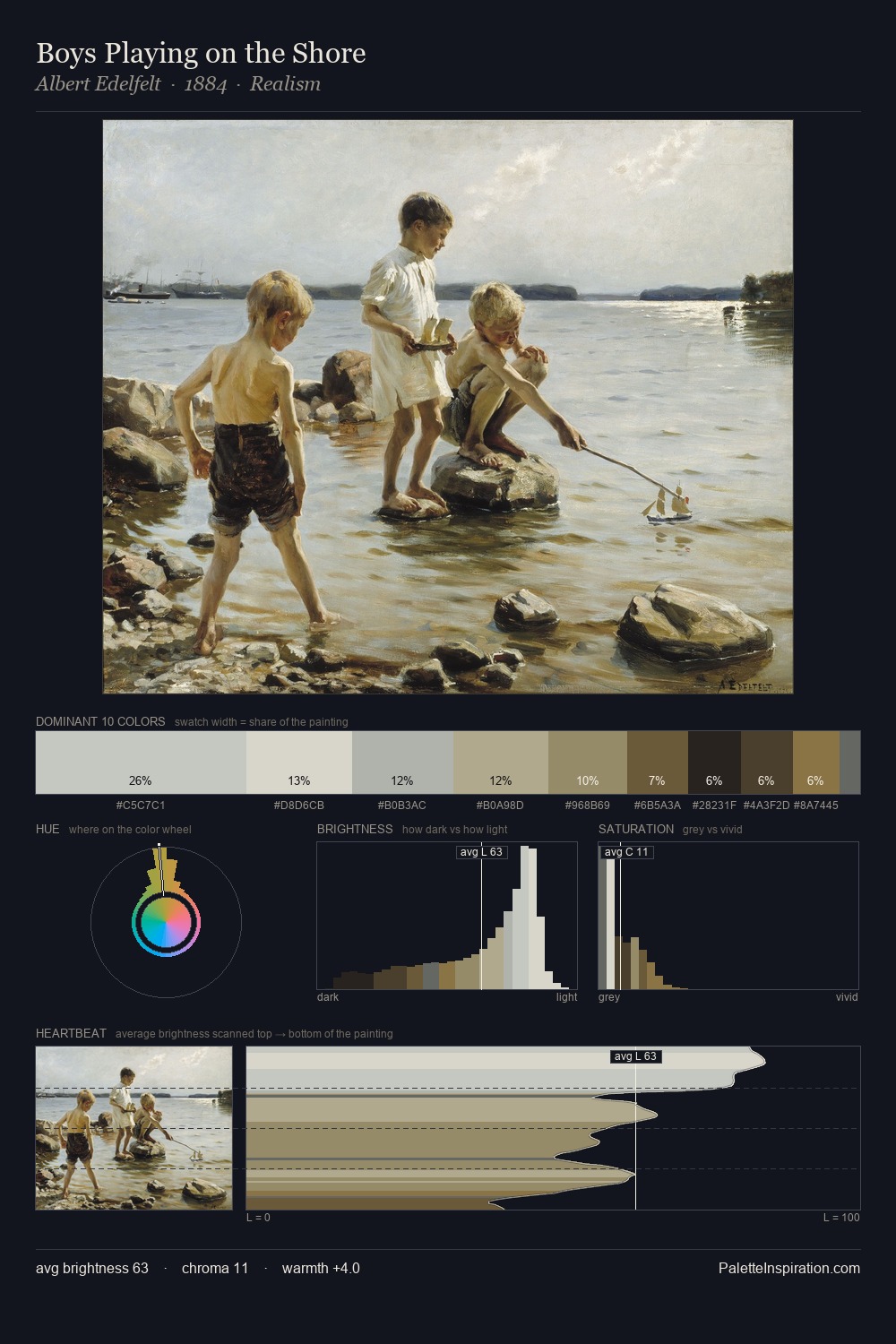
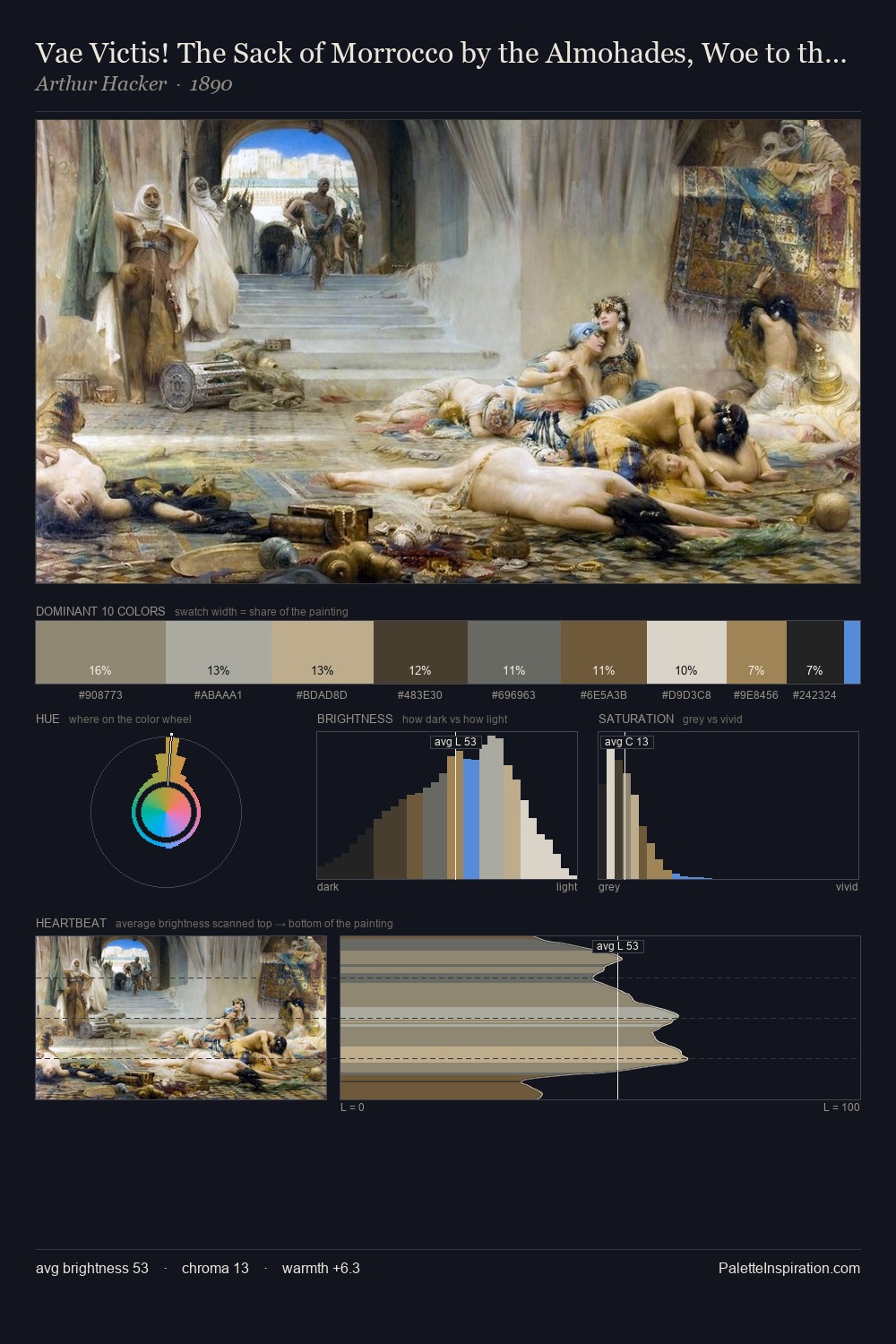
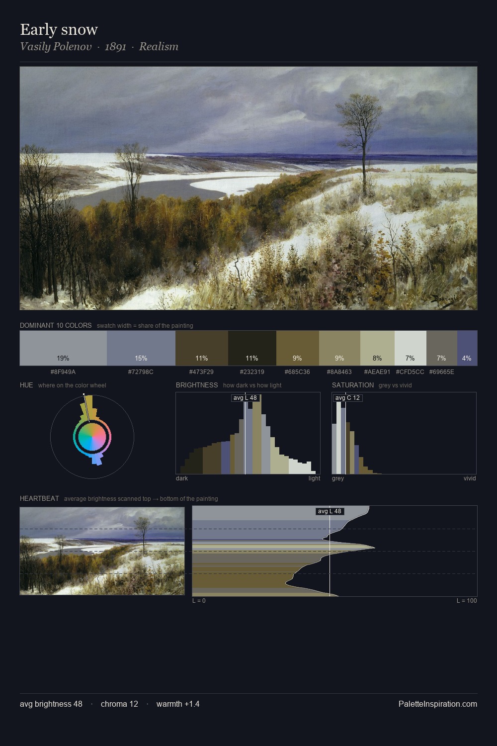
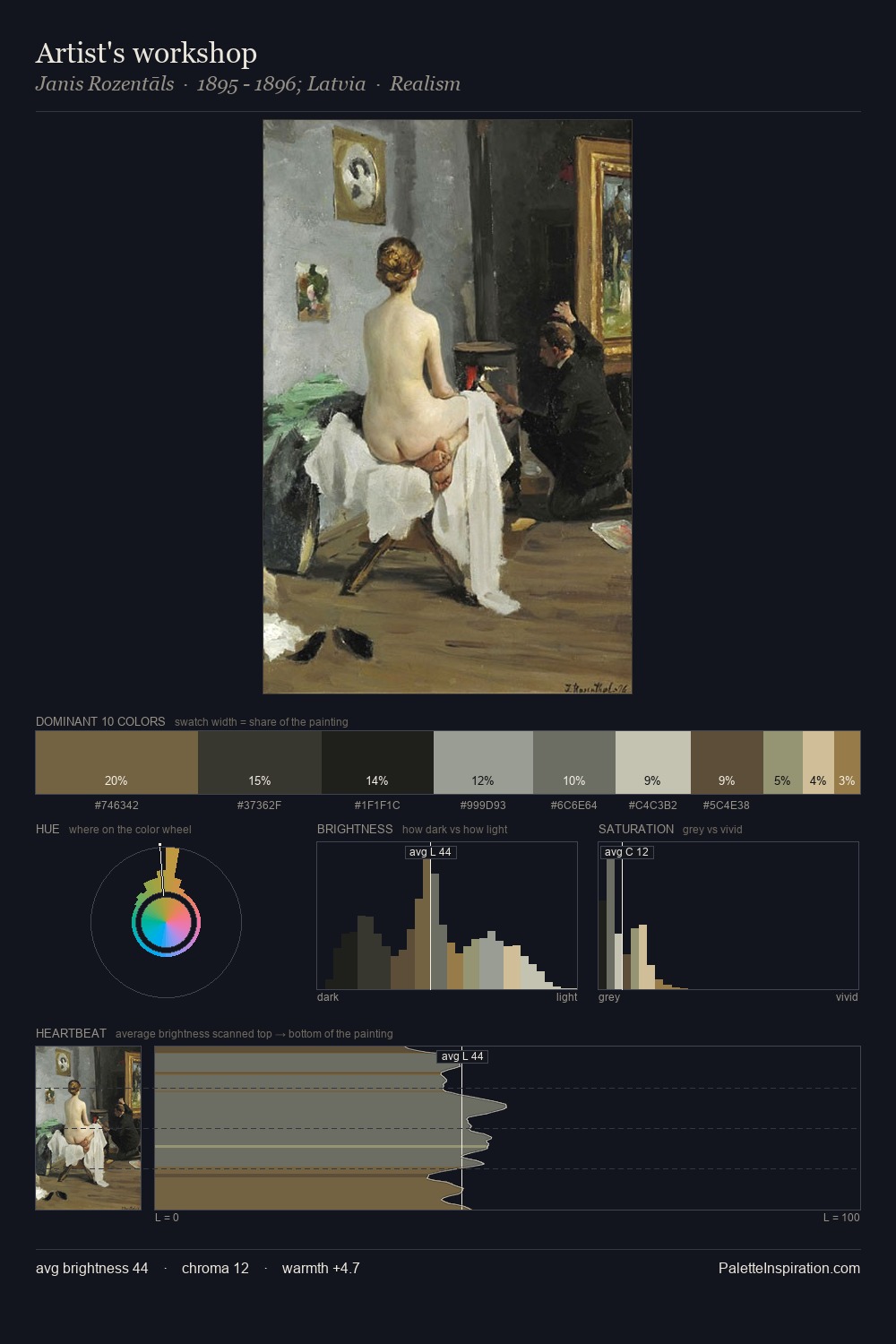
Johan Hendrik Weissenbruch Palette 6

Palette Analysis
The value structure of Johan Hendrik Weissenbruch is mid-key: quiet, controlled, and cohesive. Johan Hendrik Weissenbruch tilts toward cool - blues and silver-greys carry the structural weight. The absence of saturated colour is itself an expressive choice: this is a palette of restraint and atmosphere. The highest-chroma note - #66643C - appears at just 7.6%, deployed as a precision accent against the quieter ground. At 63 units of value range, the palette has the tonal breadth to sustain complex spatial readings. High luminosity and cool temperature suggest the plein-air condition: unfiltered daylight and open sky. In the context of Johan Hendrik Weissenbruch's full range of palettes, group 6 represents one movement in an ongoing chromatic dialogue.
Example use cases
- exhibition design
- foundation branding
- estate management
- art education
- museums & galleries
I Love This!
Copy, export, or download for your project