Adriaen van de Velde Palette 1

Palette Analysis
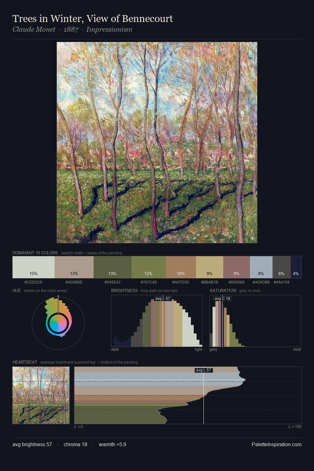
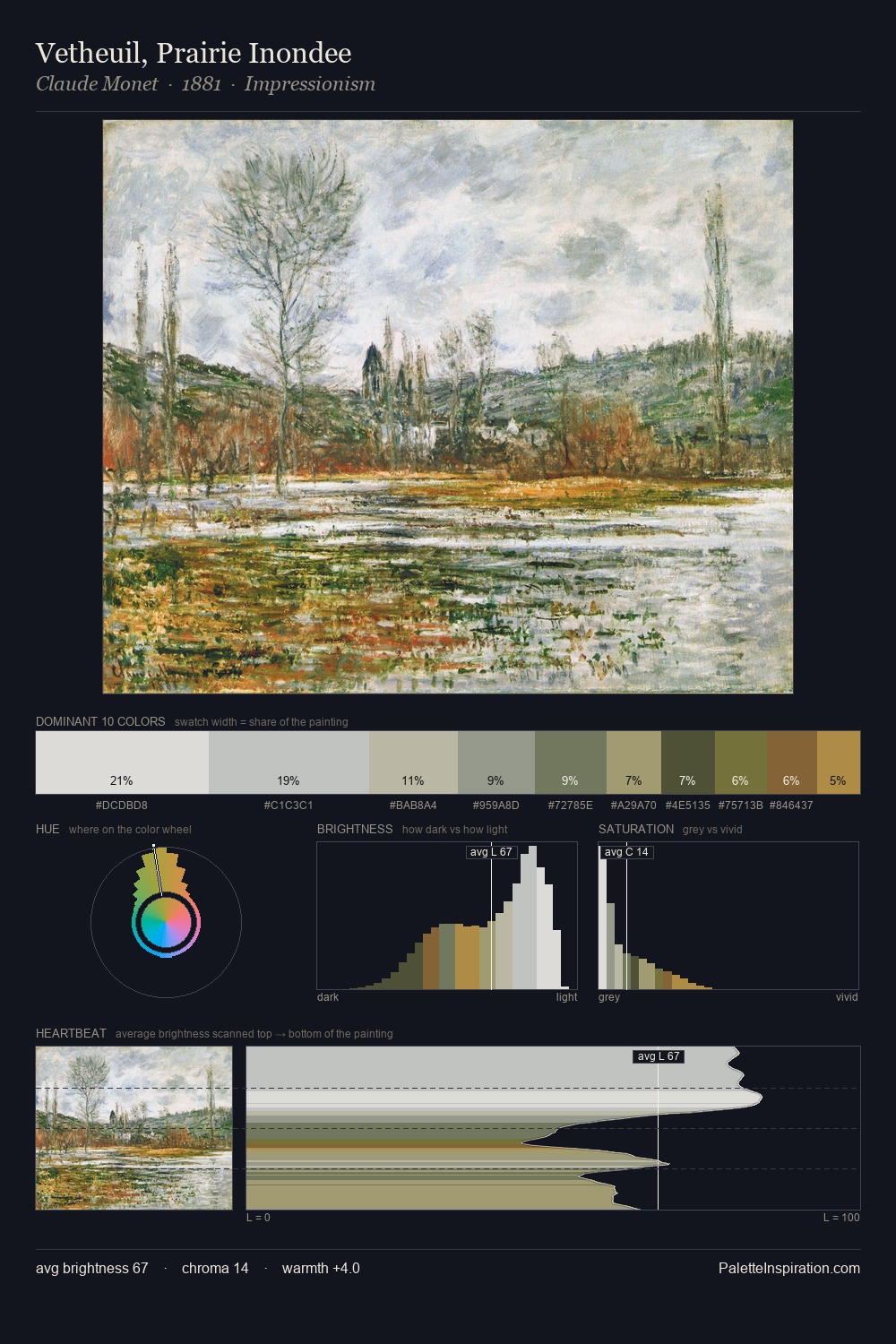
Adriaen van de Velde is high-key - luminous, open, and weighted toward light. Adriaen van de Velde builds on cool foundations: the palette favours the blue-cyan-green arc. The absence of saturated colour is itself an expressive choice: this is a palette of restraint and atmosphere. Only 7.5% is devoted to #727648, yet that small allocation delivers the palette's entire chromatic tension. The full value range is 55 units: broad enough to build convincing three-dimensional form. The mid-to-high key, cool bias, and moderate chroma point to outdoor observation - sky and diffused daylight as the dominant light source. In the context of Adriaen van de Velde's full range of palettes, group 1 represents one movement in an ongoing chromatic dialogue.
Example use cases
- garden centers
- natural beauty
- park & rec design
- sustainable fashion
- sustainability
I Love This!
Copy, export, or download for your project