Adriaen van de Velde Palette 5
Penumbral Caramel
Penumbral Partial shadow - the transitional zone between light and full dark, soft-edged.
Caramel Warm mid-brown - the color of cooked sugar, smooth and amber-toned.

Palette Analysis
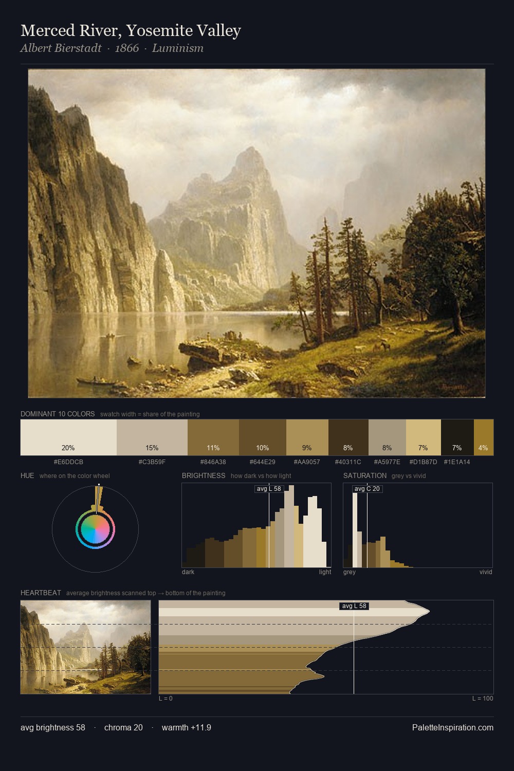
Adriaen van de Velde occupies the comfortable middle of the value scale, avoiding both extremes to hold the eye in a sustained middle grey. Warm and cool tones are held in careful balance - neither family dominates, creating tension and resolution simultaneously. All colours lean toward grey, building depth through value rather than colour punch. At 3.3%, #D2C194 carries the palette's sharpest chromatic charge: an accent that earns its place precisely because it is withheld. The value range of 53 units sits in the comfortable middle: enough depth, enough light, neither extreme. Palette 5 sits within the larger chromatic argument that Adriaen van de Velde's complete body of work advances.
Example use cases
- theater design
- jewelry brands
- tobacco-adjacent retail
- event branding
- film & entertainment
I Love This!
Use This Palette
Copy, export, or download for your project
Copy, export, or download for your project
Copy:
Download:
Share: