Jan Willem van Borselen Palette 3

Palette Analysis
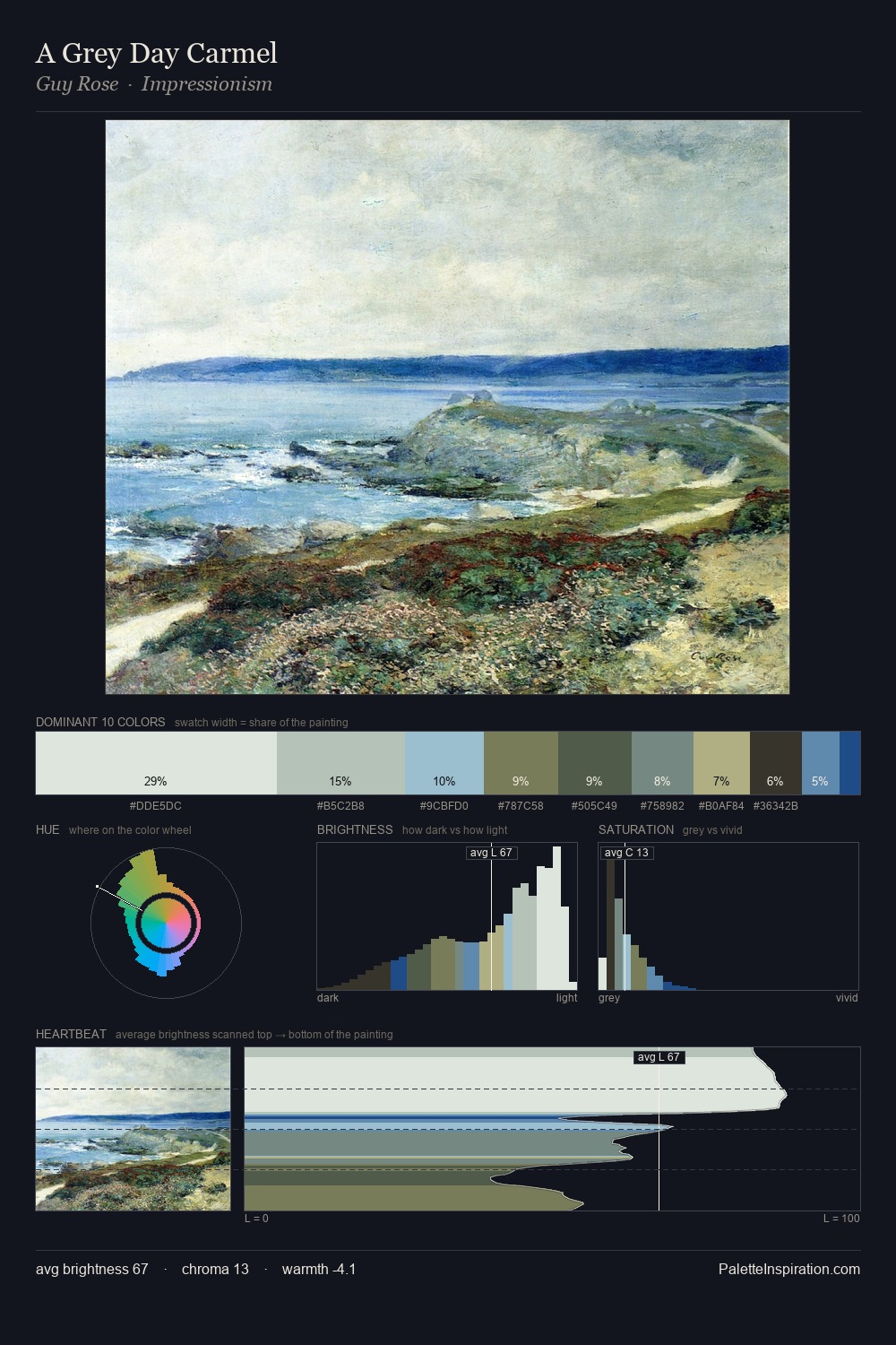
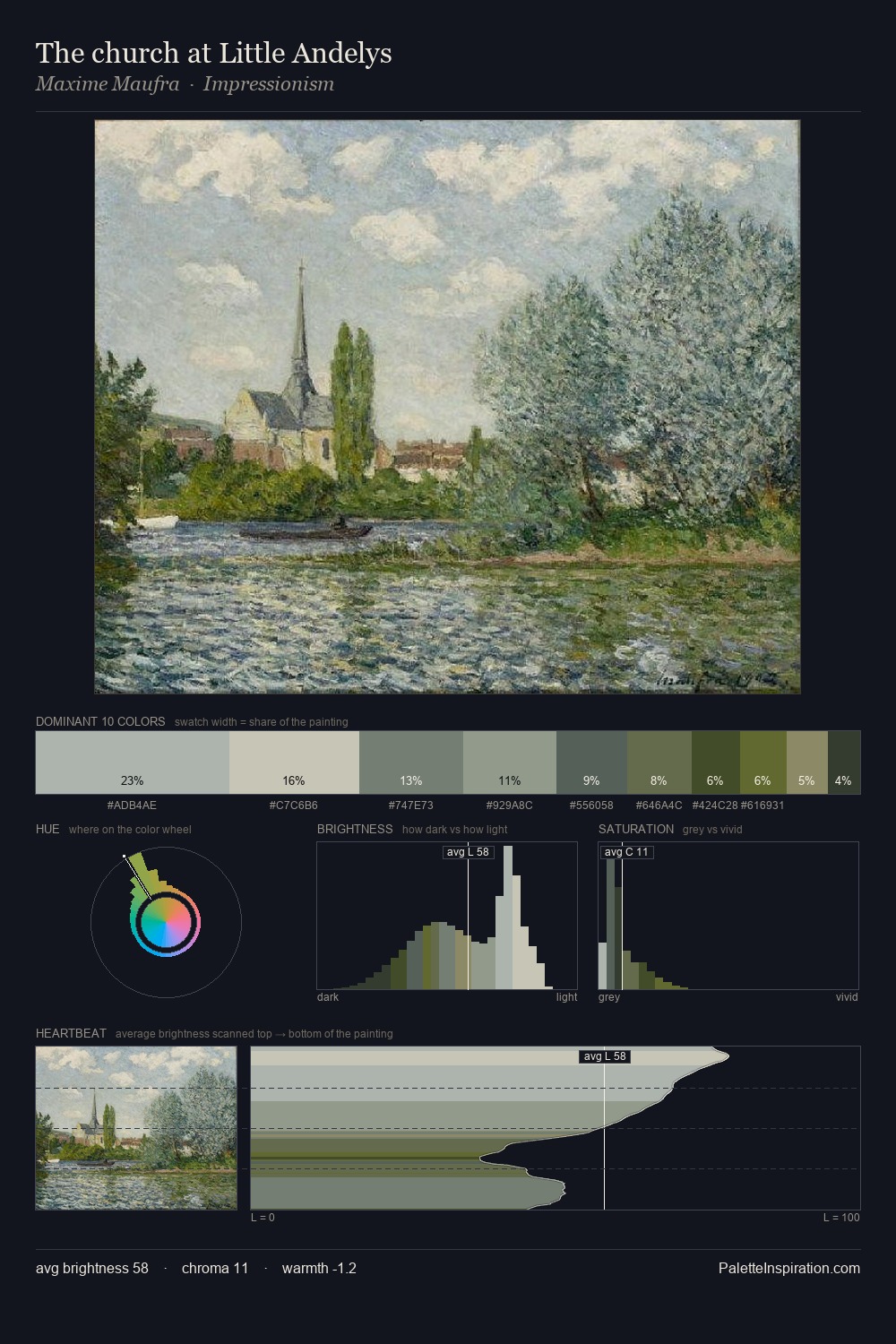
Jan Willem van Borselen occupies the comfortable middle of the value scale, avoiding both extremes to hold the eye in a sustained middle grey. Blues and teal-greys govern the palette, lending it an aquatic or atmospheric quality. Every colour is desaturated; the palette proceeds through near-neutrals and gently-coloured greys. Only 7.6% is devoted to #75714D, yet that small allocation delivers the palette's entire chromatic tension. At 53 units across the value scale, the palette keeps contrast readable without letting it dominate. High luminosity and cool temperature suggest the plein-air condition: unfiltered daylight and open sky. Jan Willem van Borselen's palette 3 carries its own internal logic while remaining in conversation with the artist's broader colour intelligence.
Example use cases
- exhibition design
- foundation branding
- estate management
- art education
- museums & galleries
I Love This!
Copy, export, or download for your project