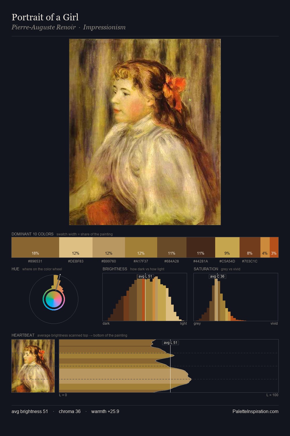
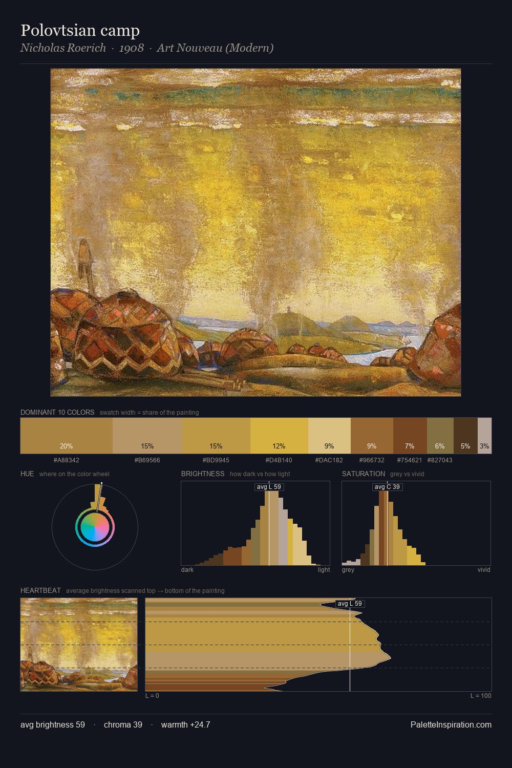
Jan Willem van Borselen Palette 1

Palette Analysis
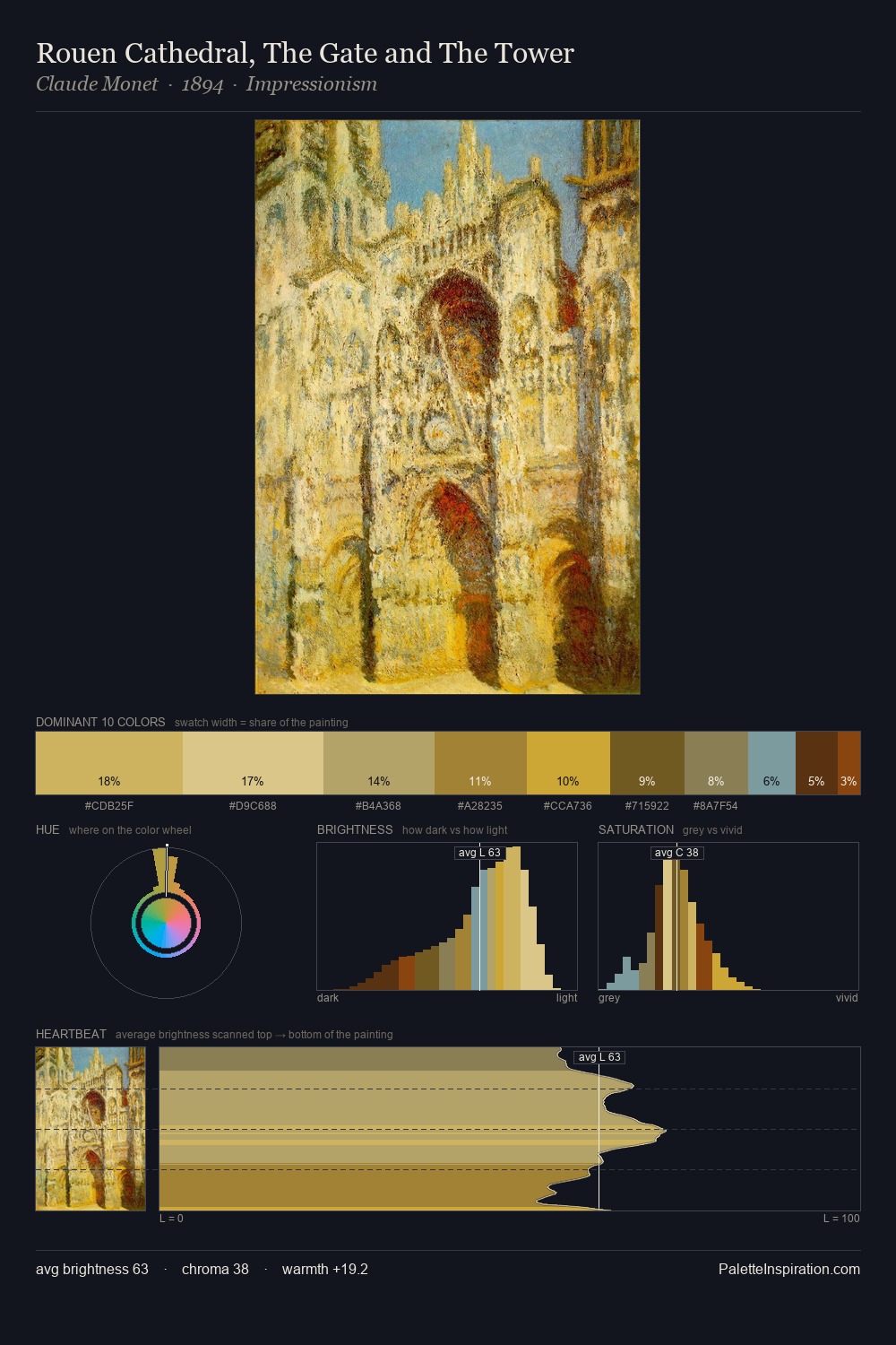
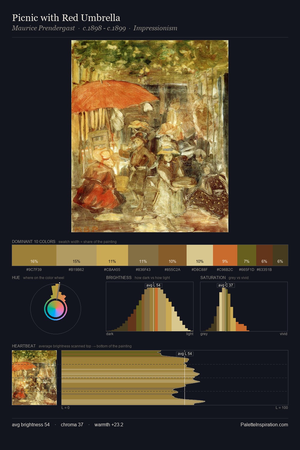
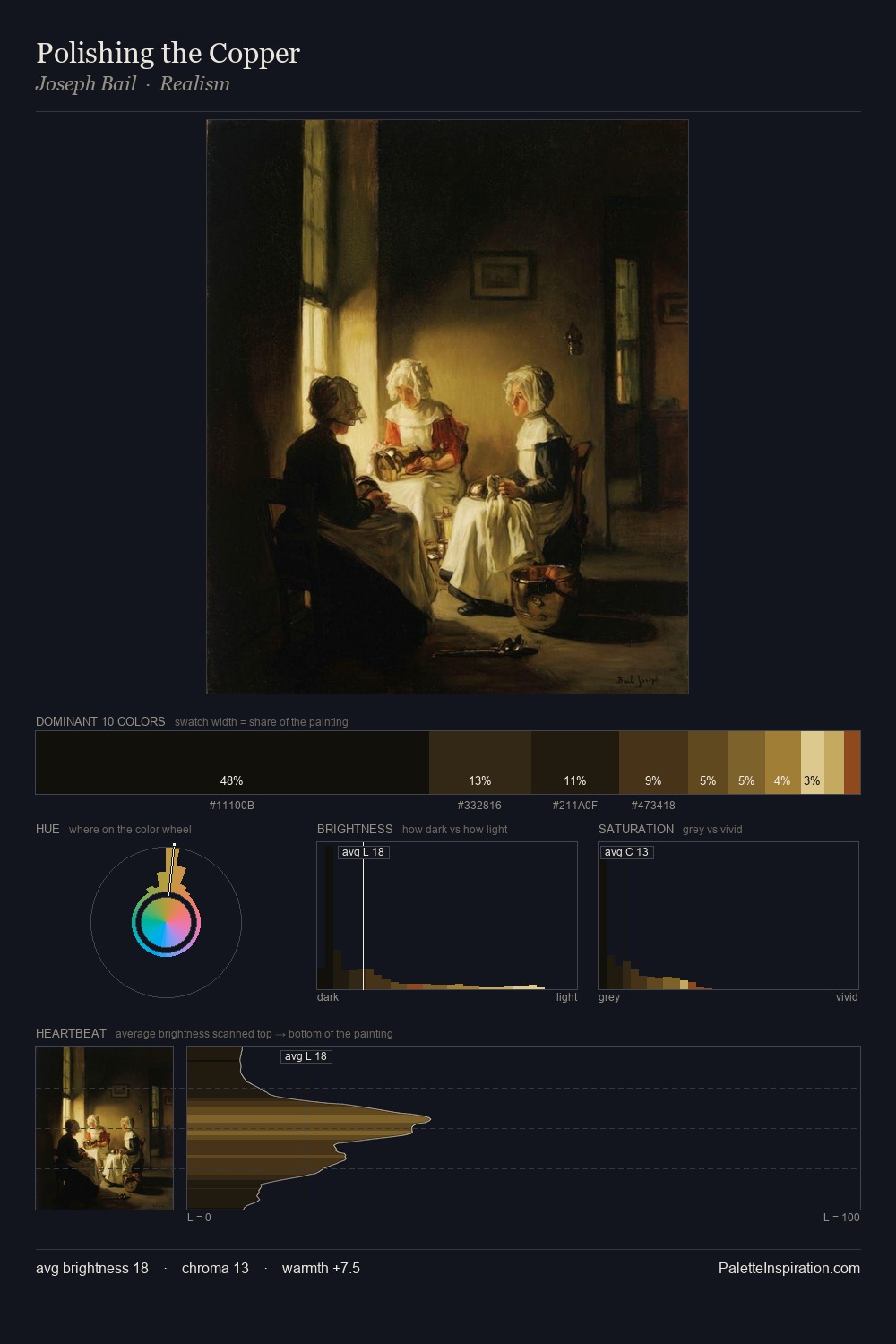
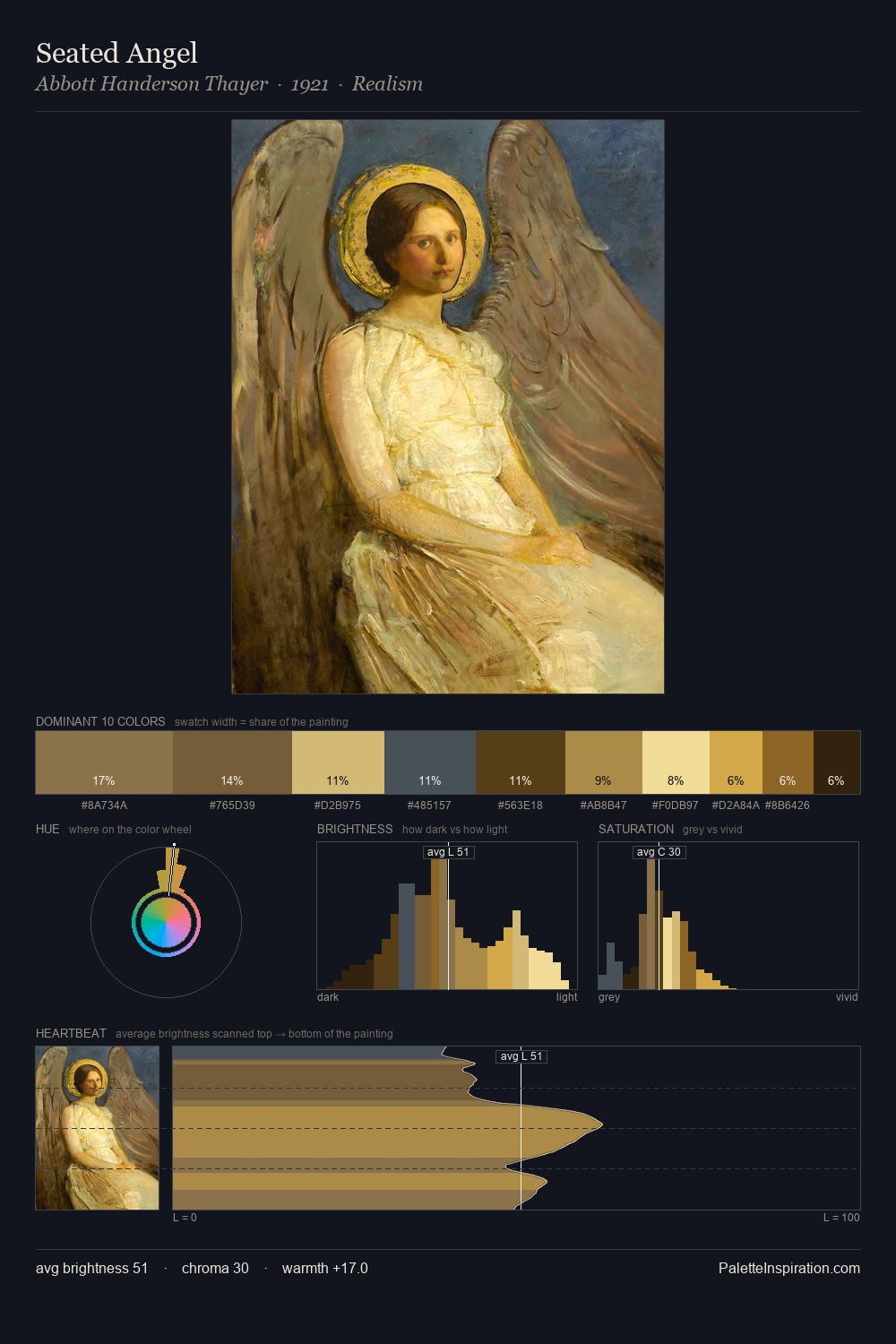
Jan Willem van Borselen sits in the centre of the value range, lending the palette a sense of even, sustained light. A distinctly cool atmosphere runs through this palette: sky, water, and mist given colour form. Chroma is held at a comfortable level - distinct colours, but no single hue is allowed to overwhelm. The most saturated colour, #66431C, covers 9.2% of the surface: too much to call an accent, too strong to ignore. The full value range is 55 units: broad enough to build convincing three-dimensional form. The palette has the character of outdoor light: cool, mid-bright, with colour rendered faithfully rather than expressively. In the context of Jan Willem van Borselen's full range of palettes, group 1 represents one movement in an ongoing chromatic dialogue.
Example use cases
- publishing
- corporate identity
- consumer apps
- hospitality
- design agencies
I Love This!
Copy, export, or download for your project