Jan Willem van Borselen Palette 5

Palette Analysis
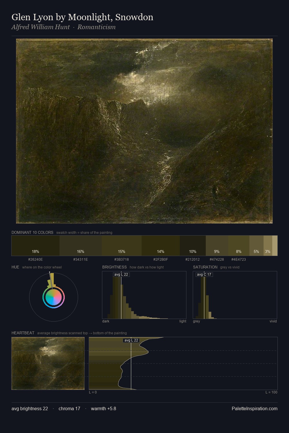
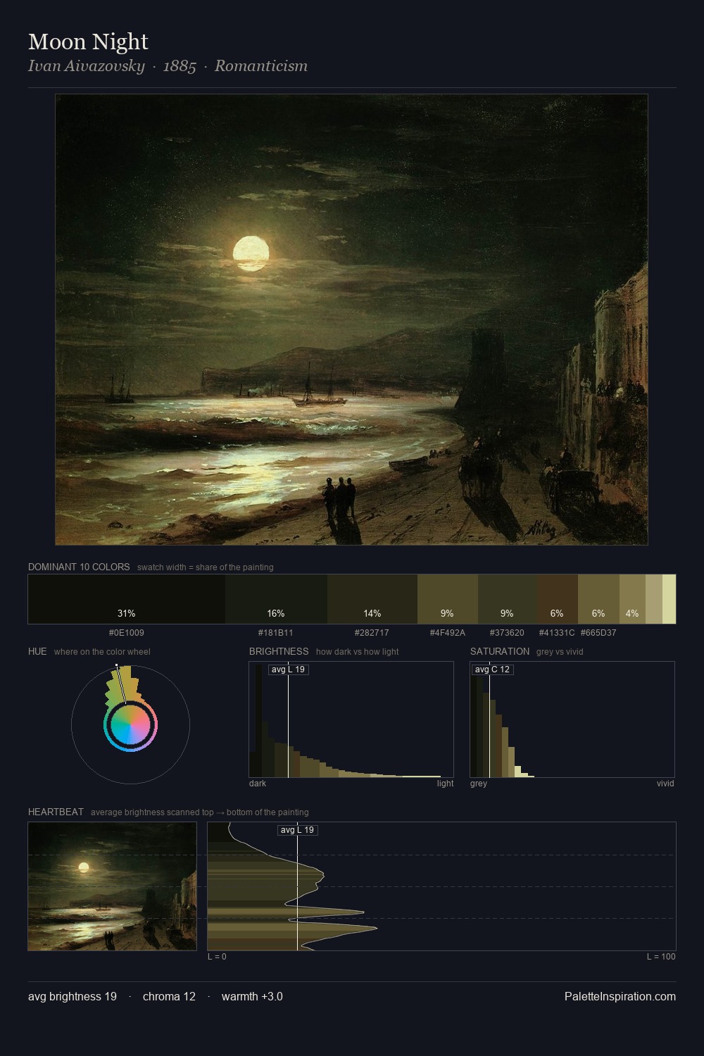
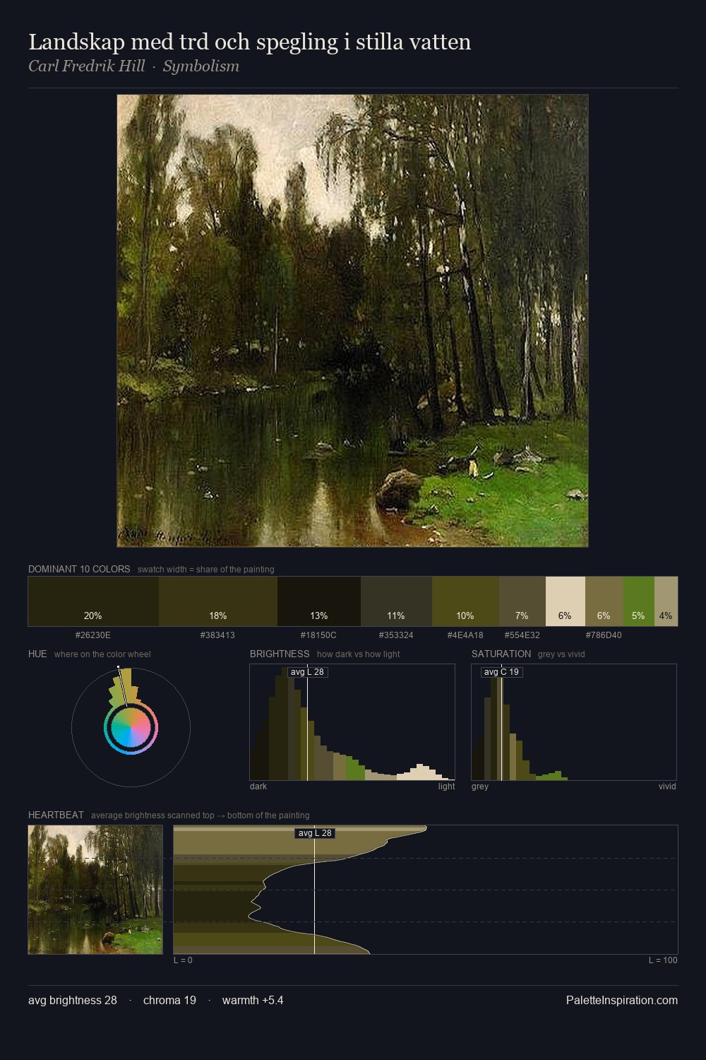
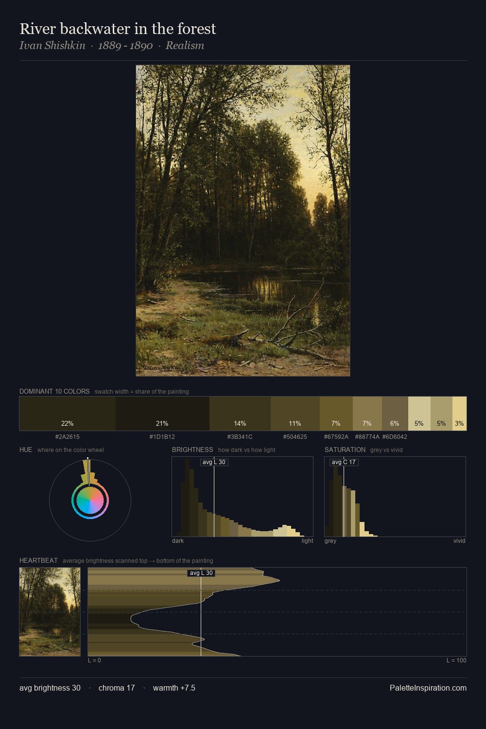
Jan Willem van Borselen distributes its values across the middle register, creating harmony without high contrast. Blues and teal-greys govern the palette, lending it an aquatic or atmospheric quality. Muted throughout, the palette achieves its effects through value and temperature rather than chromatic force. The highest-chroma note - #1B1406 - appears at just 6.7%, deployed as a precision accent against the quieter ground. Value range is moderate at 53 units - enough contrast for legibility, not so much as to fragment the tonal unity. High luminosity and cool temperature suggest the plein-air condition: unfiltered daylight and open sky. In the context of Jan Willem van Borselen's full range of palettes, group 5 represents one movement in an ongoing chromatic dialogue.
Example use cases
- theater design
- jewelry brands
- tobacco-adjacent retail
- event branding
- film & entertainment
I Love This!
Copy, export, or download for your project