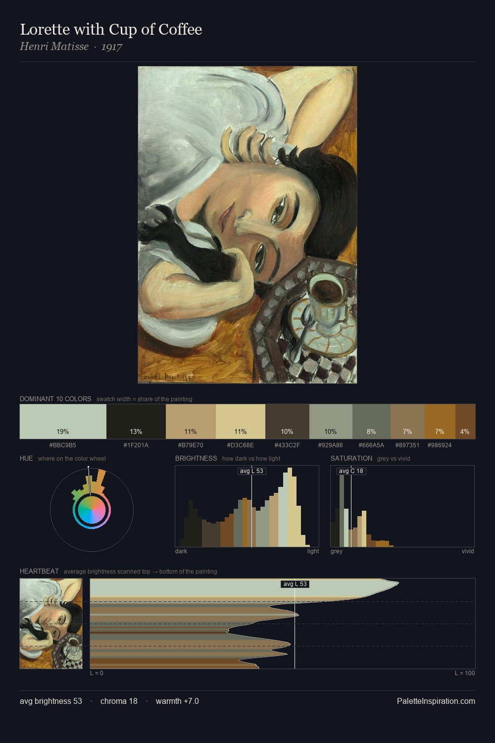
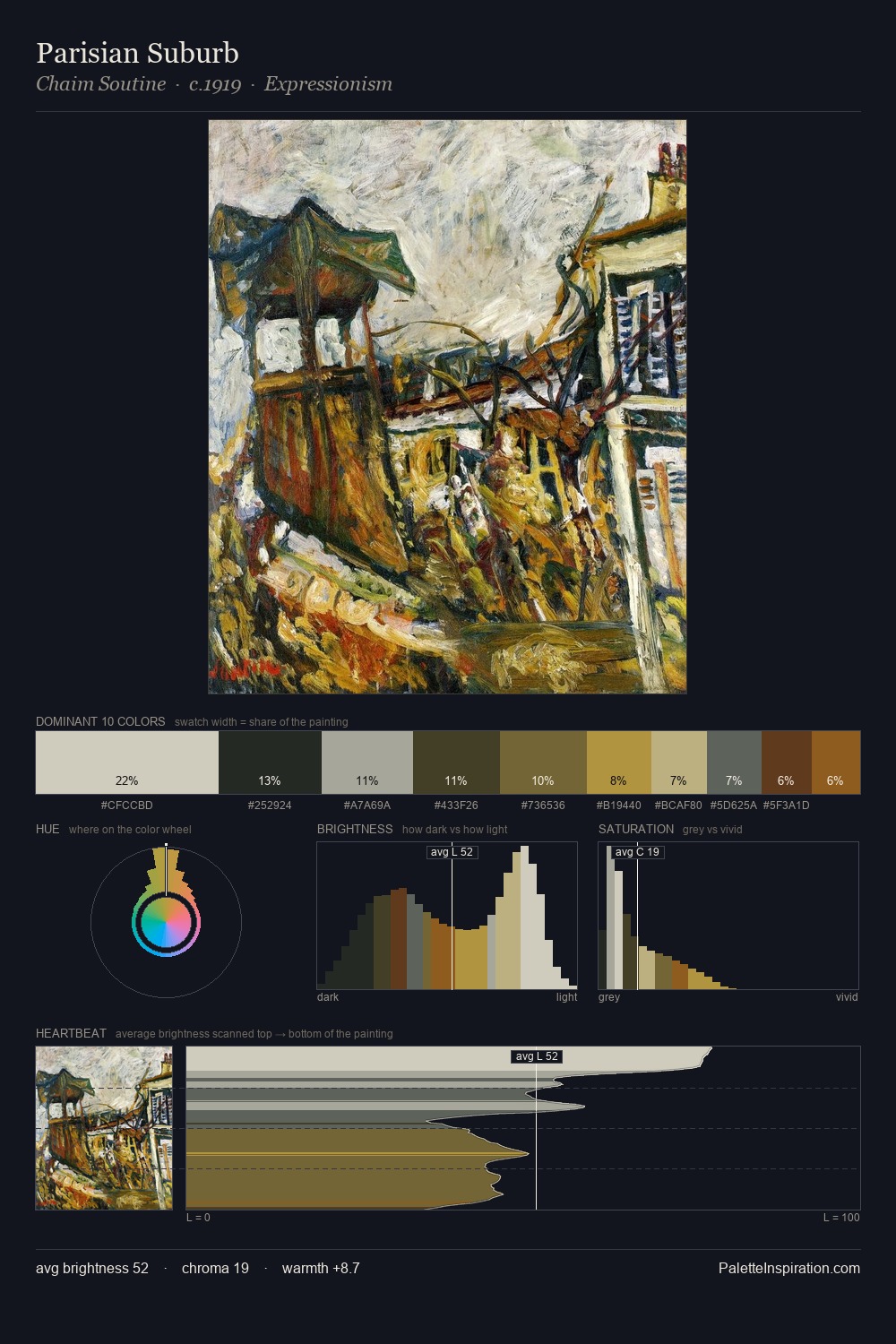
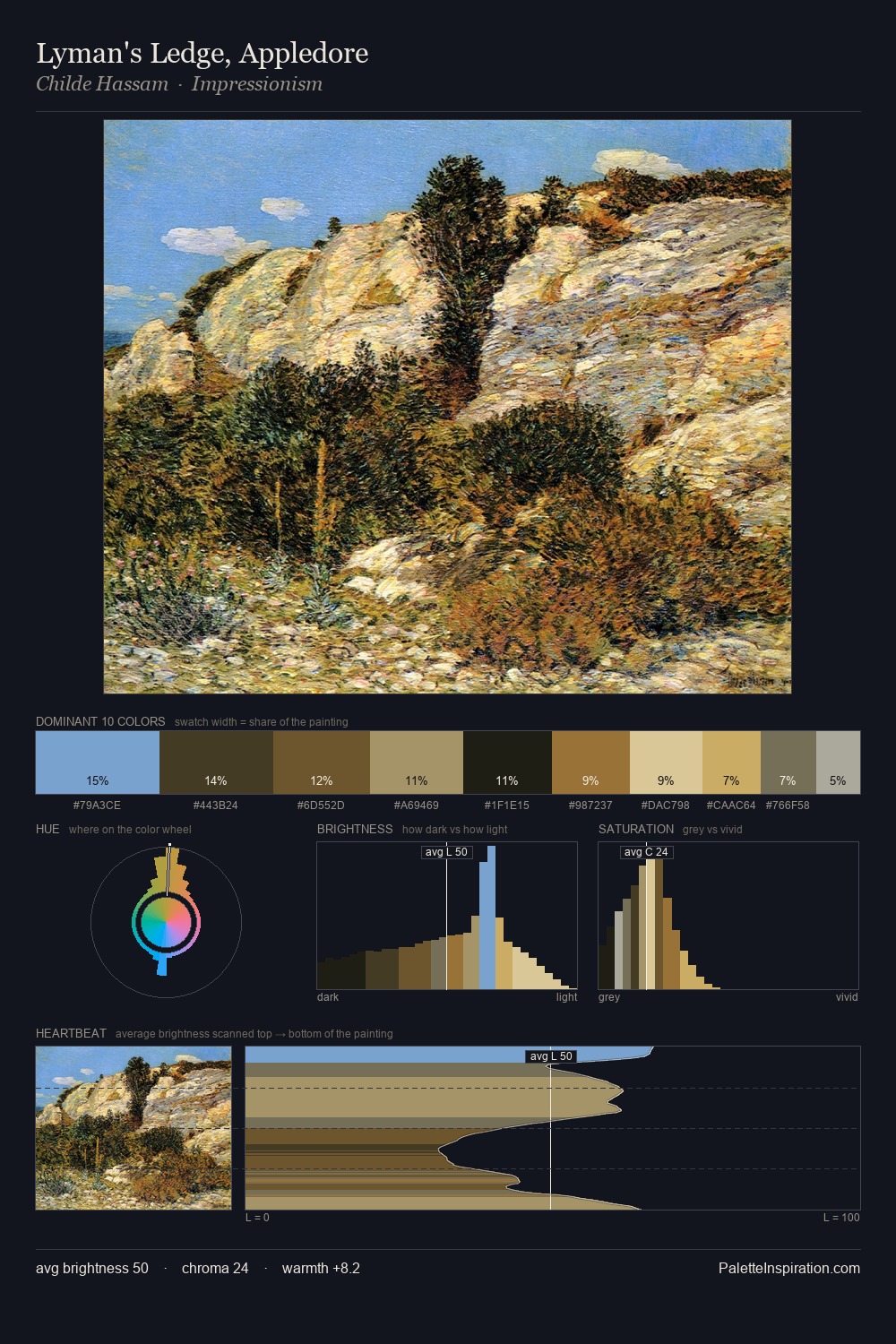
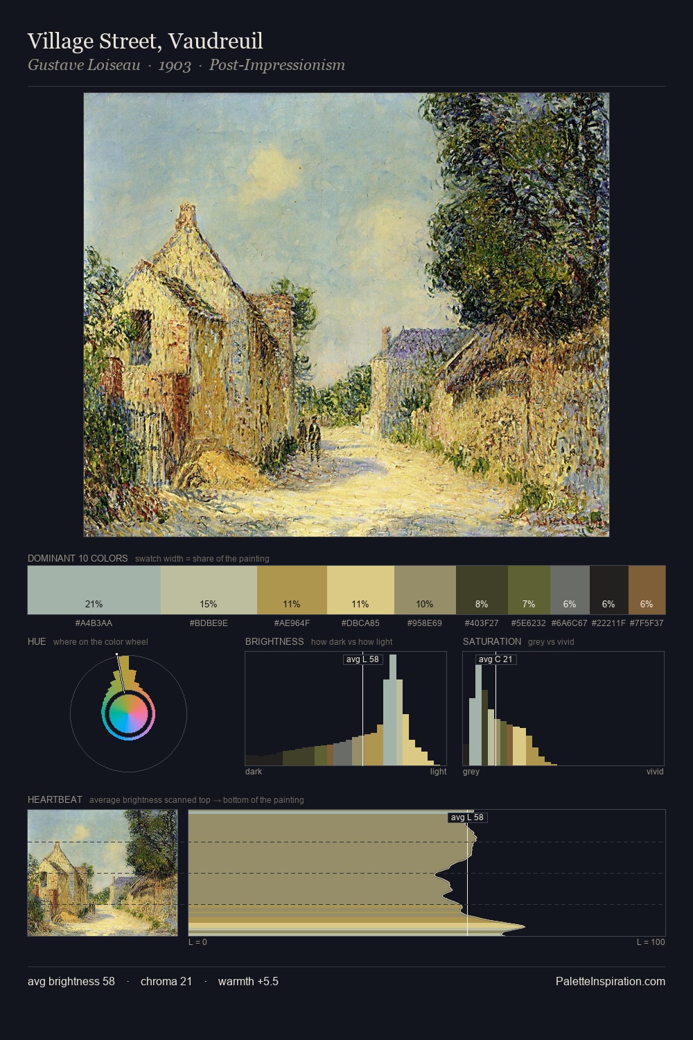
Jan Willem van Borselen Master Palette

Palette Analysis
Jan Willem van Borselen distributes its values across the middle register, creating harmony without high contrast. Jan Willem van Borselen tilts toward cool - blues and silver-greys carry the structural weight. Chroma is kept low across all colours, producing the soft, enveloping quality that characterises tonal painting. At 8.0%, #BAA159 carries the palette's sharpest chromatic charge: an accent that earns its place precisely because it is withheld. 58 units of value range underpin the palette's structural clarity: the eye always knows where light falls. The mid-to-high key, cool bias, and moderate chroma point to outdoor observation - sky and diffused daylight as the dominant light source. This is the light Jan Willem van Borselen preferred, made measurable.
Example use cases
- professional services
- specialty retail
- photography agencies
- tech products
- art galleries
I Love This!
Copy, export, or download for your project