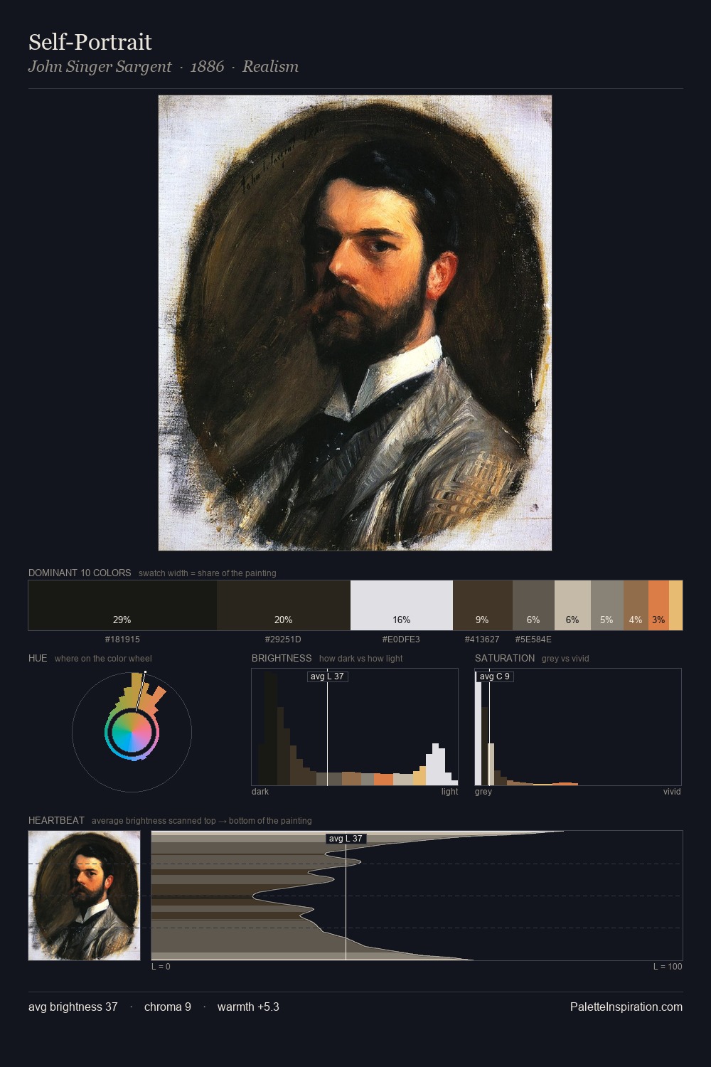
James Tissot Palette 7

Palette Analysis
James Tissot distributes its values across the middle register, creating harmony without high contrast. James Tissot builds on cool foundations: the palette favours the blue-cyan-green arc. The absence of saturated colour is itself an expressive choice: this is a palette of restraint and atmosphere. Only 1.1% is devoted to #D15E29, yet that small allocation delivers the palette's entire chromatic tension. From deepest dark to palest light, the palette traverses 72 units of the value scale - a span that creates natural depth. The mid-to-high key, cool bias, and moderate chroma point to outdoor observation - sky and diffused daylight as the dominant light source. This is palette 7 of James Tissot's sequence - a single chapter in a chromatic story told across many works.
Example use cases
- ceramics & pottery
- boutique hospitality
- menswear
- heritage food brands
- craft & artisan brands
I Love This!
Copy, export, or download for your project