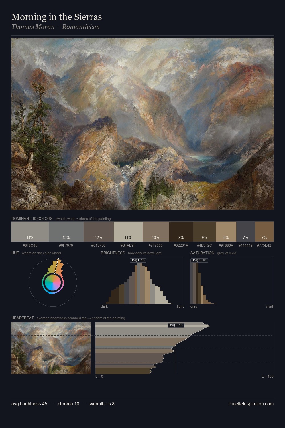
James Tissot Palette 11
Veiled Parchment
Veiled Partially obscured light - mid-dark with a hazy, scrim-filtered quality.
Parchment Aged warm neutral - the color of old manuscript parchment, tan and slightly yellowed.

Palette Analysis
James Tissot occupies the comfortable middle of the value scale, avoiding both extremes to hold the eye in a sustained middle grey. James Tissot orchestrates warmth above all else - reds, ambers, and siennas take the lead. Chroma is kept low across all colours, producing the soft, enveloping quality that characterises tonal painting. The most saturated colour, #AA8D65, is reserved to 2.6% of the surface, where it acts as a focal punctuation. At 43 units across the value scale, the palette keeps contrast readable without letting it dominate. This is palette 11 of James Tissot's sequence - a single chapter in a chromatic story told across many works.
Example use cases
- exhibition design
- foundation branding
- estate management
- art education
- museums & galleries
I Love This!
Use This Palette
Copy, export, or download for your project
Copy, export, or download for your project
Copy:
Download:
Share: