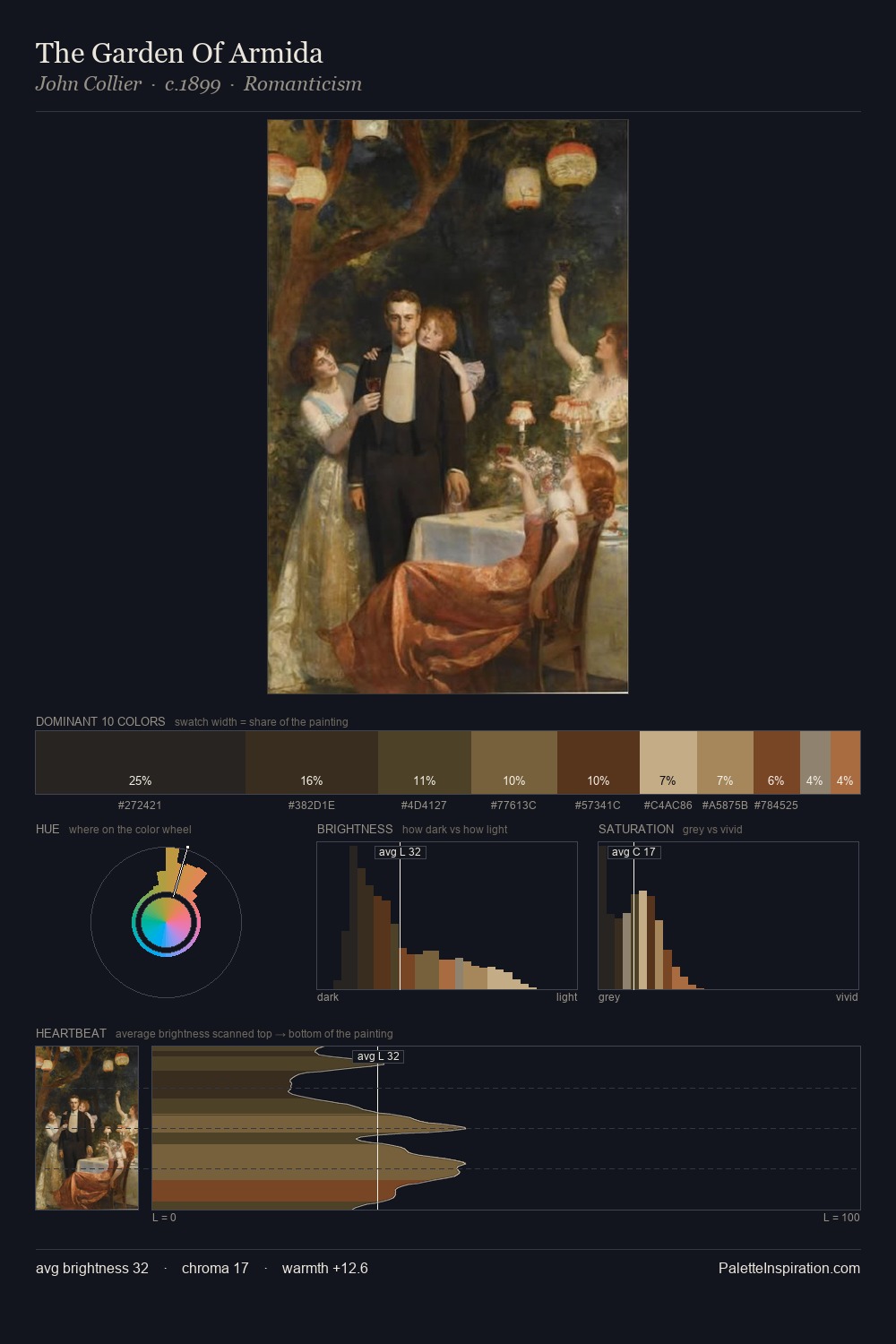
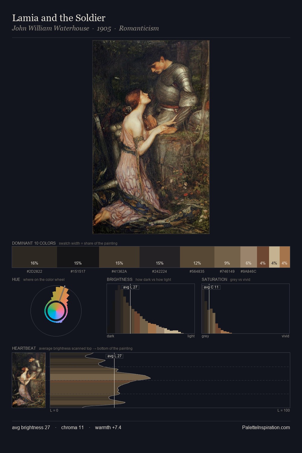
James Tissot Palette 19
Shadowed Bister
Shadowed Low-key - values weighted toward shadow, the palette of dim interiors and overcast skies.
Bister Dark warm brown - a traditional ink and wash pigment made from wood soot.

Palette Analysis
James Tissot distributes its values across the middle register, creating harmony without high contrast. Temperature reads distinctly warm: the reds and earth tones from James Tissot carry the compositional weight. All colours lean toward grey, building depth through value rather than colour punch. #5F3B29 delivers the chromatic peak at only 6.8% - a small shot of colour with outsized visual impact. 50 units of value spread create a palette that is varied but unified - contrast in the service of harmony. Palette 19 sits within the larger chromatic argument that James Tissot's complete body of work advances.
Example use cases
- theater design
- jewelry brands
- tobacco-adjacent retail
- event branding
- film & entertainment
I Love This!
Use This Palette
Copy, export, or download for your project
Copy, export, or download for your project
Copy:
Download:
Share: