James Tissot Palette 1
Gleaming Calico
Gleaming Bright and polished - high-key, often warm, suggesting reflective or luminous surfaces.
Calico Warm speckled neutral - the color of unbleached cotton, mottled and soft.

Palette Analysis
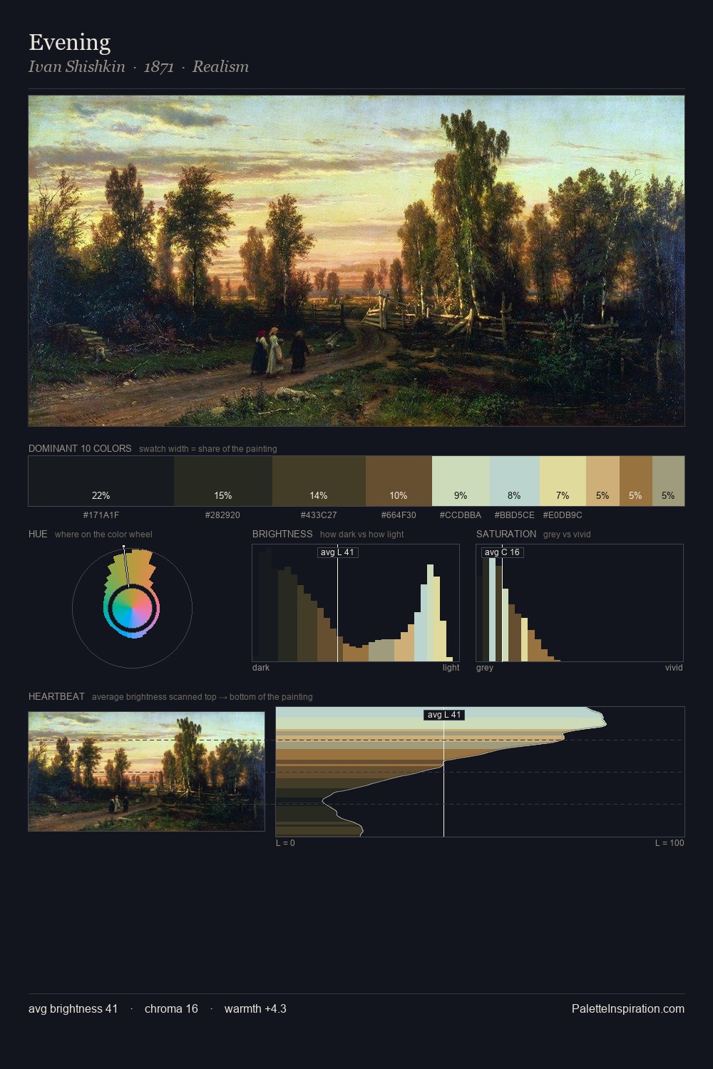
James Tissot is high-key - luminous, open, and weighted toward light. James Tissot builds on cool foundations: the palette favours the blue-cyan-green arc. Saturation is measured and controlled, giving the palette presence without visual aggression. The most saturated colour, #C2B46E, is reserved to 10.0% of the surface, where it acts as a focal punctuation. 54 units of value spread create a palette that is varied but unified - contrast in the service of harmony. High luminosity and cool temperature suggest the plein-air condition: unfiltered daylight and open sky. James Tissot's palette 1 carries its own internal logic while remaining in conversation with the artist's broader colour intelligence.
Example use cases
- professional services
- specialty retail
- photography agencies
- tech products
- art galleries
I Love This!
Use This Palette
Copy, export, or download for your project
Copy, export, or download for your project
Copy:
Download:
Share: