James Taylor Harwood Palette 6

Palette Analysis
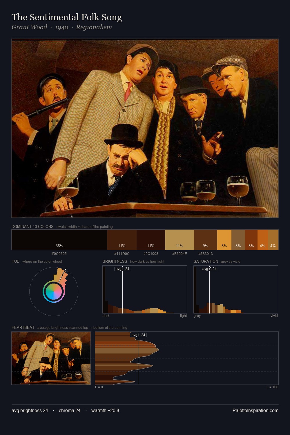
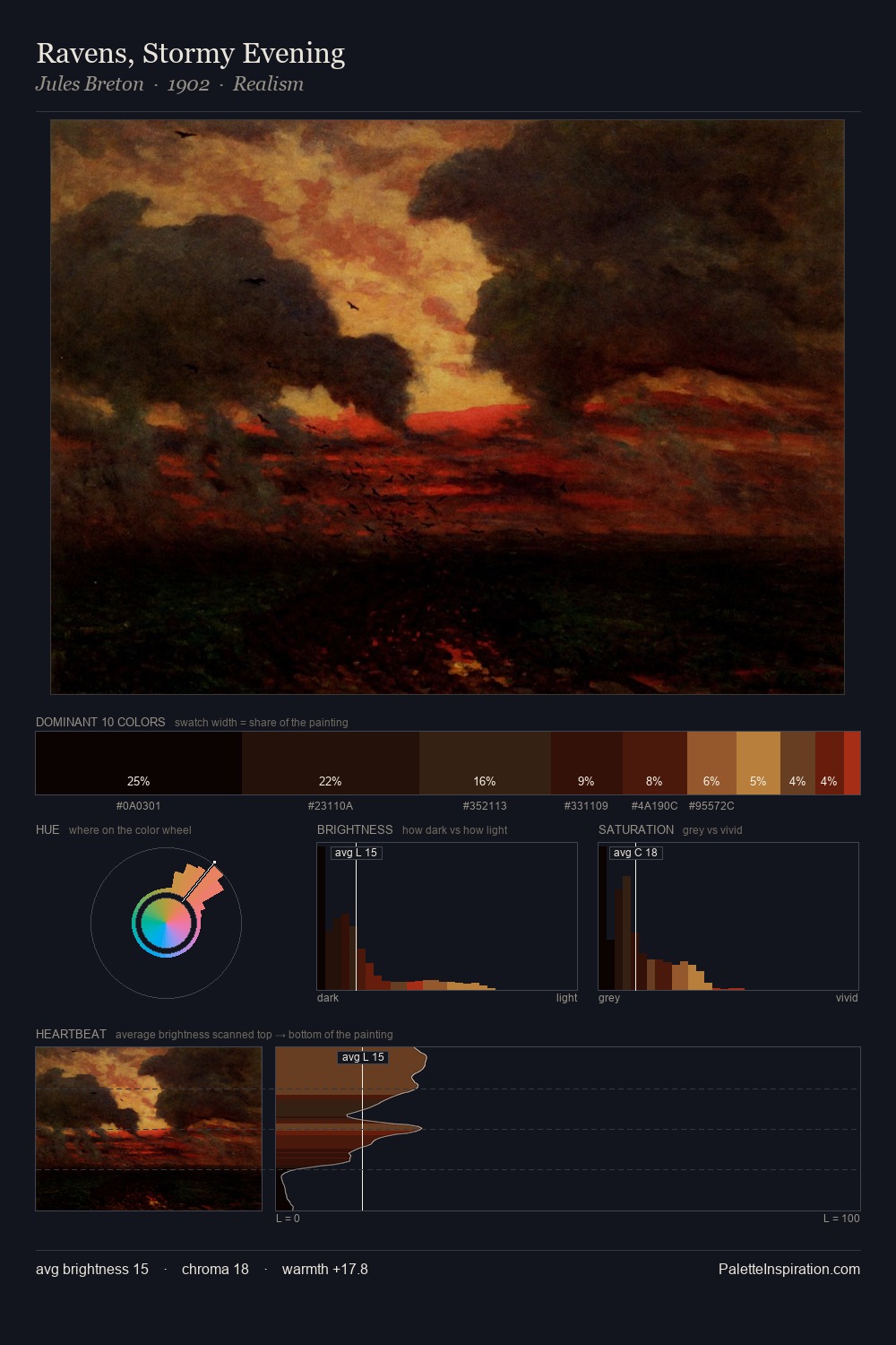
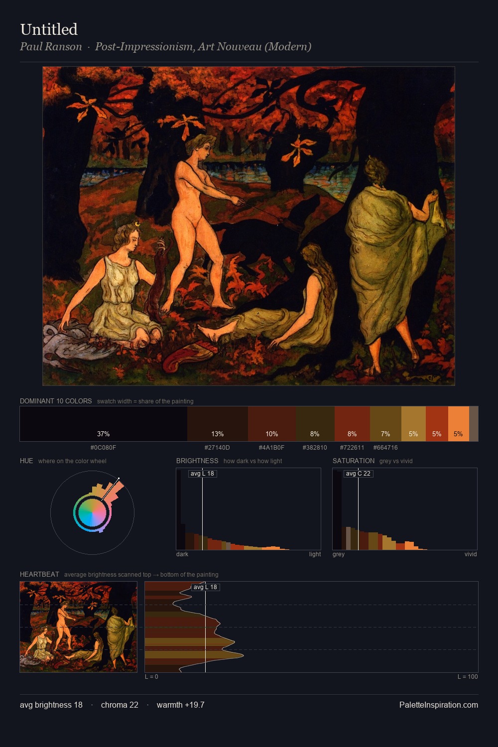
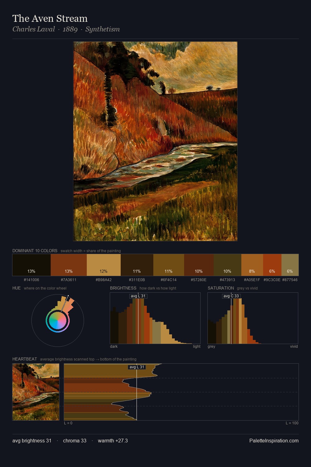
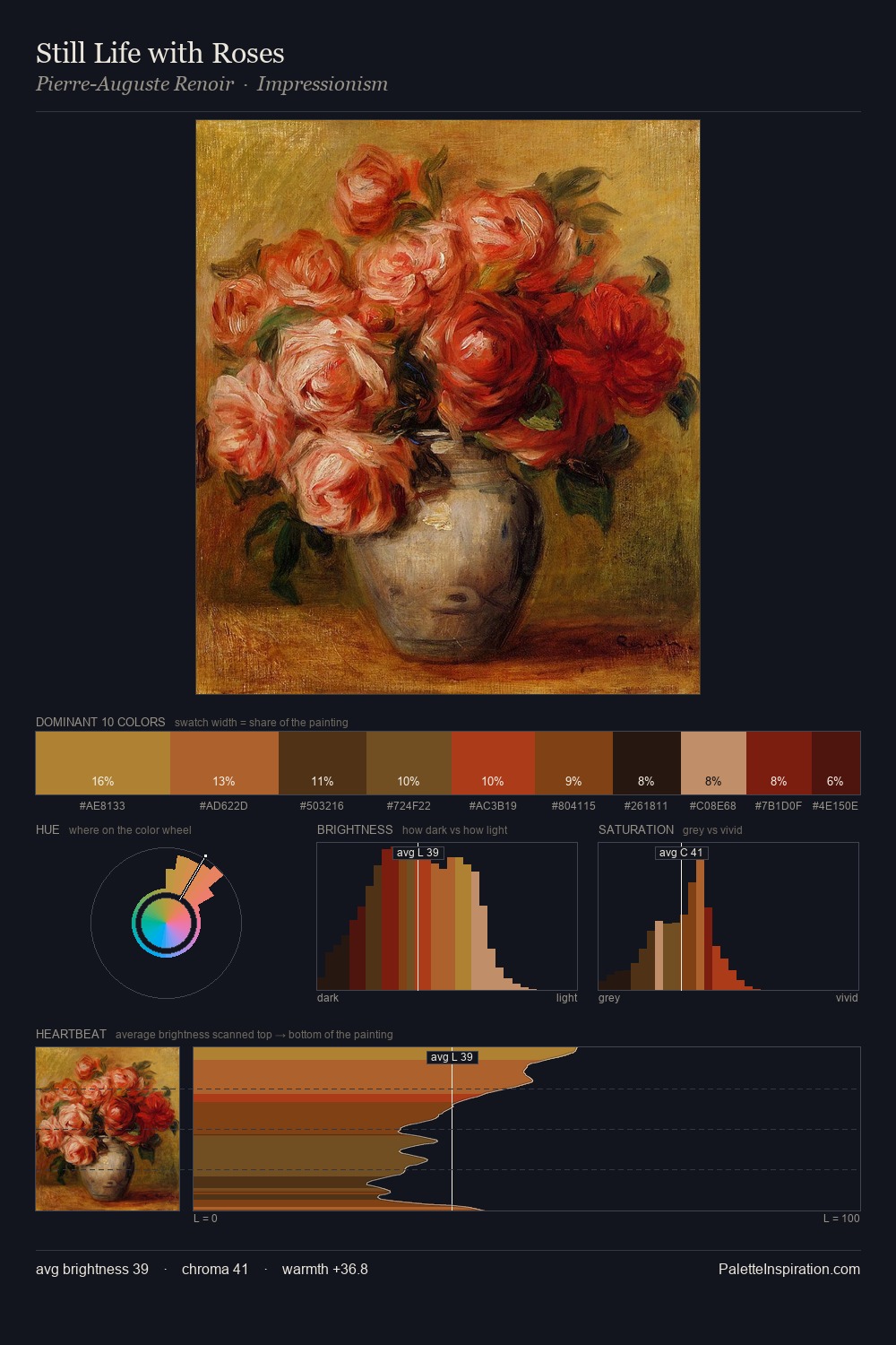
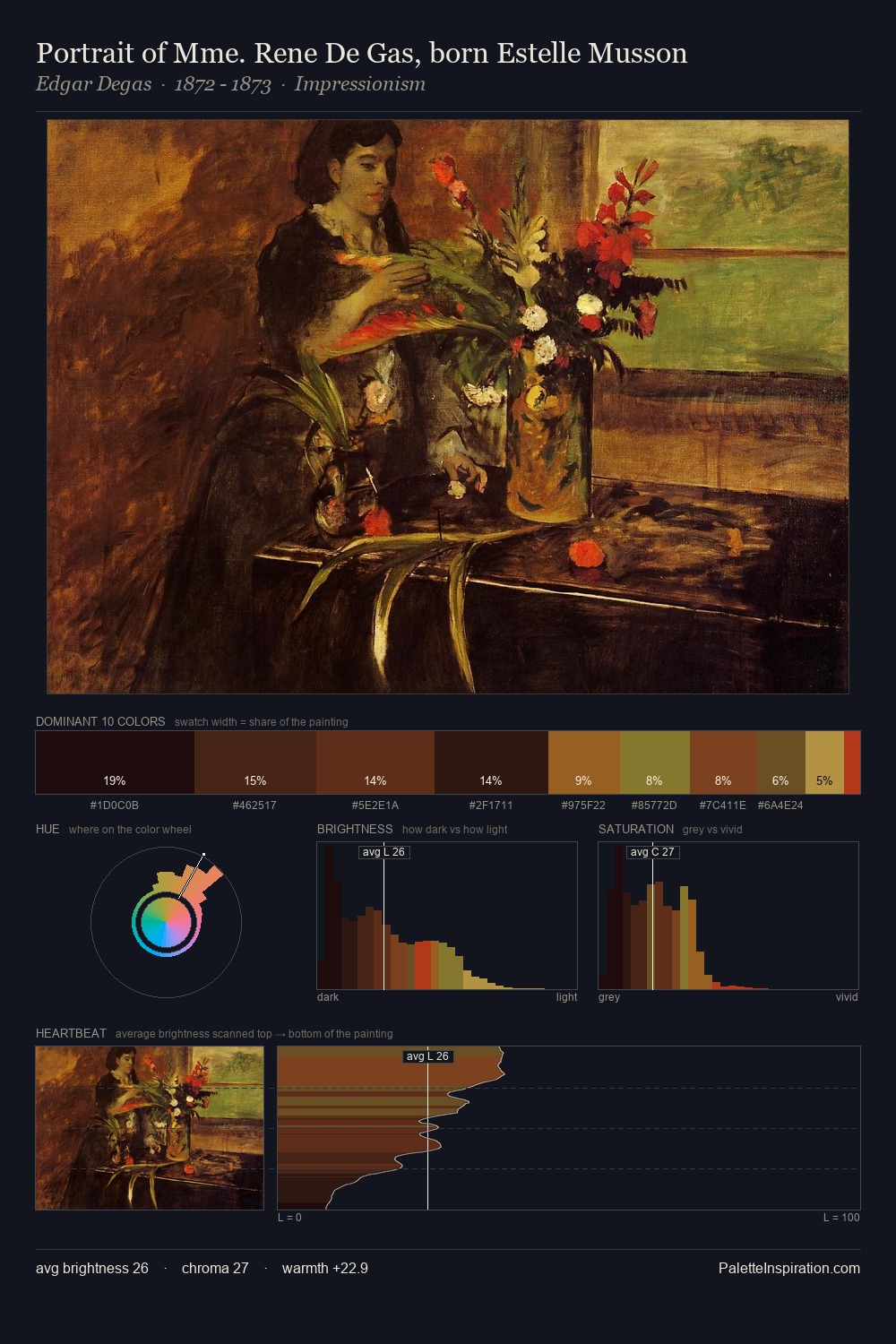
James Taylor Harwood works almost entirely in the lower half of the value scale, privileging depth over brilliance. Warm hues command this palette; James Taylor Harwood favours the reds, oranges, and yellows of firelight and earth. Mid-range chroma keeps the palette grounded - colourful but not strident. 39.9% of the palette belongs to #0D0302, a concentration that makes it the unmistakable visual centre. #C04306 functions as the palette's exclamation mark: highest chroma, lowest percentage (3.6%). The value range of 53 units sits in the comfortable middle: enough depth, enough light, neither extreme. Low-key, warm, and muted: the timeless academic formula for interior light, chiaroscuro, and human form. Palette 6 sits within the larger chromatic argument that James Taylor Harwood's complete body of work advances.
Example use cases
- premium streaming
- cocktail bars
- fashion campaigns
- book covers
- music labels
I Love This!
Copy, export, or download for your project