James Taylor Harwood Palette 1

Palette Analysis
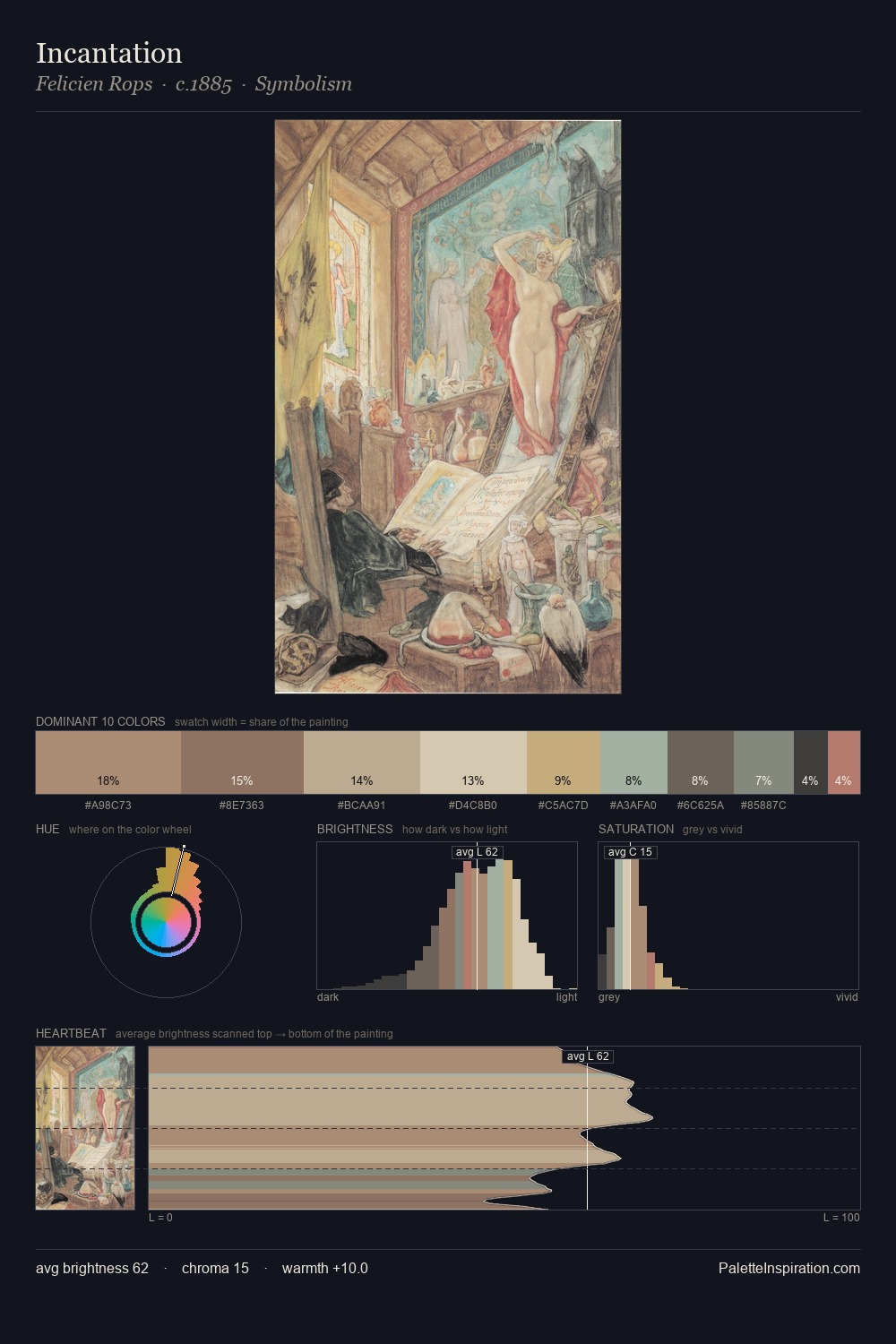
James Taylor Harwood is high-key - luminous, open, and weighted toward light. Temperature is cool-dominant, with blue and green families claiming the largest areas. Saturation is deliberately withheld - the beauty here lies in the near-monochromatic gradations rather than colour difference. At 9.6%, #AF8777 carries the palette's sharpest chromatic charge: an accent that earns its place precisely because it is withheld. The palette spans 46 value units: a measured range that delivers coherence over drama. The mid-to-high key, cool bias, and moderate chroma point to outdoor observation - sky and diffused daylight as the dominant light source. Palette 1 sits within the larger chromatic argument that James Taylor Harwood's complete body of work advances.
Example use cases
- exhibition design
- foundation branding
- estate management
- art education
- museums & galleries
I Love This!
Copy, export, or download for your project