James Taylor Harwood Palette 2
Muted Parchment
Muted Deliberately desaturated - chroma pulled toward gray, the restraint of tonal painting.
Parchment Aged warm neutral - the color of old manuscript parchment, tan and slightly yellowed.

Palette Analysis
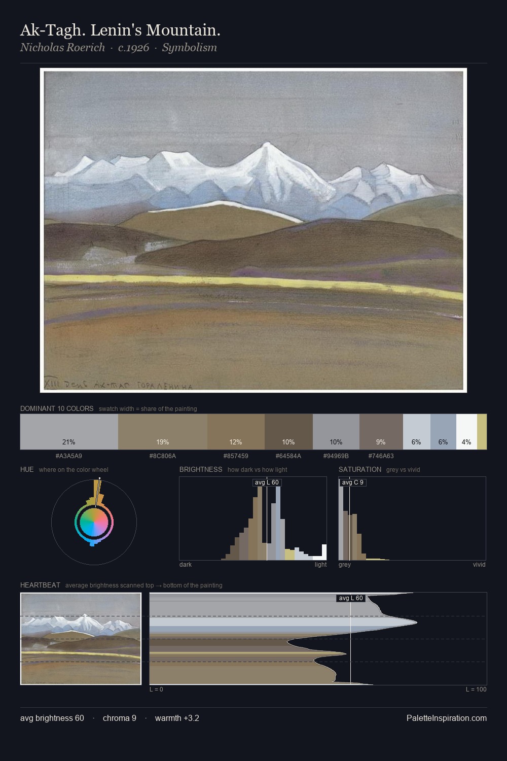
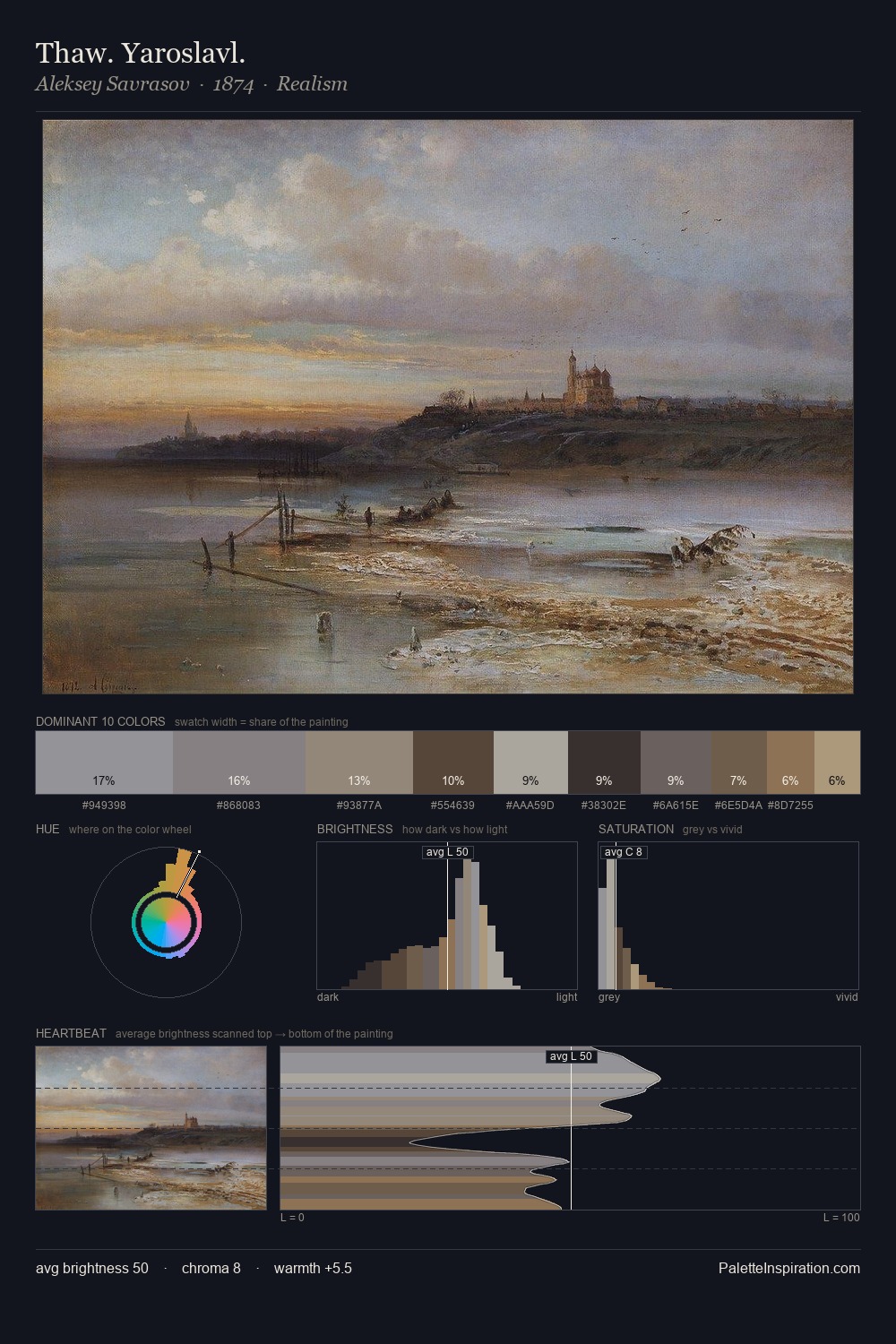
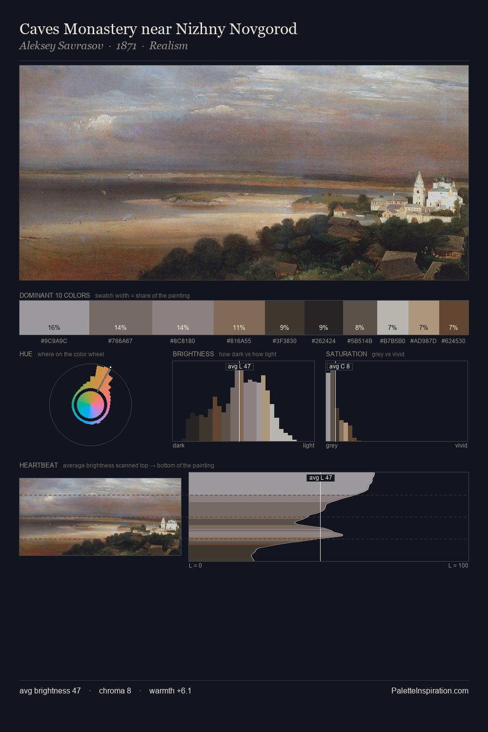
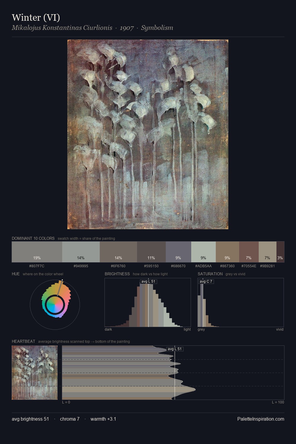
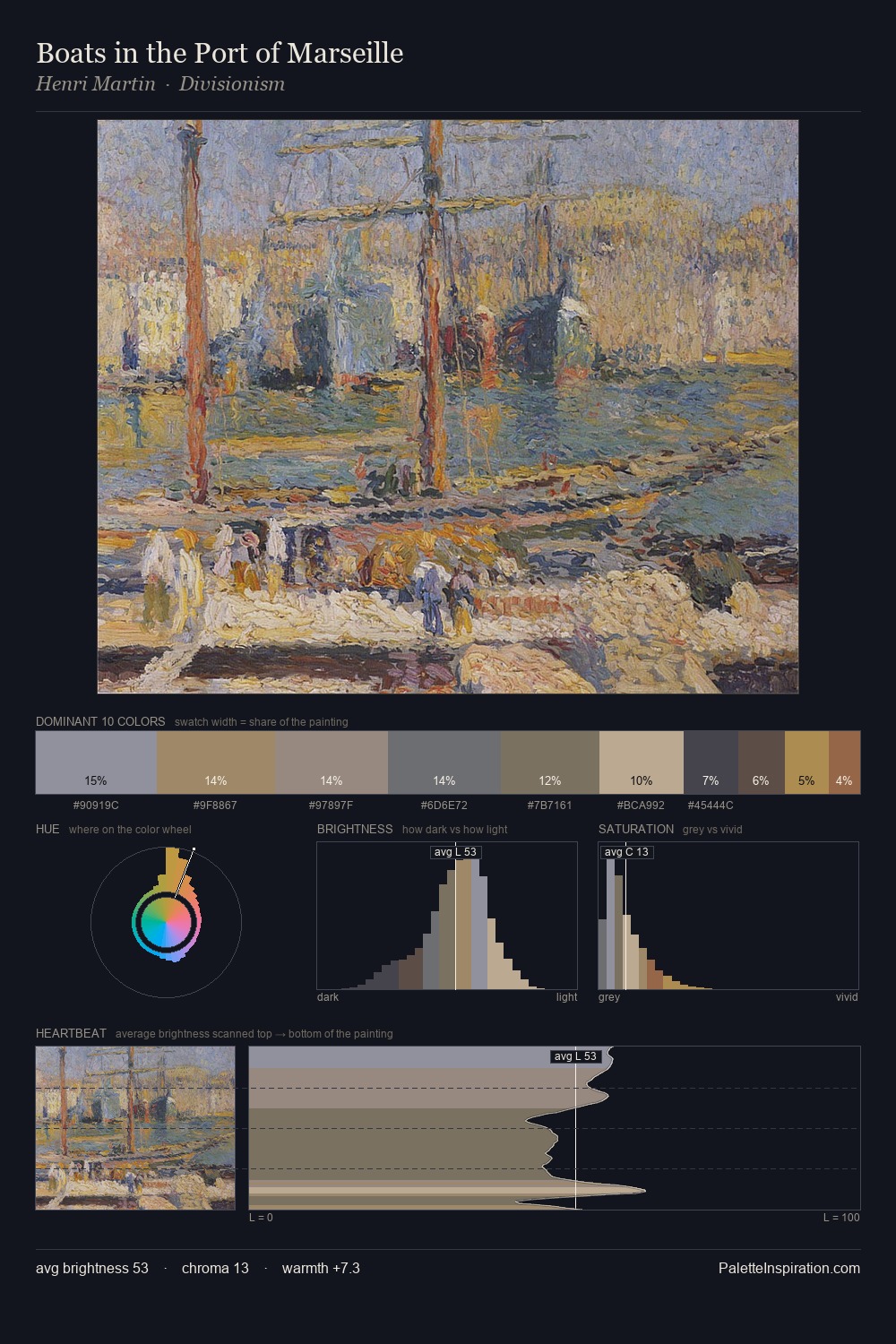
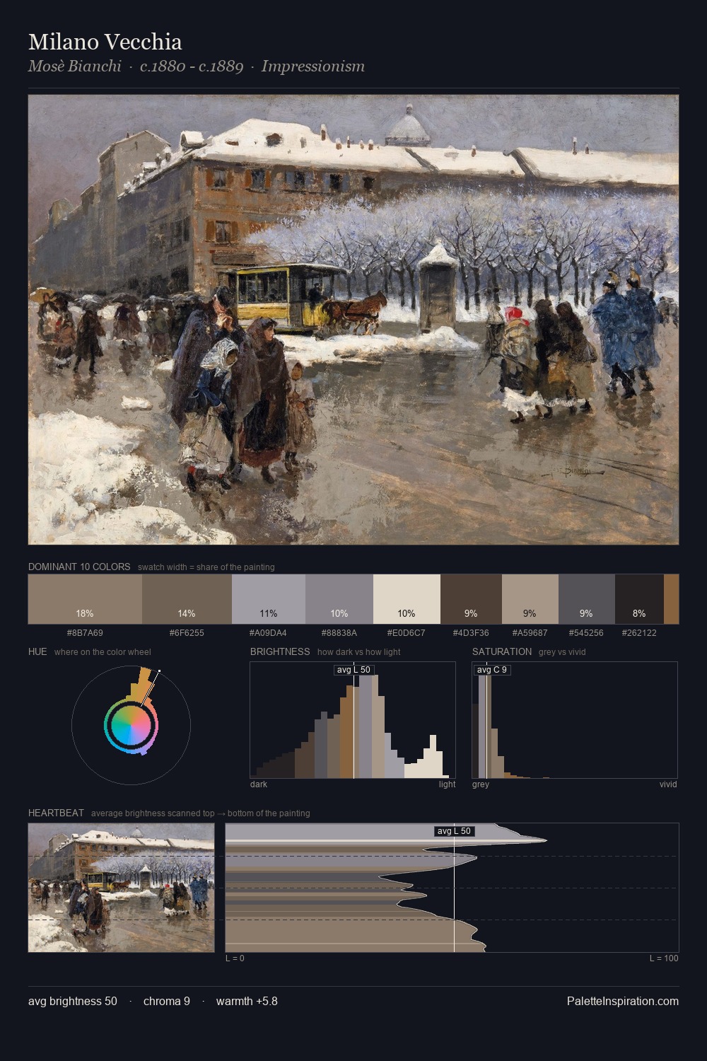
The value structure of James Taylor Harwood is mid-key: quiet, controlled, and cohesive. James Taylor Harwood orchestrates warmth above all else - reds, ambers, and siennas take the lead. Every colour is desaturated; the palette proceeds through near-neutrals and gently-coloured greys. #957B62 is not a small accent - at 18.7% it qualifies as a major presence and gives the palette its chromatic identity. Value range is moderate at 29 units - enough contrast for legibility, not so much as to fragment the tonal unity. Palette 2 sits within the larger chromatic argument that James Taylor Harwood's complete body of work advances.
Example use cases
- exhibition design
- foundation branding
- estate management
- art education
- museums & galleries
I Love This!
Use This Palette
Copy, export, or download for your project
Copy, export, or download for your project
Copy:
Download:
Share: