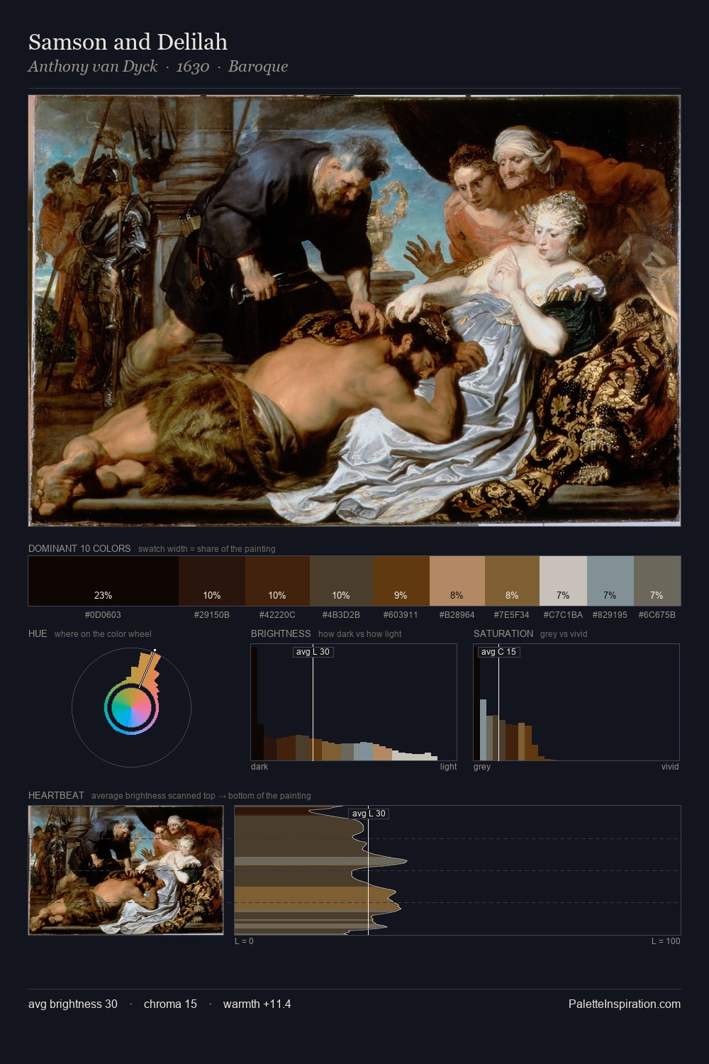
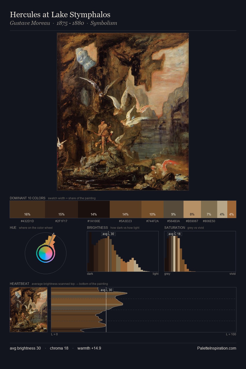
Edward Von Grutzner Palette 4

Palette Analysis
Edward Von Grutzner is low-key throughout, a quality associated with Abyssal Bister - deep shadows dominate the composition. Yellow, ochre, sienna: warm hues that Edward Von Grutzner deploys as the palette's primary energy. Chroma is kept low across all colours, producing the soft, enveloping quality that characterises tonal painting. A single dominant - #110704 at 34.5% - sets the character of the whole composition. At 3.4%, #633614 carries the palette's sharpest chromatic charge: an accent that earns its place precisely because it is withheld. 55 units of value range underpin the palette's structural clarity: the eye always knows where light falls. This tonal restraint is characteristic of the Edward Von Grutzner approach: colour serves light, not the reverse. Edward Von Grutzner's palette 4 carries its own internal logic while remaining in conversation with the artist's broader colour intelligence.
Example use cases
- theater design
- jewelry brands
- tobacco-adjacent retail
- event branding
- film & entertainment
I Love This!
Copy, export, or download for your project