Petrus van Schendel Palette 9

Palette Analysis
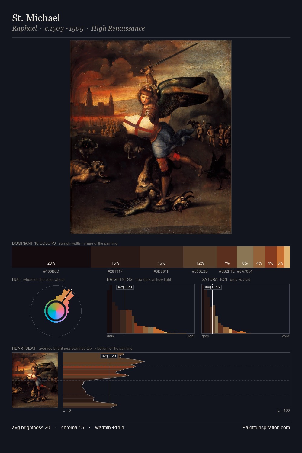
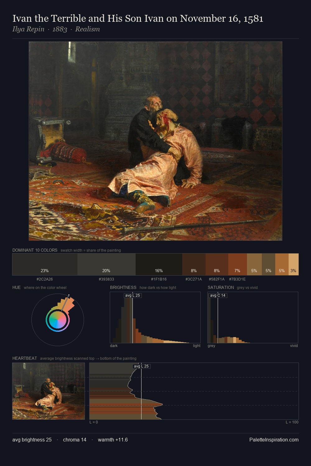
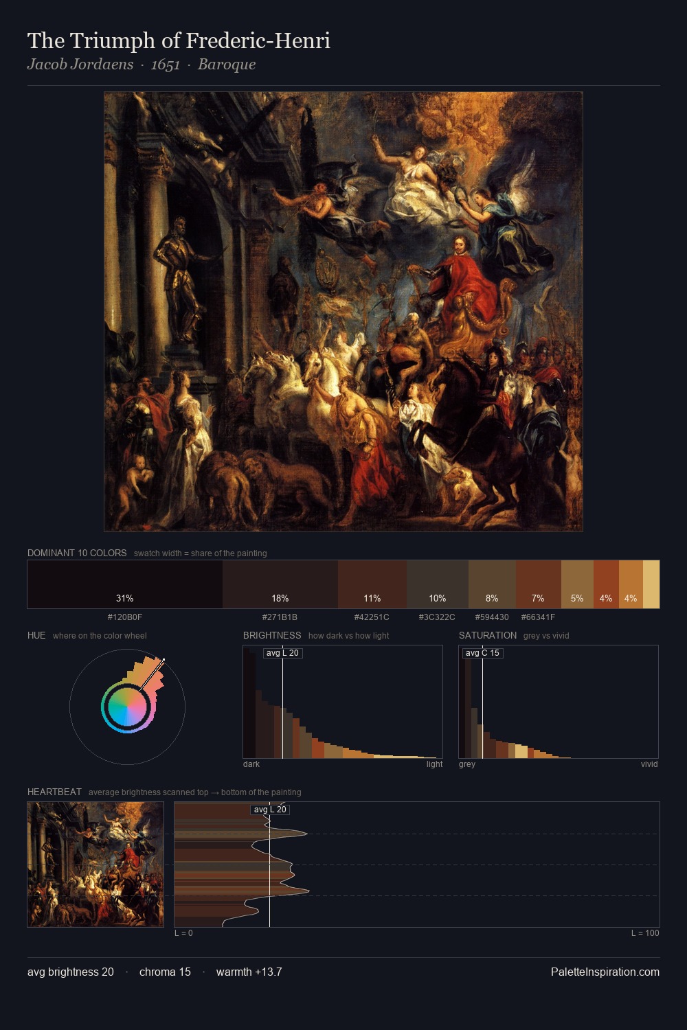
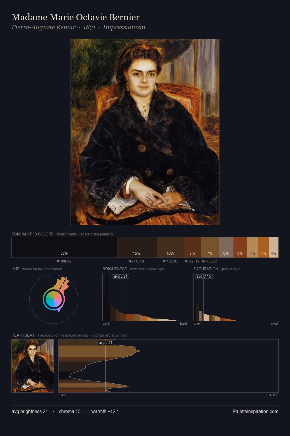
Darkness anchors Petrus van Schendel; light is rationed, creating dramatic contrast rather than open air. Warmth dominates - the palette of Petrus van Schendel leans heavily on the yellow-orange-red arc of the colour wheel. Saturation is deliberately withheld - the beauty here lies in the near-monochromatic gradations rather than colour difference. The dominant colour, #16100E, takes 35.0% of the total area, establishing the overall mood before any other hue is introduced. #D7A566 delivers the chromatic peak at only 1.8% - a small shot of colour with outsized visual impact. At 57 units of value range, the palette has the tonal breadth to sustain complex spatial readings. Together these qualities place Petrus van Schendel firmly in the tonal tradition - concerned with mood and atmosphere rather than chromatic display. In the context of Petrus van Schendel's full range of palettes, group 9 represents one movement in an ongoing chromatic dialogue.
Example use cases
- theater design
- jewelry brands
- tobacco-adjacent retail
- event branding
- film & entertainment
I Love This!
Copy, export, or download for your project