Petrus van Schendel Palette 8

Palette Analysis
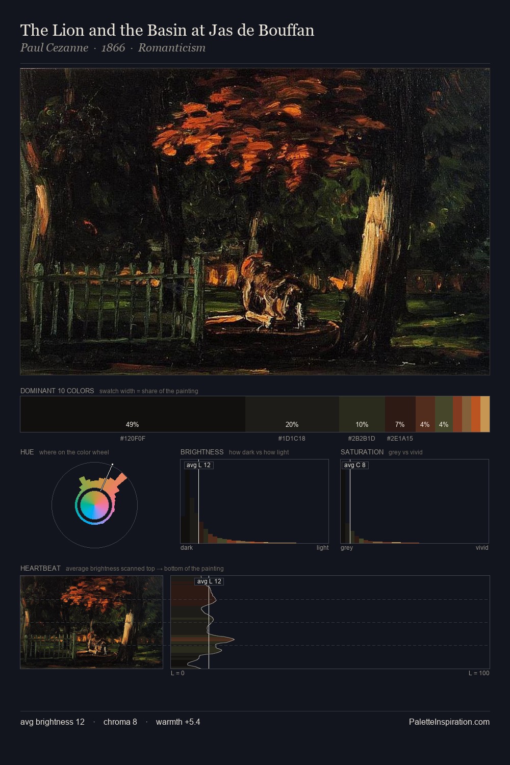
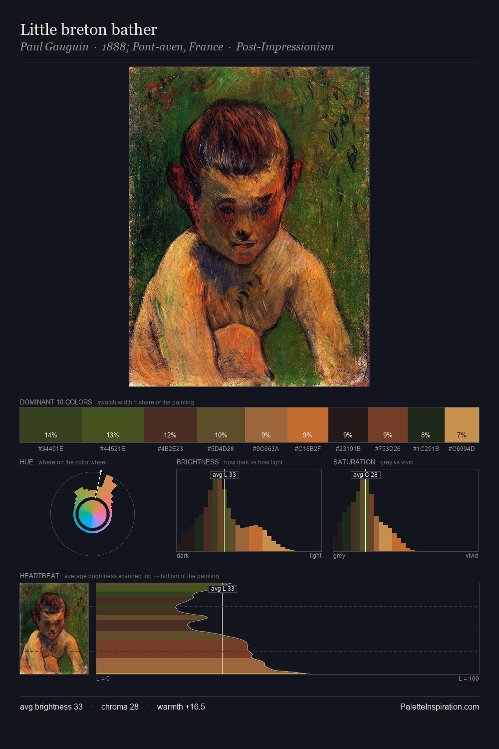
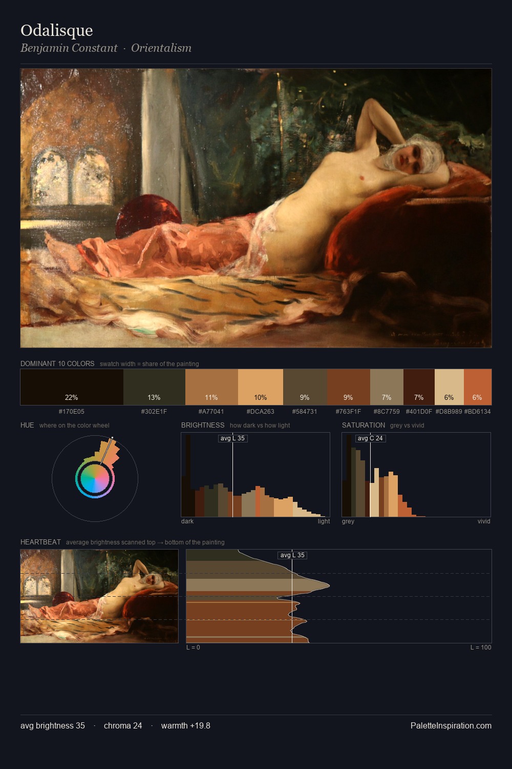
Petrus van Schendel works almost entirely in the lower half of the value scale, privileging depth over brilliance. Petrus van Schendel orchestrates warmth above all else - reds, ambers, and siennas take the lead. All colours lean toward grey, building depth through value rather than colour punch. The saturated accent, #E0965E, registers at 6.1% - sparse enough to feel like a deliberate surprise. The value range spans 57 units across the palette, providing the full gamut from deep shadow to near-white and ensuring clear tonal hierarchy. This tonal restraint is characteristic of the Petrus van Schendel approach: colour serves light, not the reverse. In the context of Petrus van Schendel's full range of palettes, group 8 represents one movement in an ongoing chromatic dialogue.
Example use cases
- theater design
- jewelry brands
- tobacco-adjacent retail
- event branding
- film & entertainment
I Love This!
Copy, export, or download for your project