Salomon Koninck Palette 4

Palette Analysis
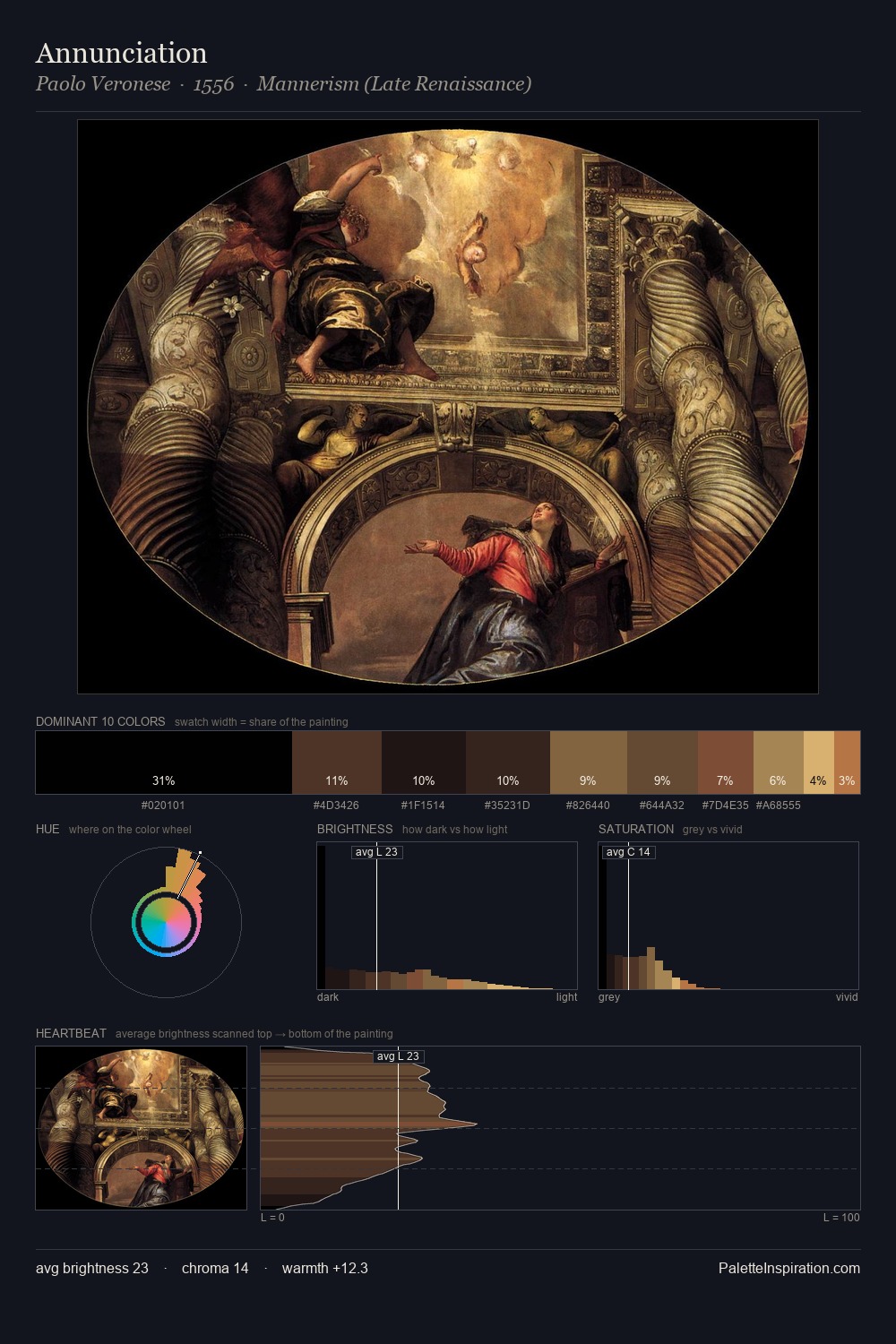
Salomon Koninck works almost entirely in the lower half of the value scale, privileging depth over brilliance. Temperature reads distinctly warm: the reds and earth tones from Salomon Koninck carry the compositional weight. Chroma hovers near zero; colour declares itself through subtle shifts in hue rather than outright saturation. At 28.0%, #141211 functions less as a colour accent and more as a complete atmospheric environment. The highest-chroma note - #49331F - appears at just 6.1%, deployed as a precision accent against the quieter ground. A value spread of 63 units gives the palette both depth and air - shadows are genuinely dark, lights genuinely light. This tonal restraint is characteristic of the Salomon Koninck approach: colour serves light, not the reverse. Palette 4 sits within the larger chromatic argument that Salomon Koninck's complete body of work advances.
Example use cases
- theater design
- jewelry brands
- tobacco-adjacent retail
- event branding
- film & entertainment
I Love This!
Copy, export, or download for your project