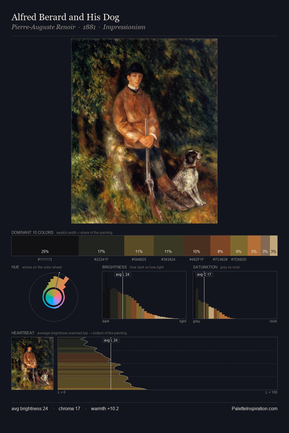
Rachel Ruysch Palette 5

Palette Analysis
Rachel Ruysch dwells firmly in the shadows, with no more than a whisper of light. The dominant temperature is warm, with earth tones and fire-hues setting the emotional key. Saturation is deliberately withheld - the beauty here lies in the near-monochromatic gradations rather than colour difference. The dominant colour, #17110E, takes 35.6% of the total area, establishing the overall mood before any other hue is introduced. At 2.6%, #80421C carries the palette's sharpest chromatic charge: an accent that earns its place precisely because it is withheld. The value range spans 55 units across the palette, providing the full gamut from deep shadow to near-white and ensuring clear tonal hierarchy. Together these qualities place Rachel Ruysch firmly in the tonal tradition - concerned with mood and atmosphere rather than chromatic display. Palette 5 sits within the larger chromatic argument that Rachel Ruysch's complete body of work advances.
Example use cases
- film & entertainment
- fine dining
- spirits branding
- menswear
- theater design
I Love This!
Copy, export, or download for your project