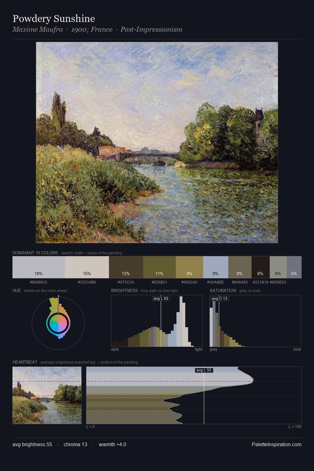
Jacob van Ruisdael Palette 3

Palette Analysis
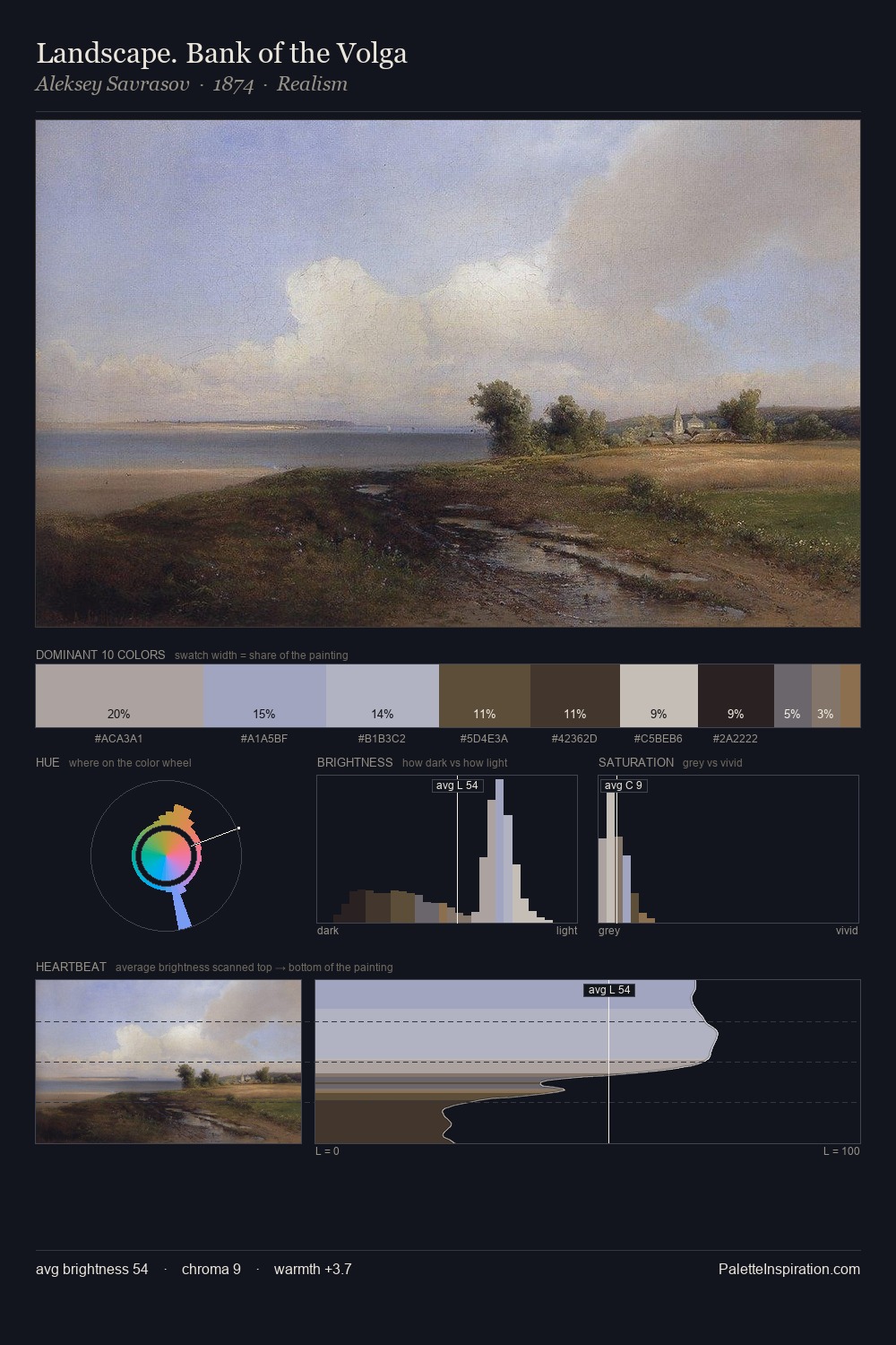
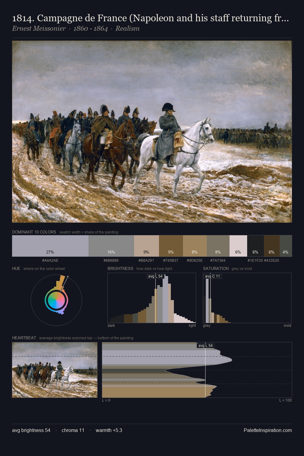
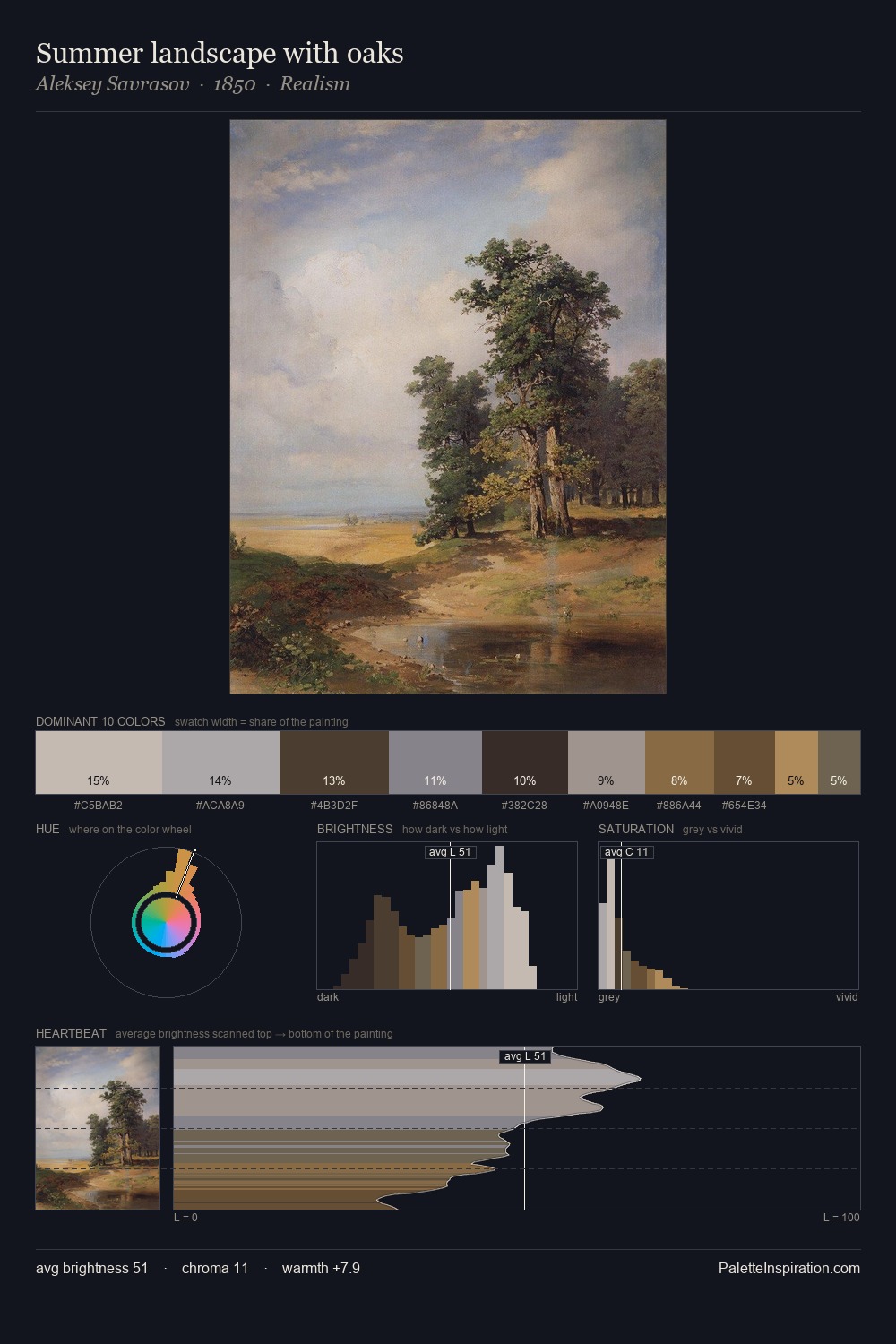
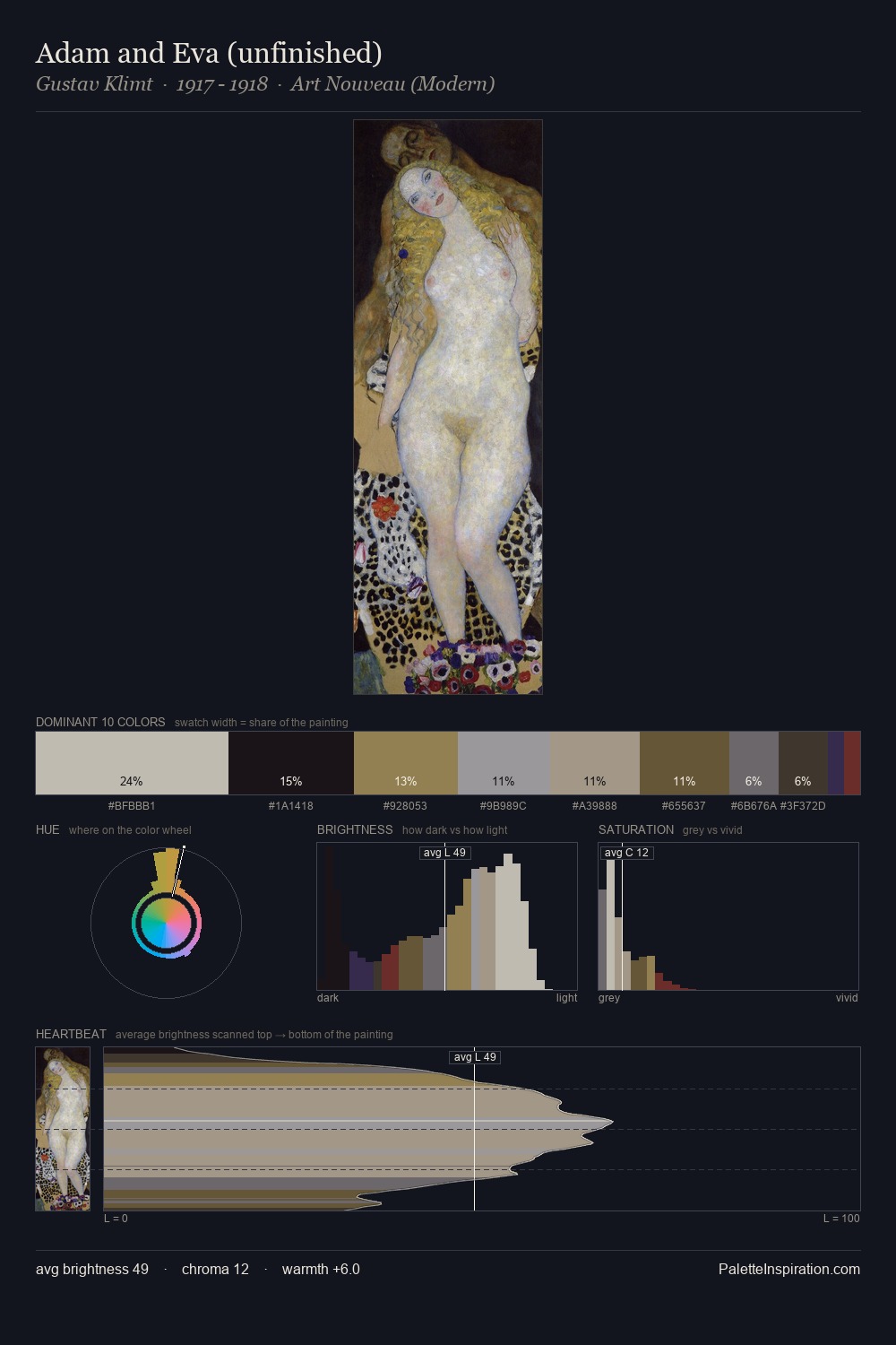
The value structure of Jacob van Ruisdael is mid-key: quiet, controlled, and cohesive. Temperature reads distinctly warm: the reds and earth tones from Jacob van Ruisdael carry the compositional weight. Chroma hovers near zero; colour declares itself through subtle shifts in hue rather than outright saturation. #929190 at 25.7% of the palette: an overwhelming presence that pulls all other colours into its gravitational field. Only 2.7% is devoted to #8E7D51, yet that small allocation delivers the palette's entire chromatic tension. The value range spans 59 units across the palette, providing the full gamut from deep shadow to near-white and ensuring clear tonal hierarchy. Palette 3 sits within the larger chromatic argument that Jacob van Ruisdael's complete body of work advances.
Example use cases
- museums & galleries
- academic publishing
- heritage brands
- auction houses
- exhibition design
I Love This!
Copy, export, or download for your project