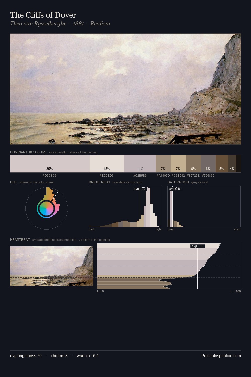
Jacob van Ruisdael Palette 1
Pale Alabaster
Pale High-key and low-chroma - delicate, bleached, washed with light.
Alabaster Warm off-white - creamy stone white, luminous and slightly translucent.

Palette Analysis
Jacob van Ruisdael works in the upper reaches of the value scale, creating an atmosphere of brightness and expansiveness. Heat pervades this palette; warm chromatic identities outweigh cool ones at almost every weight. Saturation is deliberately withheld - the beauty here lies in the near-monochromatic gradations rather than colour difference. #C1C2D6 functions as the palette's exclamation mark: highest chroma, lowest percentage (10.6%). 66 units of value range underpin the palette's structural clarity: the eye always knows where light falls. Palette 1 sits within the larger chromatic argument that Jacob van Ruisdael's complete body of work advances.
Example use cases
- florist branding
- event design
- real estate
- jewelry retail
- hospitality branding
I Love This!
Use This Palette
Copy, export, or download for your project
Copy, export, or download for your project
Copy:
Download:
Share: